


Why have colourful watches only recently become the norm?
Fergus NashWatchmaking is not at all a recent development. Even if you’re only counting from when pocket watches were widespread, that’s still coming up on 300 years of development and evolution. Despite that, shifting cultures and styles are constantly bringing forward new designs, new complications, and new technologies. So with all that in mind, why is it that brightly-coloured dials have only just started to blow up in popularity?
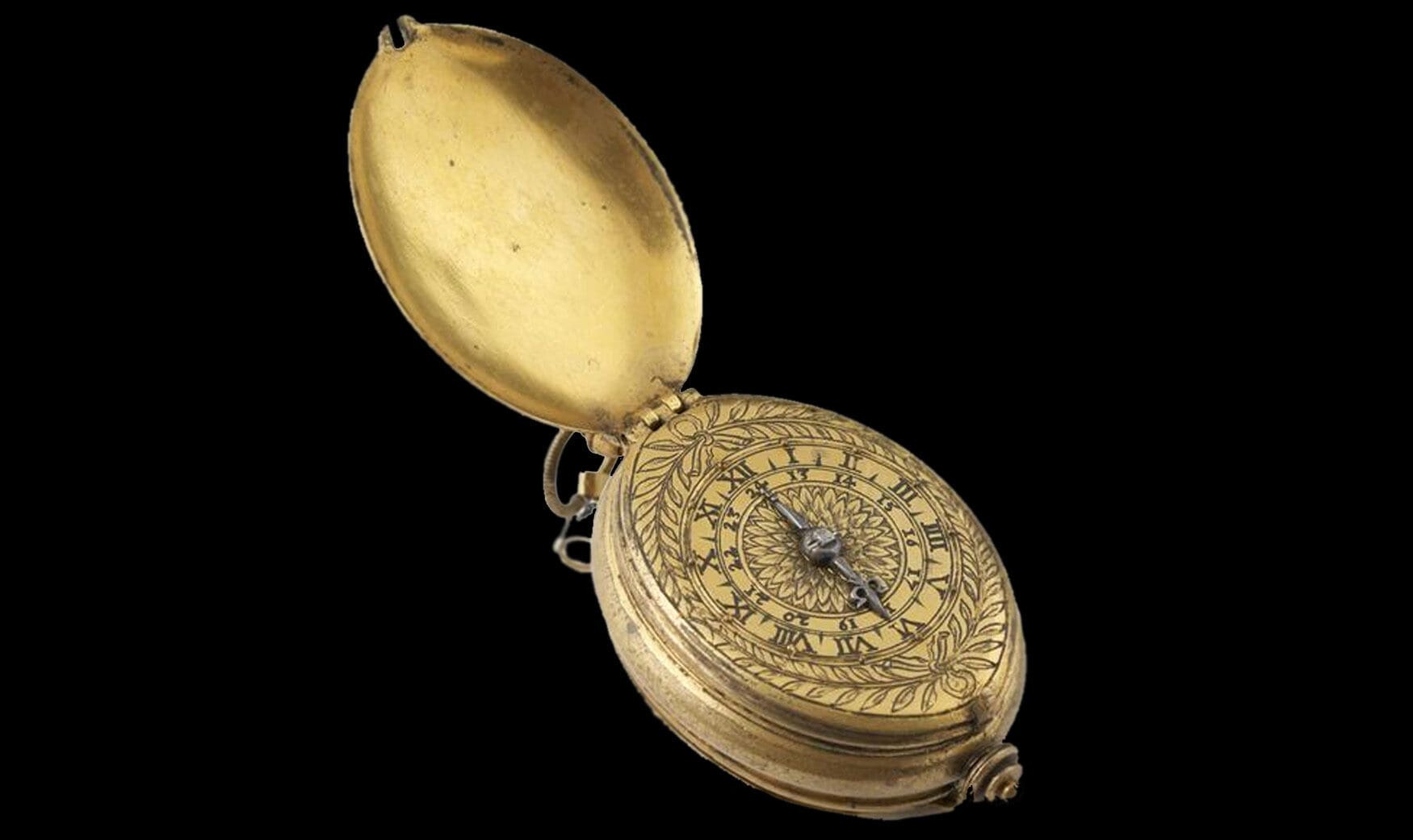
Going back to the very earliest forms of wristwatches, they were considered luxuries far beyond the classifiers we use today. Even middle low-income earners can buy “luxury” watches if they save up and prioritise them over other things, but those 17th and early 18th century examples were mainly reserved for royalty and exceptional aristocracy. Not only were the mechanics which powered them ground-breaking, but their cases and dials made from precious metals were the work of experienced artisans. Compared to those watches, even the most stunning of green or purple modern dials feel pretty tame.
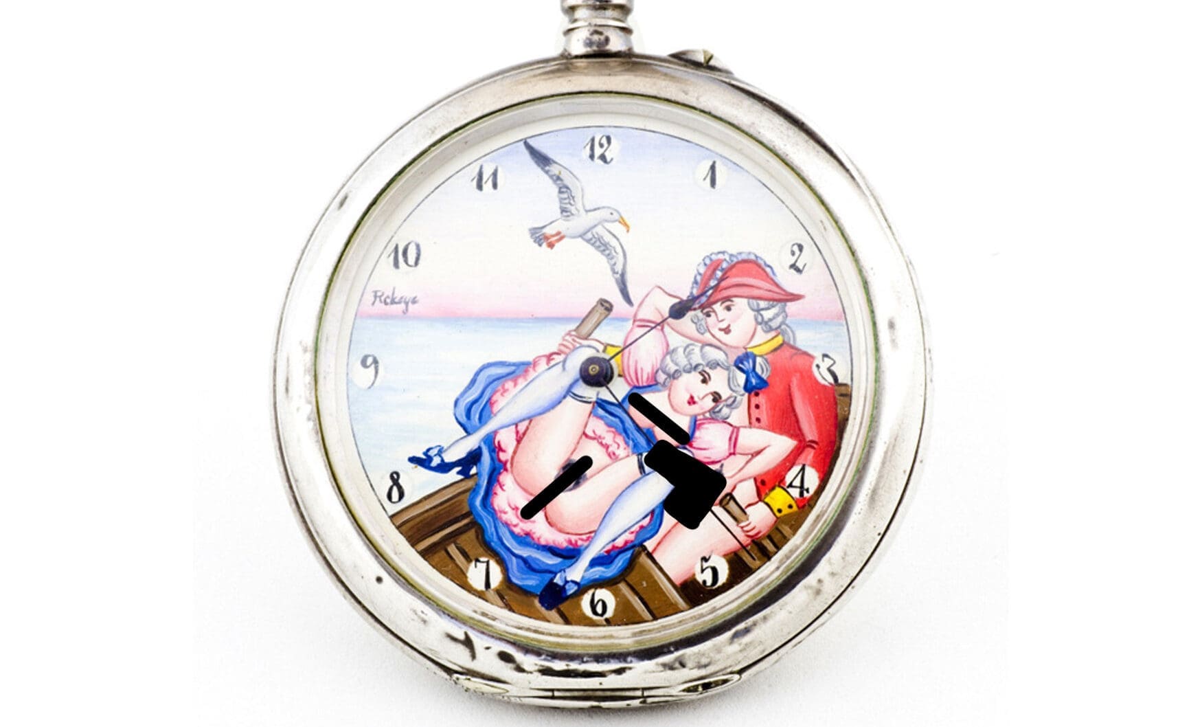
When pocket watches became more affordable for the general populace in the latter 18th century, the dials were one of the main things to be simplified. Occasionally they would be painted with a landscape, perhaps a maritime, or ‘spicy’ scene for sailors, but the base was still a plain white backdrop for simplicity and legibility. Some upmarket watches were still decorated with dazzling displays of lacquer, enamel and gemstones, but the decoration was usually focused around the case than the dials. As demand for pocket watches rose in the 19th century and American businesses like Waltham and Elgin spurred mass-production worldwide, the race for exponential affordability didn’t really allow for experimentation with dial colours or other customisations.
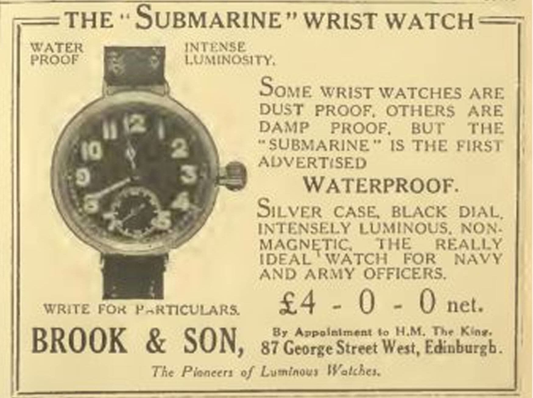
Along came the 20th century, and with it, world war. Wristwatches turned from novelty to necessity, and the military influence introduced popularity of black-dialled field and pilot’s watches. Some attention was given to developing waterproof watches for divers and submarine operators, but they wouldn’t become a widespread thing for some decades. Dress watches departed from the strict, military focus throughout the 1930s, ’40s and ’50s, but the ’60s is really where we start to see some colourful exploration.
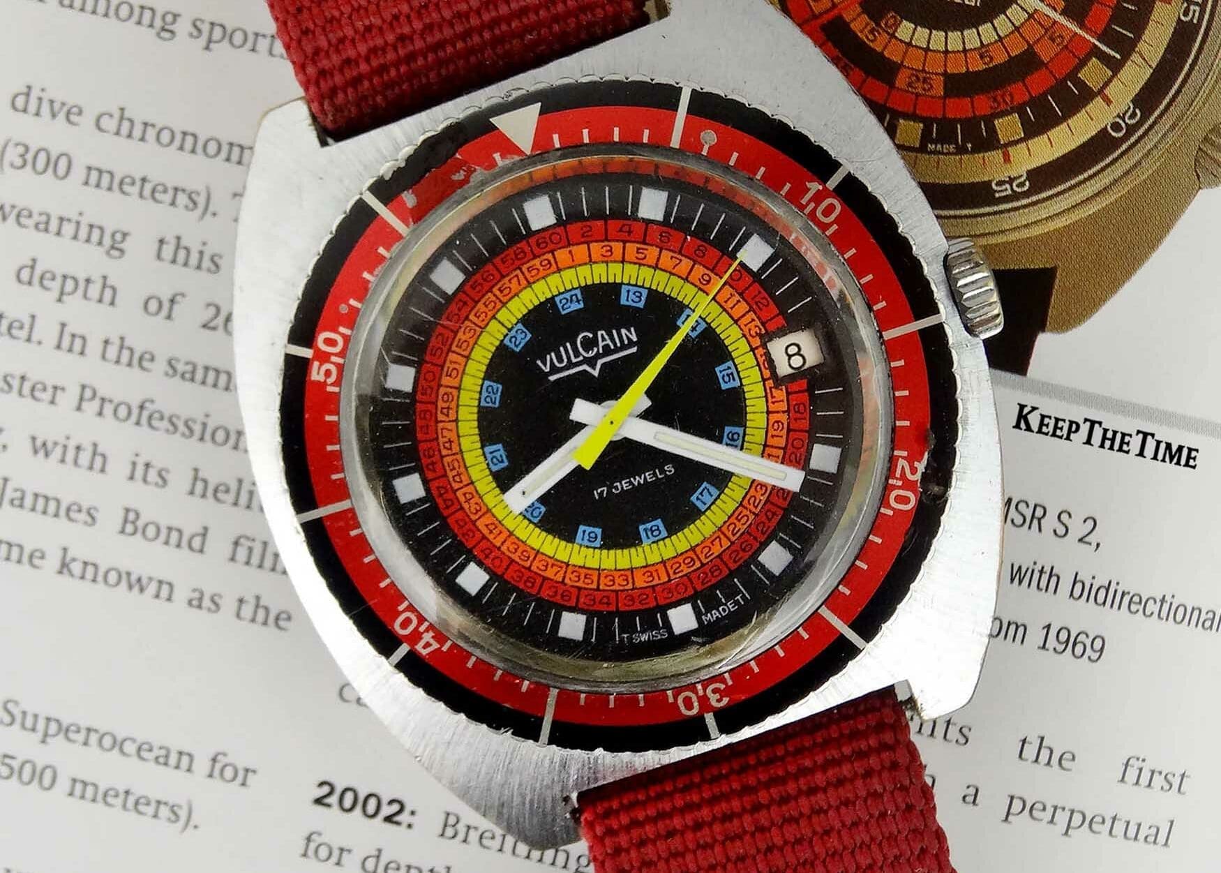
Once the technology was there, dive watches exploded throughout the 1960s. Not only were brands going wild with different kinds of cases, waterproofing systems, and sizes, but dials were also a matter of great innovation. Sunburst finishes made even the dullest of silver dials look dazzling, while brands such as Mido, Doxa and Zodiac contributed to bright displays of blue, orange, yellow – sometimes even rainbow ones. These trickled into other kinds of watches, although the brightest colours were usually reserved for the sportiest of designs. Divers and chronographs were the main colourful culprits, but even still, the vast majority of watch dials didn’t dare venture out of the white, silver and black safety net.
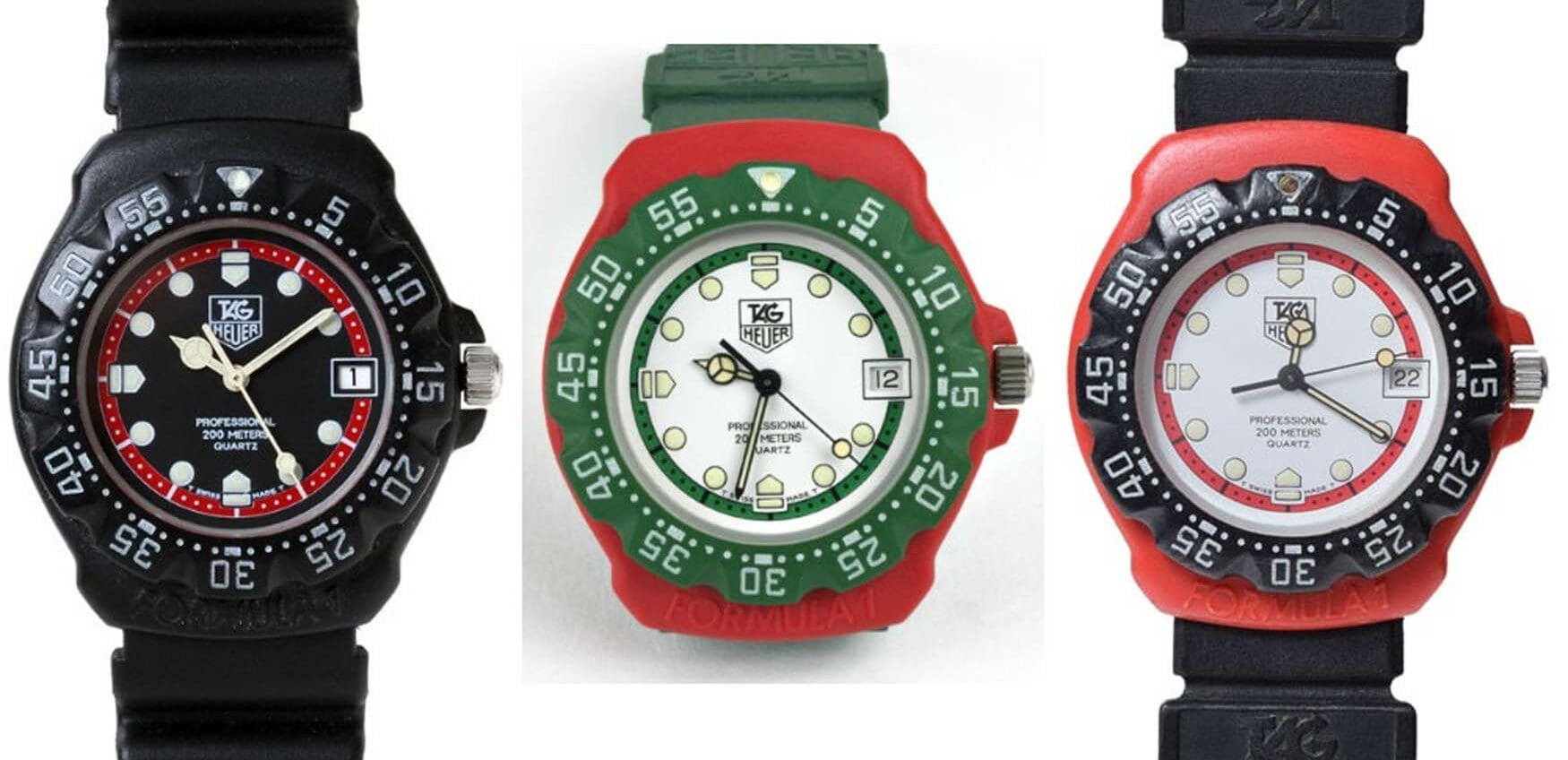
During the ’70s and ’80s, the post-war conservative culture eased away. The seeds planted by the flower power movement embraced a greater sense of individualism, and expressive watches became more common yet again. It was also the peak era of the quartz crisis, and brands like Rolex introduced watches like the Stella dial Day-Dates to stand out from their competition. Blue dials started to become almost as common as white ones, but the real revolution wasn’t happening in the luxury sector. Affordable quartz like the TAG Heuer Formula 1 and Swatch were bright and exciting to younger generations, while kids were finding plastic LCD watches in cereal boxes. Most “serious” watch enthusiasts turned their nose up at those cheap, near-disposable examples though, further delaying bright colours into mainstay watch catalogues.
The 1990s and 2000s didn’t evolve much in the way of colourful watches, but culture changes did have a huge impact. MTV, tabloid magazines, and the internet all contributed to an obsession with celebrity and status. Collectors looked to what the stars were wearing, celebrity endorsements became widespread, and athletes weren’t afraid to strap on huge cases flooded with diamonds. The idea of a luxury watch was redefined, and given tiers of differentiation almost like the separation of sports cars, supercars and hypercars. On the opposite end of the spectrum, rising experience and standards in manufacturing countries like China meant that cheap watches were also rising in quality.
The mid 2010s is when things really started to pick up for colourful dials. The rise of social media platforms like Instagram and Facebook began to outshine all of the forums which previously housed most of the internet’s biggest watch enthusiasts, and opened up the hobby to the world. Not only could people instantly share their favourite wrist shots to a global audience, but it also gave brands insight to customer trends, opinions and data more vast than they’d ever had before. Anything eye-catching was bound to be shared, interacted with, and then pushed further by marketing algorithms designed to be viral. White, black, and silver dials were still classic, but nothing could compete with something colourful in terms of viral success.
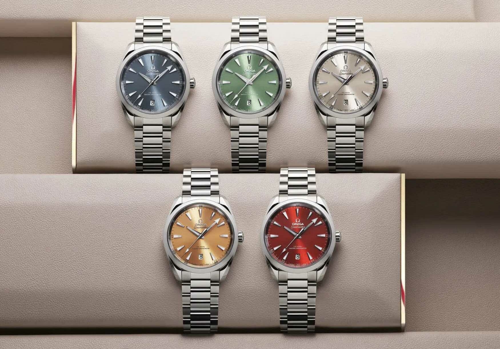
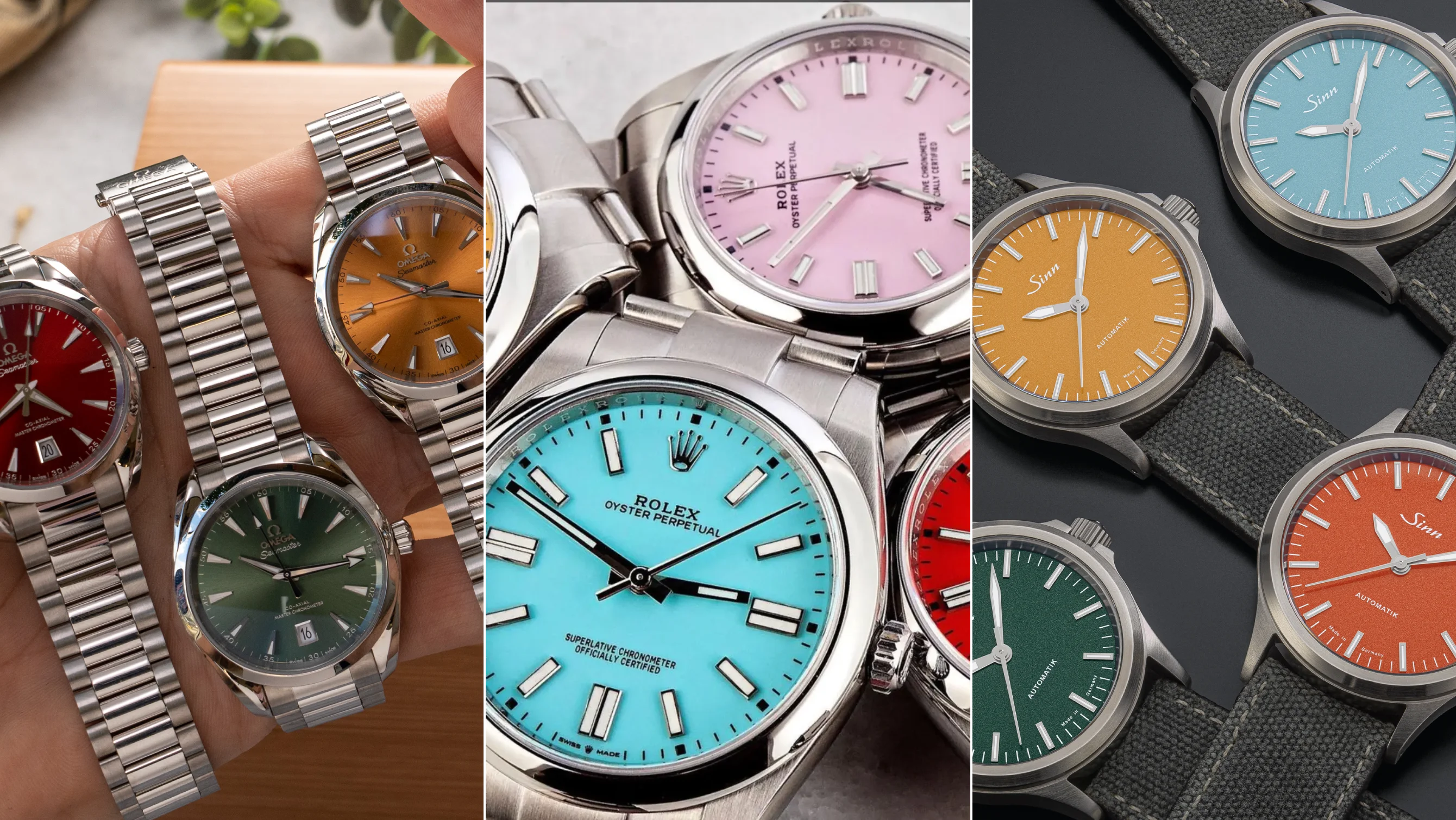
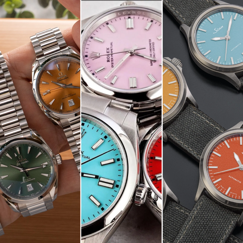
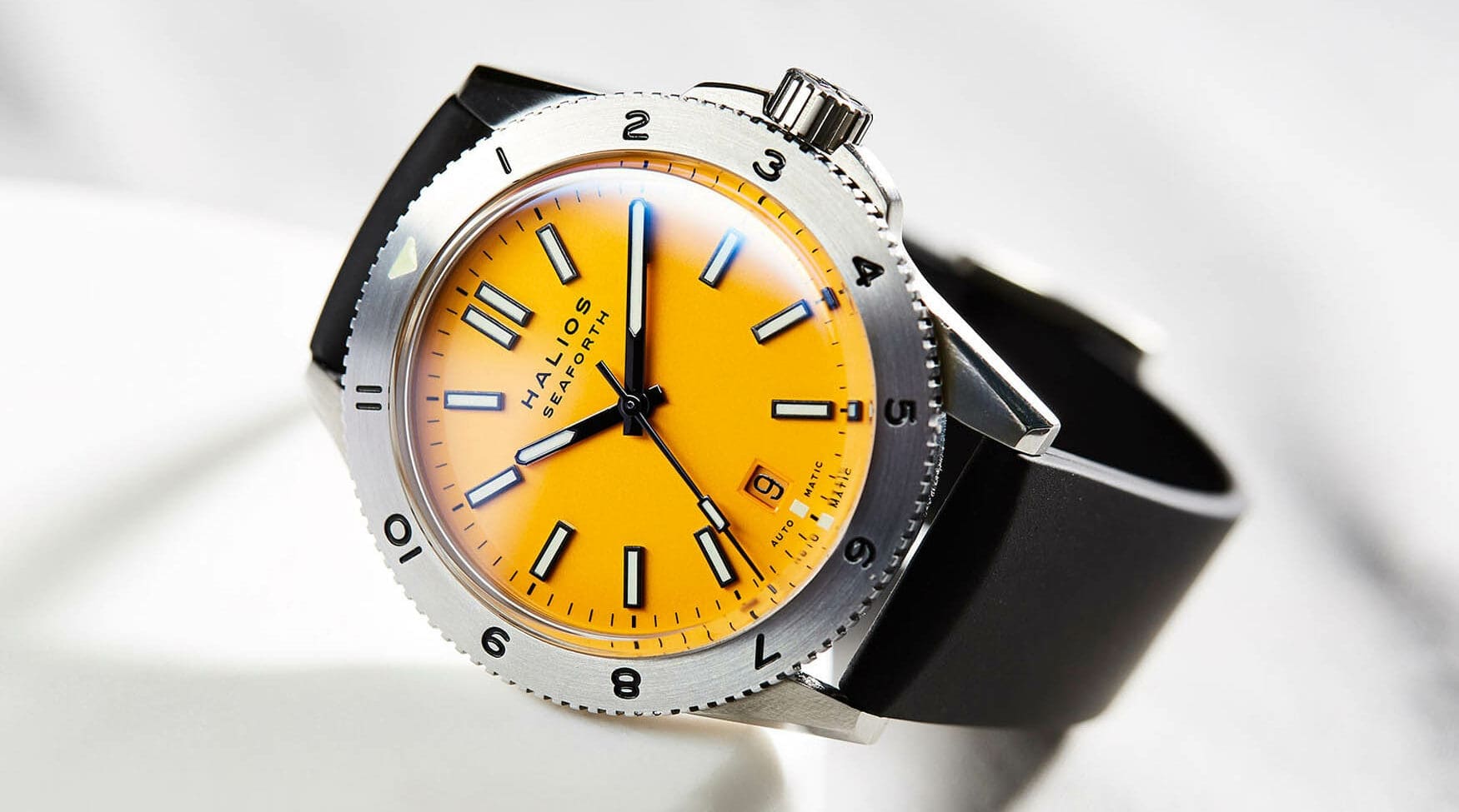
Microbrands were the next big colourful powder keg, as collectors were able to buy all kinds of niche-appeal watches without risking thousands of dollars. Mostly helped along by crowdfunding platforms like Kickstarter, bang-for-buck watches with colourful dials could be designed by passionate individuals, unafraid of losing money with a flop release like the big established brands were. As more and more microbrands got off the ground successfully, the big brands got braver. Hype followed a string of green dials, then purple, red, and the current trend seems to lie with grey and rose gold accents, and of course, pink. But, unlike many watchmaking trends, the colourful dials refuse to go away. Those kids who were opening bright plastic watches in cereal boxes are now well into their 40s, and nobody’s afraid of colourful expression anymore. Over the last few years they have become the norm, and it looks as though they’re here to stay.