


WHAT TWEAKS MY TOURB: Why asymmetrical running seconds drive me crazy
Zach BlassTaste is subjective, we all have our individual preferences – therefore what irks me may not necessarily irk you. But What Tweaks My Tourb is all about the horological features and quirks that make me shudder. You may well totally disagree with my views in this series and I wholeheartedly welcome that too. In a marketplace where tastes are seemingly becoming more and more homogenised, I like the idea that people appreciate different styles of aesthetics. But back to the question at hand. As many British women have said on a guilty television pleasure of mine, Love Island, there is one design choice that gives me “the ick”. And that, my friends, is asymmetrical seconds registers.
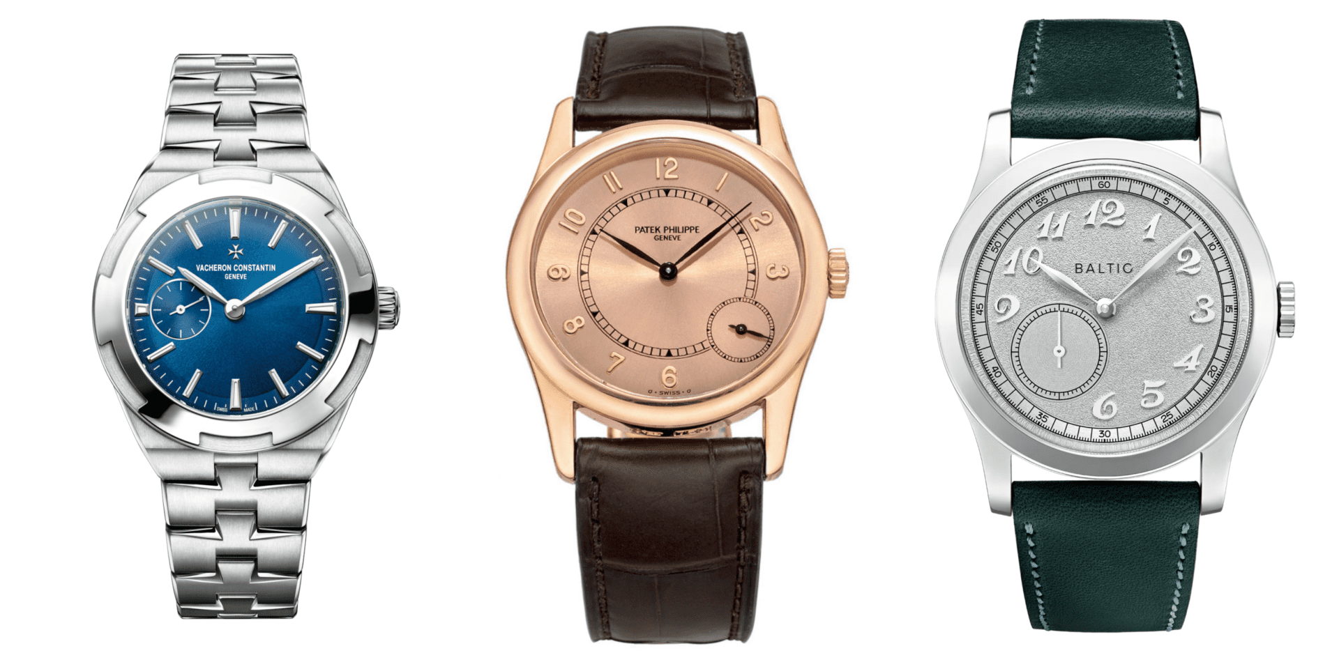
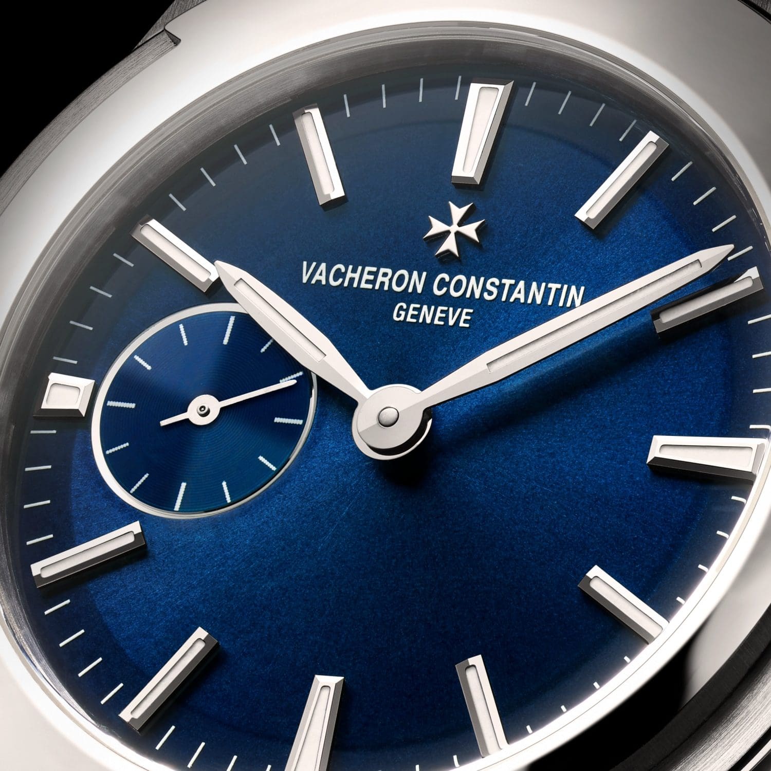
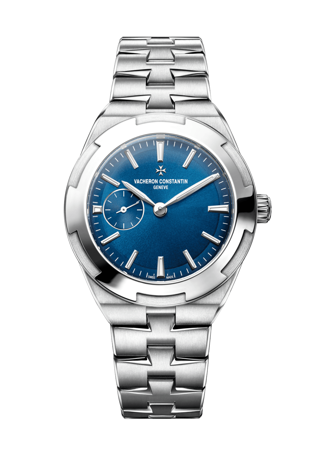
The first thing the majority of the watch buyers notice about a watch is its dial, and I am no exception. So, whenever I receive a press alert from brands for an upcoming release, the first thing I do is head straight to the image assets. It is always an exciting feeling to see a new design, but, when the image opens on my laptop and I see a running seconds register at 9 o’clock, 99% of the time my heart sinks.
Sure, this is a personal thing and it doesn’t necessarily mean I think that an asymmetrical seconds register makes for a bad watch. It’s just not a watch for me and here’s why.
Dial purity is a major consideration for many watch buyers. As an example, calendar complication placement, or even presence, can make or break a design for many buyers. In that same vein, I find I cannot visually digest time-only or time-and-date designs that have a sub seconds register anywhere besides 6 o’clock. When placed at the 6′ position there is balance to the aesthetic. Anywhere else, I find my eyes drawn into a greater sense of unrealised real estate on the dial.
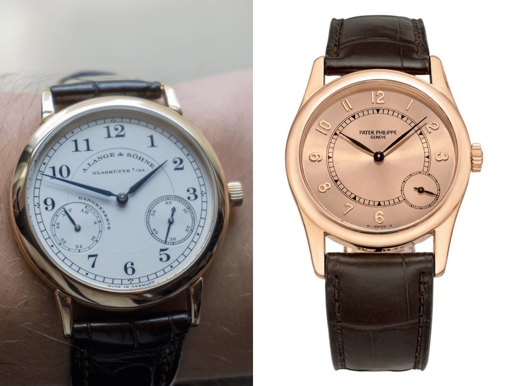
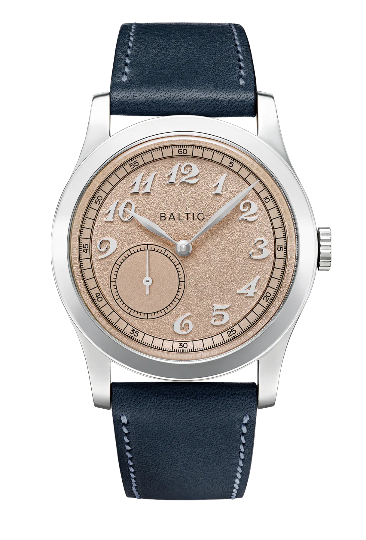
An example of this in my collecting journey would be when I was deciding between a A. Lange & Söhne 1815 Up/Down ref. 221.021 (the winner) and Patek Philippe Calatrava 5000R (a contender). When I saw both of these watches at a steal of a price, likely due to their smaller sizing, I immediately decided to trade a few pieces to snag one. Ever since I leveraged my Patek Philippe Golden Ellipse to acquire a Rolex Submariner, there was a gaping hole in my collector heart to return a Patek Philippe into my collection. Eventually, however, I decided I could not get past the 4′ placement of the running seconds hand. Now, you’ll notice the placement of the running seconds register is identical on my Up/Down. But there is one glaring distinction on its dial. By having a power reserve complication at the 8′ position, the sense of symmetry is restored. There is a gratifying balance, the dial doesn’t convey, to me, an irredeemable sense of emptiness. The 5000R, while a fantastic piece, loses me due to the lopsided nature of the hour numerals, with the four and five numerals conspicuously missing. With all the empty space on the left, the sub-seconds appears to me more like a pesky zit on the dial, I can’t seem to find the beauty in it as I would with, perhaps, Cindy Crawford’s birthmark.
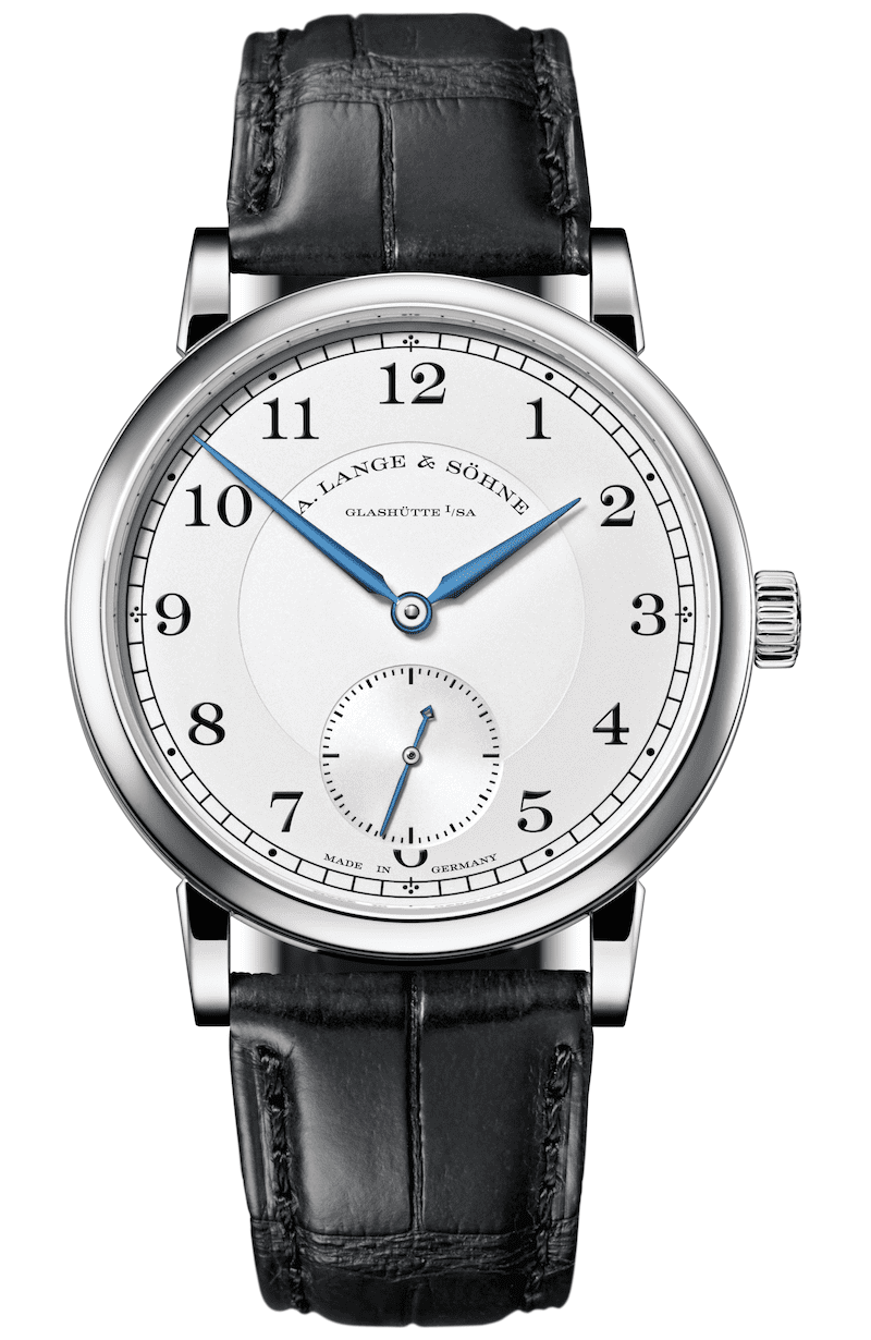
A. Lange & Söhne understands the appeal of symmetry in their time-only references. Were you to drop the power reserve complication, and opt for the standard 1815 watch, the German manufacturer returns the sub-seconds register to the 6′ position. As a result, it is super clean and balanced. It may not cause a stir, but it is classic and timeless with enduring appeal.
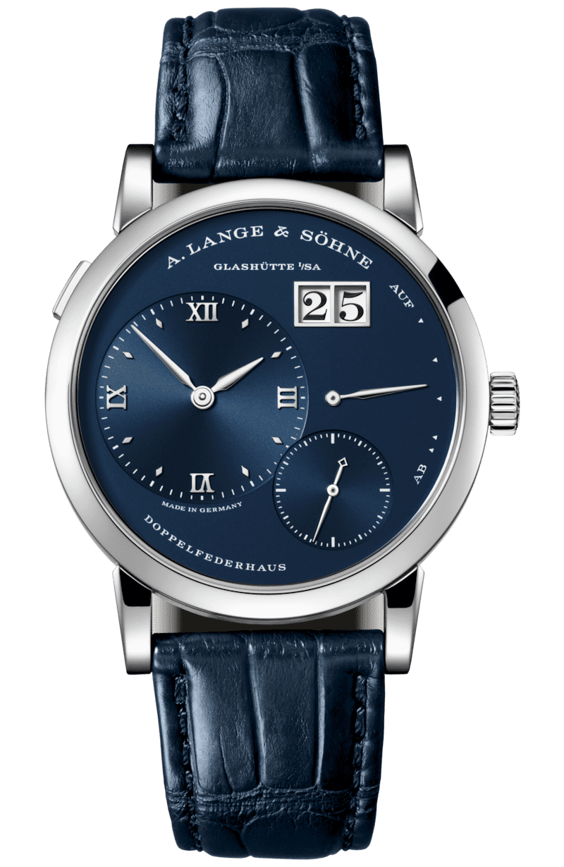
To say I don’t appreciate asymmetry as a blanket statement for my tastes would be a lie. As I expressed with my 1815 Up/Down, it’s not an issue of just placement. It is context. If the watch is time only, or time and date, asymmetrical running seconds ruin the dial equilibrium for me. But with other complications present, depending on their arrangement it can result in an appearance I absolutely drool over. The Lange 1 is a perfect example. Nothing about the dial is symmetrical, but it is harmonious. Each of the indications are strategically laid out with the golden ratio in mind. Also, with the numerous complications and indications present, the dial doesn’t feel empty.
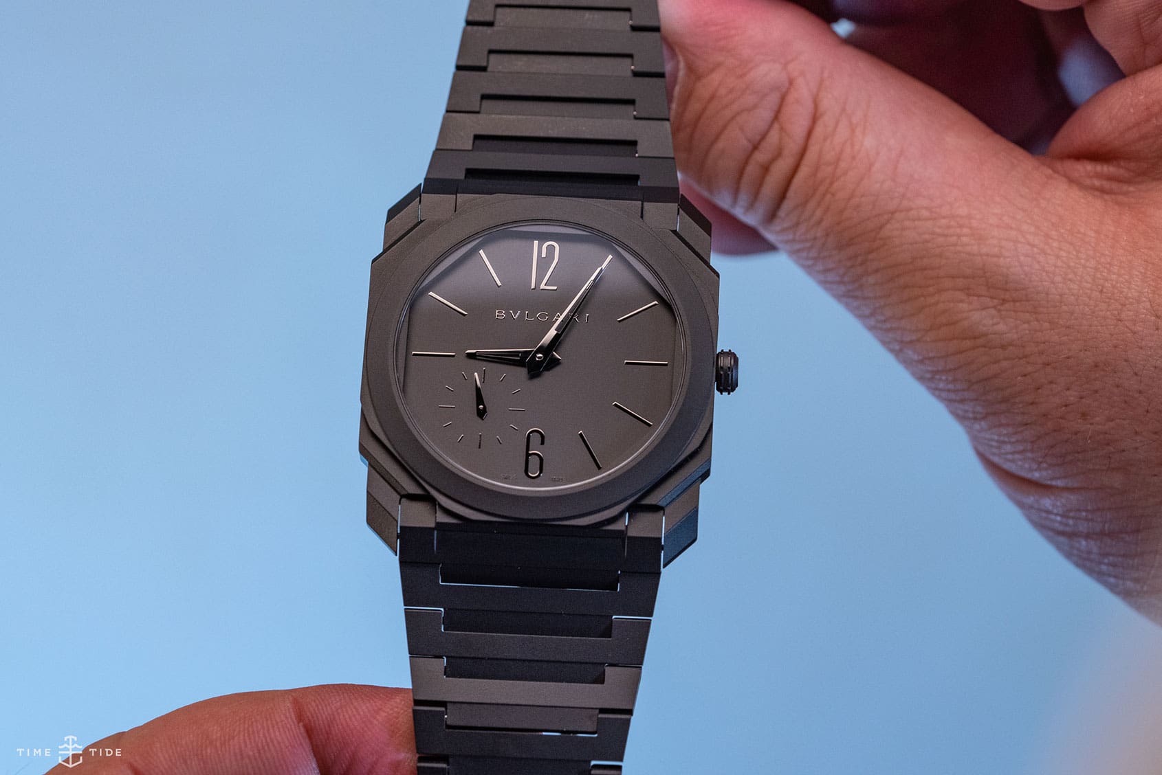
One watch I would make an exception for is the Bulgari Octo Finissimo. I think its because the overall sense of the line is about pushing design forward, so a conventional seconds placement might actually look out of place on it. As I said before, it really is about context, and in the instance of the Finissimo it feels right at home – so in this case, I’ll allow it.
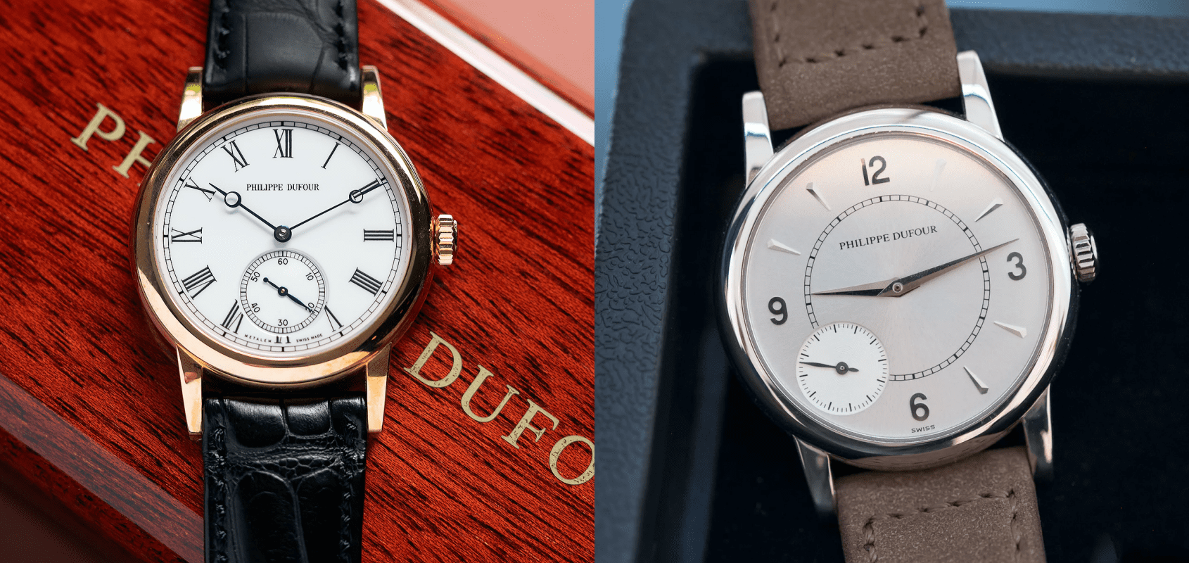
I know it is such a small detail, but watchmaking is a game of millimetres after all. What can I say, it just gives me “the ick”. I just can’t shake it in most instances. Would I love to own the Philippe Dufour Duality above on the right? Absolutely, I would easily make an exception there. But I would probably choose the Simplicity on the left over the Duality, on the grounds of the sub-seconds placement. Call me crazy, but this is what tweaks my tourb.