


Why I bought the Kurono Chronograph 2 – an owner’s review
Zach BlassWhen the first Kurono Chronograph was released, I admired its design but felt the white/black colour scheme was an unnecessary addition to my collection. I won’t pretend any watch is a necessity, but in order to splurge on these items that I love, I have to be able to qualify their purchase – even with arbitrary logic. When the Kurono Chronograph 2 was announced, I wasn’t initially sold on adding it to my personal collection either. In fact, I passed on the opportunity to “pre-order” the watch as a member of the contributor tier. But as the public window to purchase arrived, the FOMO became real and I became anxious at the prospect of letting such a well-designed chronograph slip by.
I realised the Kurono Chronograph 2 actually met a lot of my personal requirements. Its dial introduced more colour than the previous generation, incorporating four tones and added detailing. I may have black dials covered in my collection, but the Kurono chronograph 2 at its heart leverages a brown tone – a colour that I didn’t yet own.
As a result, I made sure that upon its public release I was logged into my account and ready to pull the trigger. Fortunately, I secured a piece from the limited run. Having owned the watch for a little over two weeks now, I wanted to share my experience with the watch now that I have enjoyed it for a good amount of time on the wrist.

The case
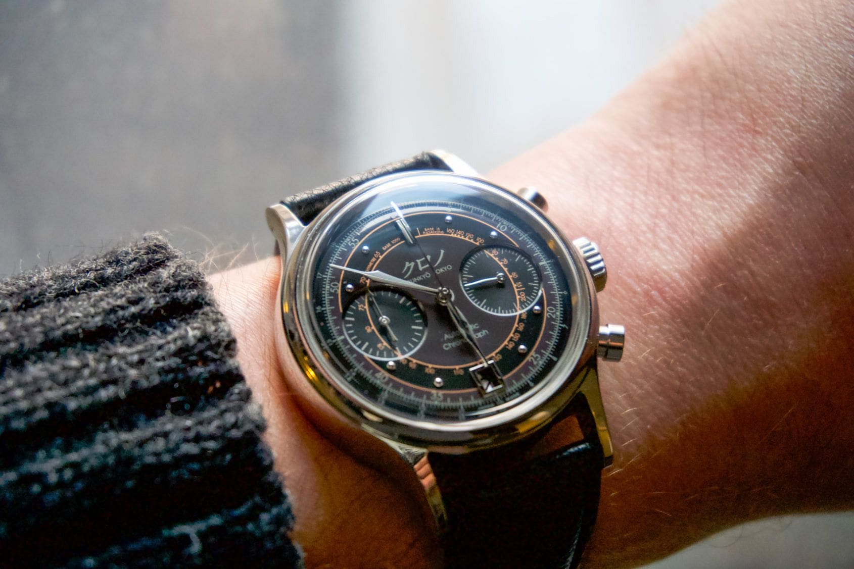
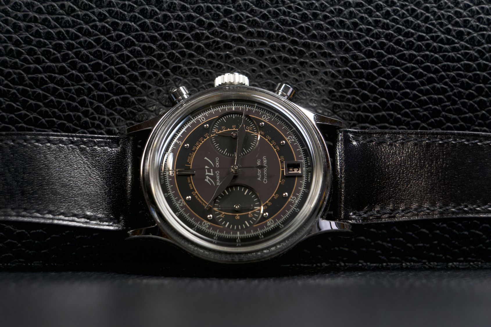
The stainless steel 38mm x 13.9mm case sits well on the wrist, it’s curved lugs conforming nicely around my wrist. At approximately 46.5mm lug-to-lug, I have no worry of wrist flare on my smaller sized wrist. While all Kurono watches feature excellent high polished cases, the thicker sized case made me appreciate the quality of finish even more. It is incredibly reflective, you could literally check your hair in the reflection of the caseband.
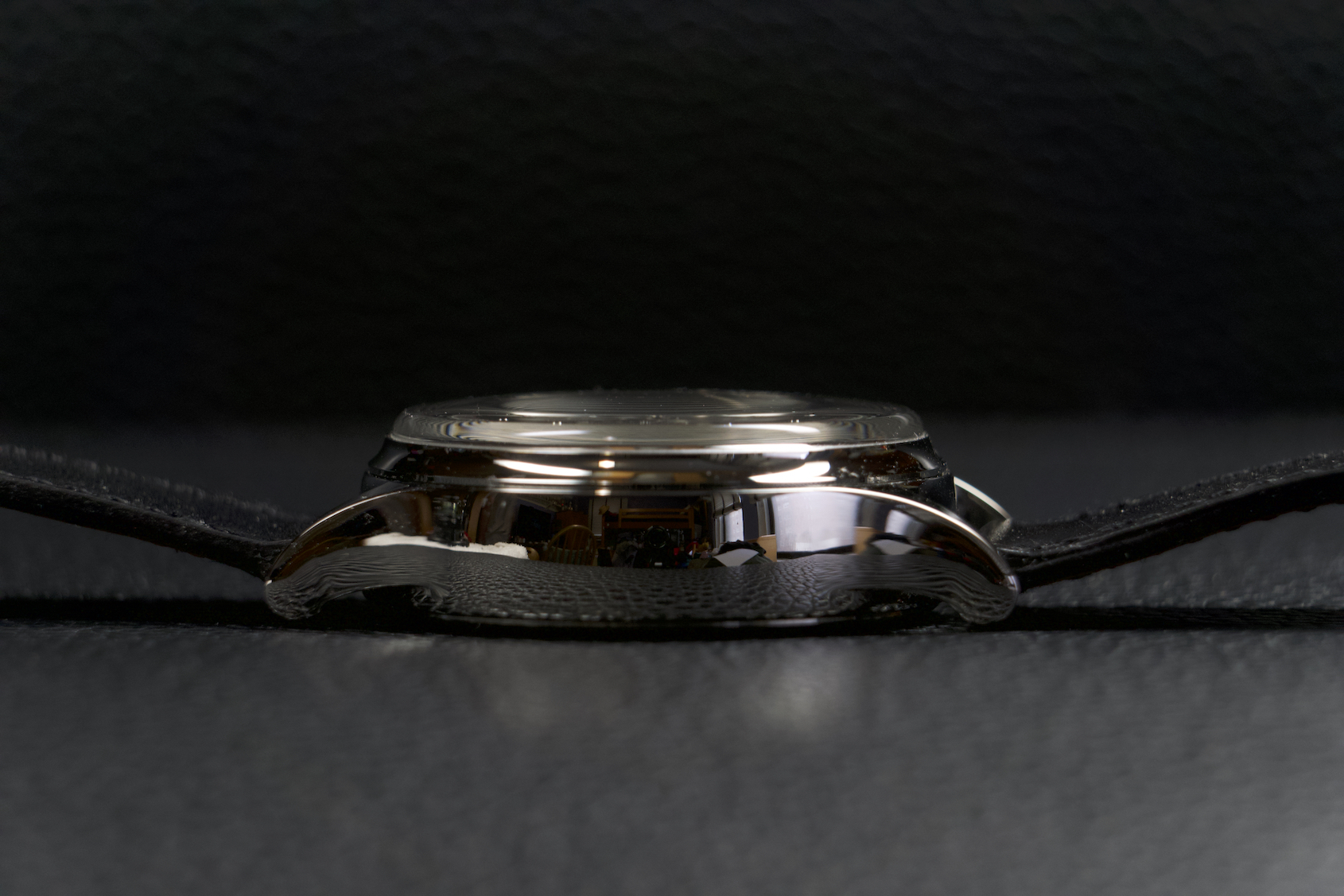
While on paper it is 13.9mm thick including the crystal, I have found it still manages to slide easily beneath the cuff of a shirt or sweater. The boxed crystal may add a tiny bit of thickness, but it really caters to the vintage and art-deco inspired sensibilities of its design. With a water resistance of 30 metres it is by no means a watch I would wear during more strenuous activity, but in the few instances I have ventured out of my home for drinks or dinner over these past two weeks, it was the piece I put on from my watch box. One detail I enjoy, in terms of setting the watch, is that there is a well sized gap between the case and crown that makes it very easy to pull the crown out. It is not large enough for you to think it isn’t pushed in, but enough to make it very grippable – which for someone who occasionally engages in the bad habit of nail biting is a total bonus.
The dial
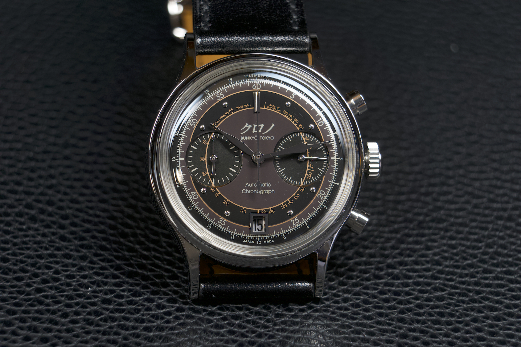
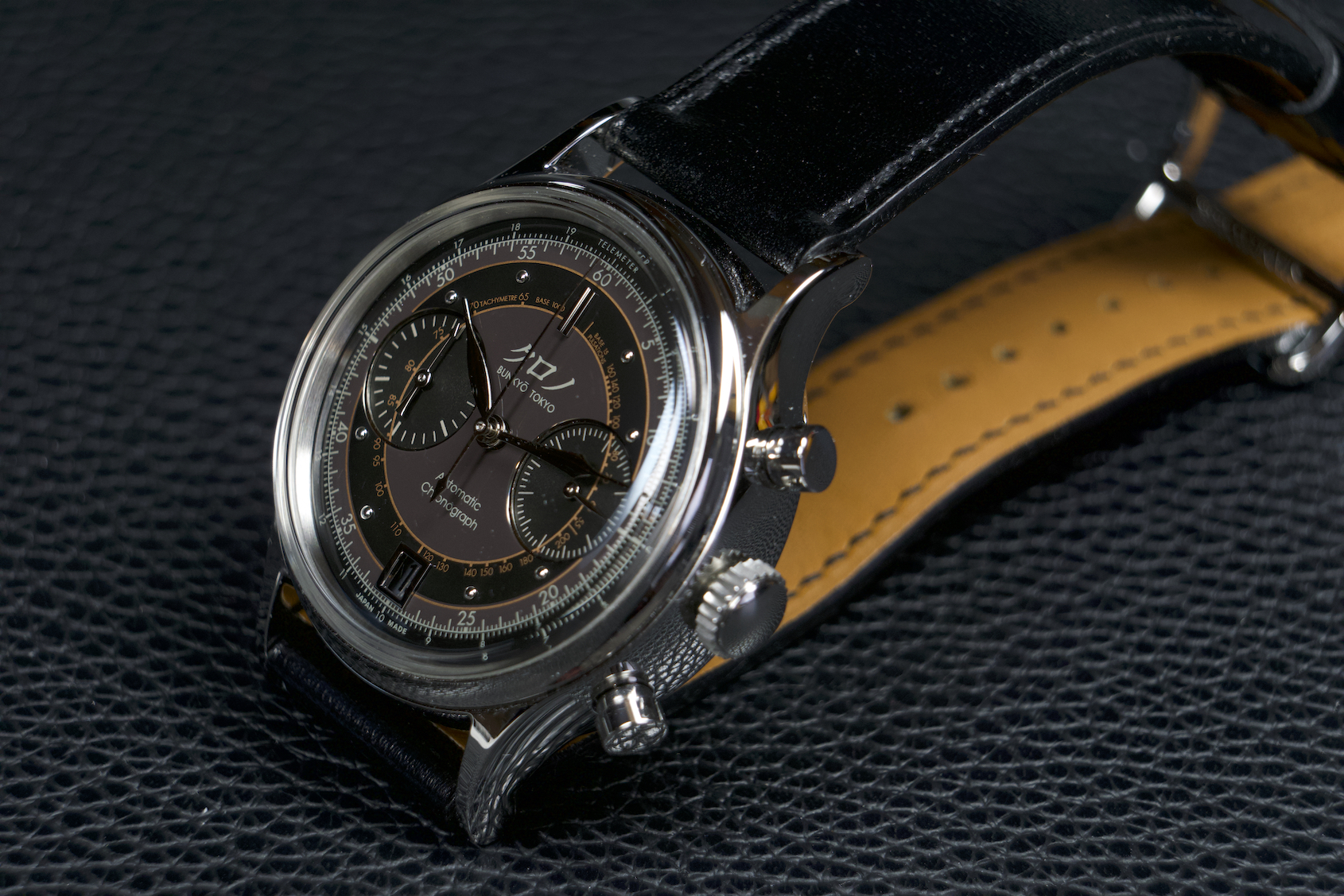
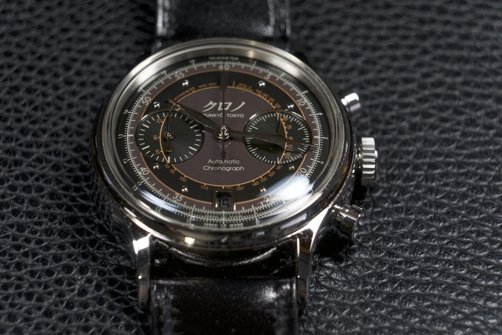
The dial can be quite a colour chameleon depending on the environment. Under direct light the dark brown is very easy to discern, but at night it blends a bit more into the black middle ring of the dial. Regardless of light, the copper accents that frame each ring of the dial make it easy to make out each scale. Kurono also did a great job ensuring there is no parallax error, and that the rings are perfectly aligned even as they step down to cross each chronograph register. In the metal, I will say the dial may take a minute to acclimate to in terms of reading all the information – particularly the proximity of the minutes scale to the telemeter scale. The hash markings are not aligned and therefore when reading the minutes your eye has to remember to correlate the minutes with the scale in outer brown ring and not the black. That being said it becomes second-nature to read and distinguish within your first wear.
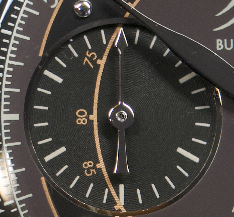
The colour scheme is really attractive, but it also helps you understand the dial and better discern all of its information as well. There are dark brown, black, copper, and silver tones to the dial – all of which work harmoniously to convey a ton of information. The contrasting texture of the chronograph registers, with a very fine concentric guilloche, makes them stand apart. To the naked eye the texture is not immediately noticeable, it is so thin that it takes a certain reflection of light or a loupe for the uninitiated to notice. It does however introduce a sort of matte texture to the eye that contrasts well against the smooth glossy aspects of the dial.
The hands maintain the distinct Kurono shape and format seen on the previous reference, and are polished very well. I love that they take the extra time and effort to bend the edges of the hands so they curve down for added elegance and legibility. The Kyudo arrow hand is a nice touch, adding Japanese influence and flavour that is aesthetically pleasing to the eye. It also ensures it is clear to the wearer which hand is responsible for the elapsed minutes of the chronograph (a thirty minute scale total). While some may prefer to have luminescent material on the dial, the steel stud hour markers are very reflective like the case and add further silver accents that better round out the aesthetic of the dial. The only change I would make to the dial is its date disc. I don’t mind the presence of the complication, but I wonder how it would have looked with a white on black disc instead of its black on metallic silver disc.
The strap
While the factory strap included was very nice, soft, supple and comfortable on the wrist, I opted to swap it out for a Hermes strap I had in my arsenal. Originally an Apple Watch strap, I think we can all agree it is much more suited to this Kurono Chronograph 2. The factory strap is a more matte and pebbled black, whereas this Noir Hermes strap has more of a polished patent leather look to it. I felt this further drove home the elegance of the watch and made it a bit more dressy and fashion forward. Also, I like how the underside of the strap ties into the part-brown colour scheme of the dial – serving as an added matching accent just for me.
The movement
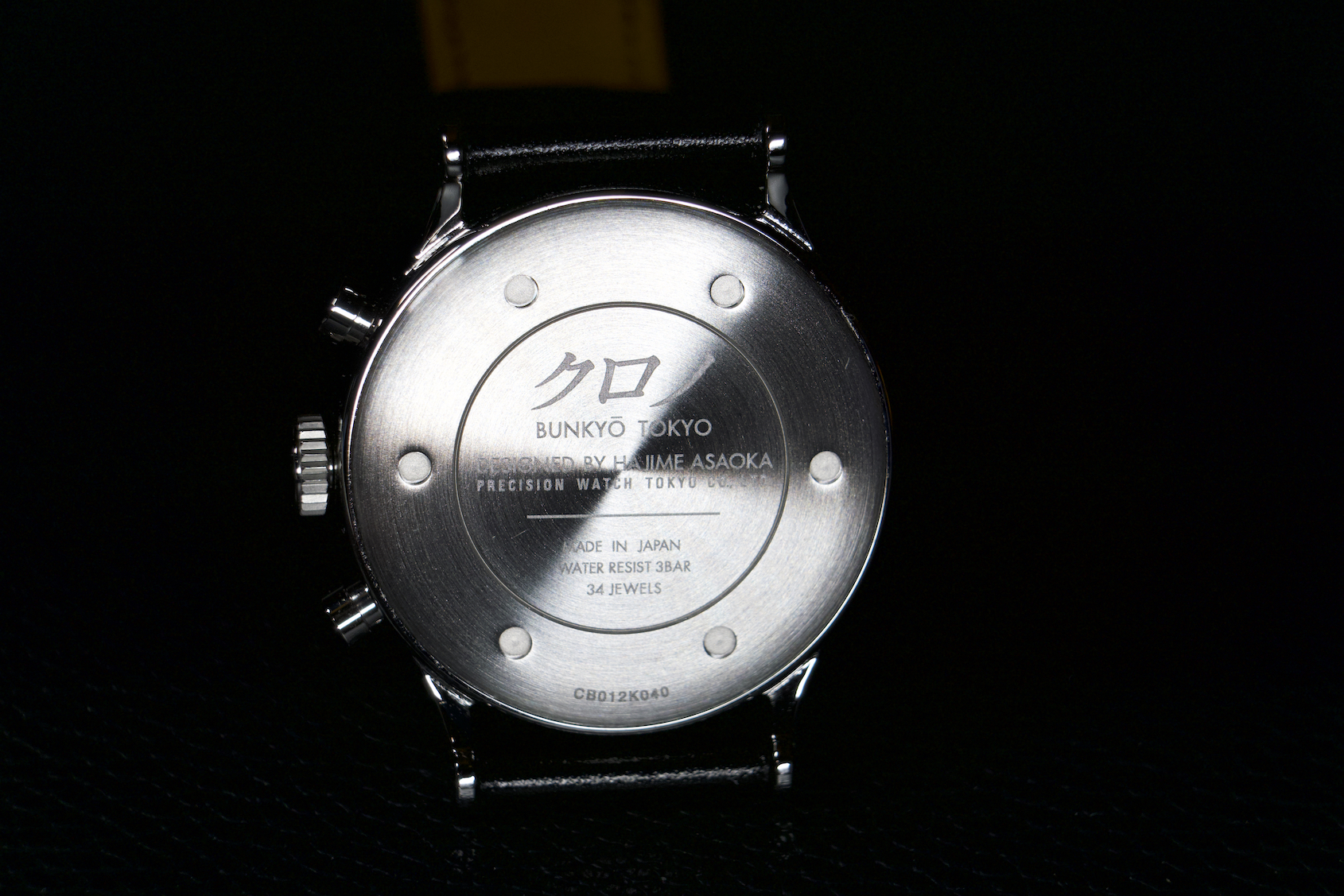
Underneath a radially brushed solid caseback, which has a sort of sunburst effect beneath a light source, is a Seiko NE86A automatic vertical clutch column wheel chronograph movement that delivers a fantastic experience for the dollar. The pusher actuation is very crisp and clean thanks to the column wheel, and with its vertical clutch architecture I find myself synching the central chronograph seconds hand with the running seconds register knowing that its constant motion will add little (if any) extra wear and tear to the movement. In terms of power reserve, it is rated to run for approximately 45 hours with the incredibly efficient magic lever winding system ensuring the watch will quickly self-wind itself while worn.
An interesting quirk of the movement is that the elapsed minutes hand of the chronograph sweeps rather than jumps, slowly gliding to each interval every sixty seconds. According to Kurono, this is due to the fact it has “a unique three-pointed hammer system that starts, stops and resets all three wheels simultaneously. This system allows for all the counters to advance continuously rather than only at one-minute intervals. Additionally, instead of driving the minute and hour counters from the chronograph seconds wheel, each is driven by a powered wheel with its own clutch.”
In terms of accuracy, I have found my Kurono Chronograph 2 gaining around 20-25 seconds per day off the wrist. While worn, the movement inevitably put in varying orientations, the watch seems to run closer to plus 20 seconds per day – and I am happy with that. It is not billed as a COSC chronometer and considering it fits into the more formal and fashionable side of my collection I don’t require it to be running with superlative accuracy.
Final thoughts on the Kurono Chronograph 2
Overall I am thrilled to own the Kurono Chronograph 2. The aesthetic is, in my opinion, absolutely distinct and stunning. You can’t buy this look from any other brand, it is the clear product of Hajime Asaoka’s design DNA. Aside from the date disc, there is no aspect of the watch aesthetic I would want to imagine differently. Also, as someone who missed the opportunity to buy the time-only Reiwa watch that inspired its colour scheme, I was excited at owning a more complicated take on the format. I also appreciate that it’s diameter is only 1mm larger than former designs, jumping from 37 to 38mm. These more classic diameters cater well to my smaller sized wrist and really stand apart from the modern enlarged offerings we are typically subject to.
At nearly $4,000 USD their chronograph watches are more expensive than their previous offerings, but now owning one I totally understand why the original Chronograph 1 was nominated for a GPHG. Considering my affection and admiration for my first Kurono watch, the GPHG nominated Kurono Mori, I did not expect to be anything less than pleased with this Chronograph 2. I can proudly say the watch lived up to any expectation I had, and it is definitely a staple of my watch roster.
While already very well respected within the watch community, it is clear Kurono’s journey is only just beginning and that it would be fair to expect some very interesting and exciting releases in the coming years. I for one will certainly keep my eye out for the upcoming anniversary watch, and would encourage you all to do the same. You won’t regret it.
For those less familiar with the brand click here to check out my overview of Kurono and their mission.