“About 80% of human experience is filtered through our eyes.” IWC proves the power of Pantone®
Zach BlassWith any sort of commercial product, the choice of colour plays a crucial role in attracting the consumer. But watchmaking is a game of precision, an art ever striving for the pursuit of perfection. It is no longer enough to make a black dial these days, now it needs to be the blackest black or the richest blue or the most vibrant green. Recognising the importance of colour, IWC recently partnered with the Pantone Color Institute to create ceramic cases in specifically designed shades inspired by the landscapes where Top Gun pilots train.
“With about 80% of human experience filtered through our eyes, the first challenge is to grab the eye, and nothing does that better than the thoughtful use of color,” says Laurie Pressman, Vice-President of the Pantone Color Institute.
“Color is the first thing we see and the first thing we connect to, influencing up to 85% of product purchasing decisions which is why the use of colour for product and how brands put their colour themes and stories together is so important.”
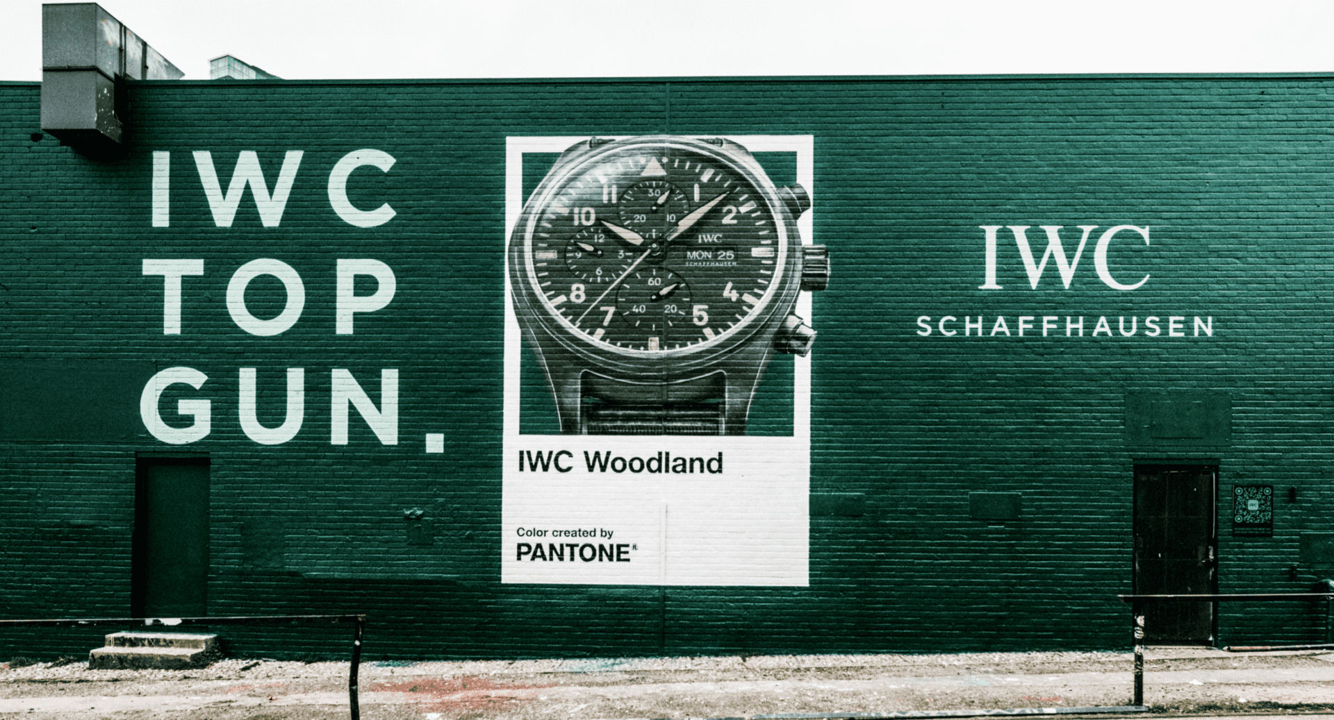
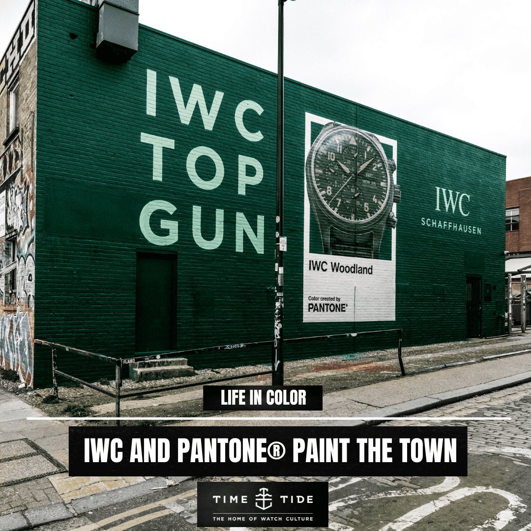
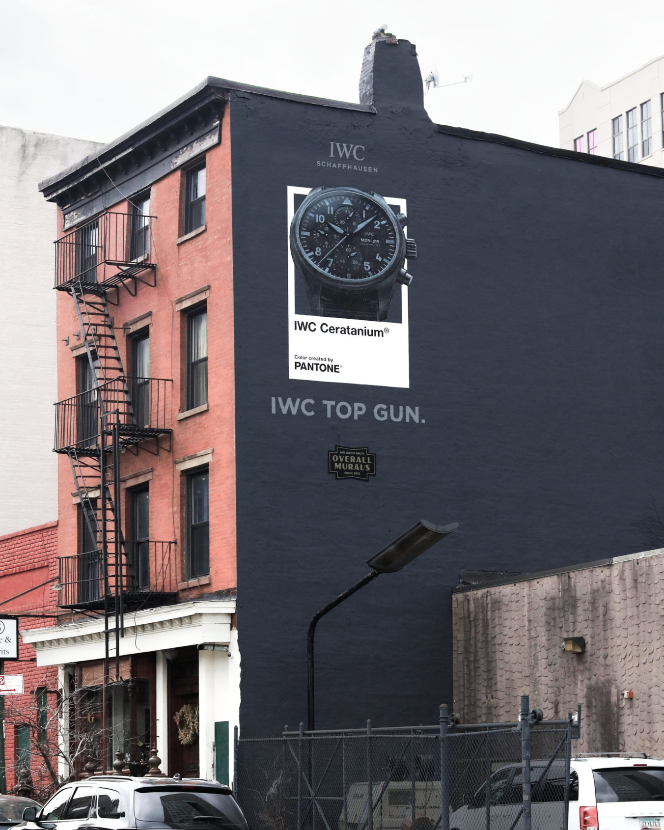
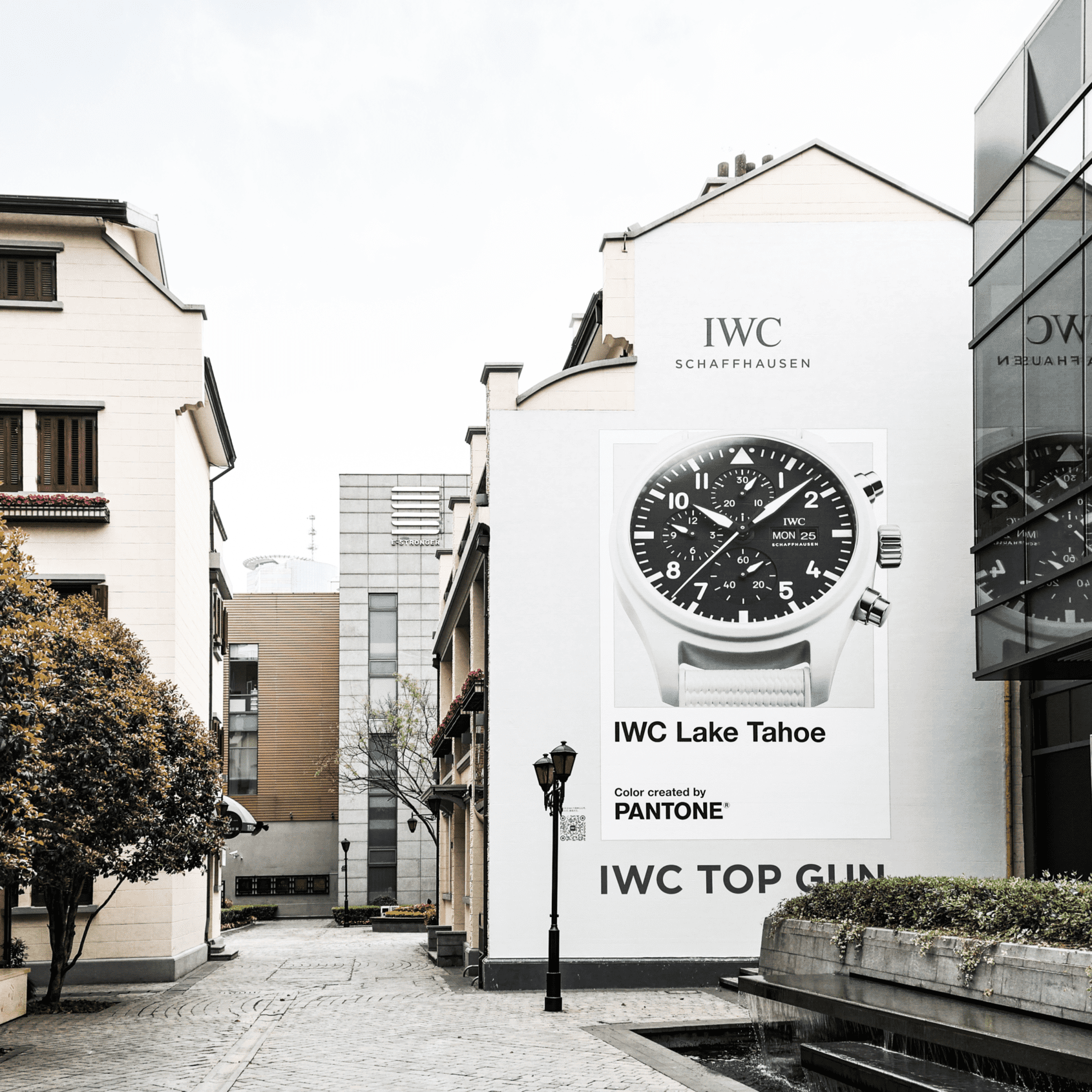
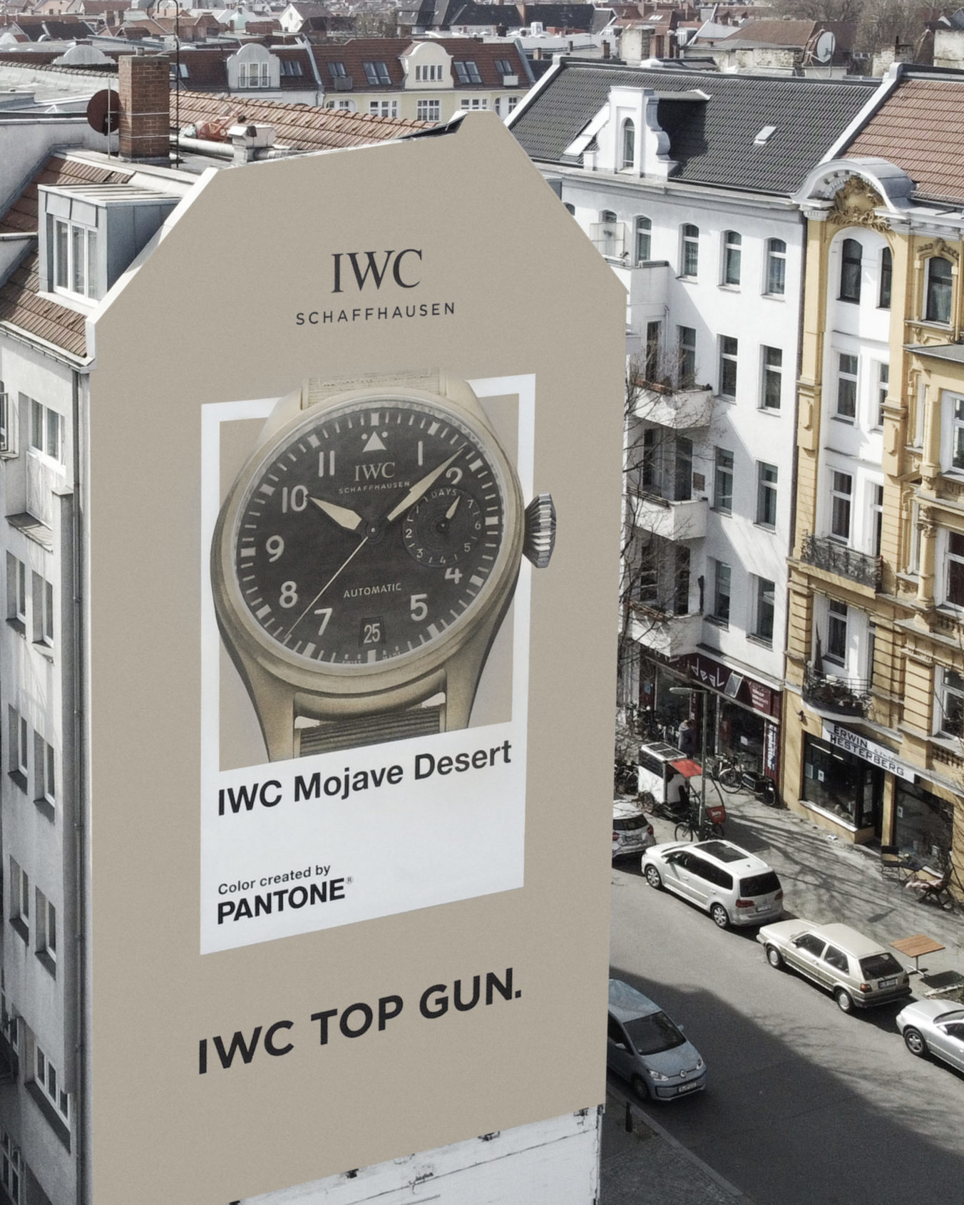
In recognition of the impact that colour has, IWC and Pantone recently executed an ingenious advertising campaign where entire facades of buildings, in various cities (London, New York, Shanghai, and Berlin), were painted in the distinct colours they created together. The corresponding Top Gun watch was then positioned inside the sort of colour tile that you would typically find in a Pantone catalogue. Visually, these adverts are impossible to miss as you pass by. They do not so much beg for attention as command it. Whether it’s the purity of “Lake Tahoe” white, the depth of “Jet Black”, the mystery of “Woodland” green, or the warmth of the sandy tones of “Mojave Desert”, the eye is immediately drawn.
To learn more about the new IWC TOP GUN Pilot’s Chronographs, you can head here for a full hands-on review.


