


INSIGHT: Designing A. Lange & Söhne – part 4, colour, material and finish
Sandra LaneThink of Lange’s colour palette and the word ‘sober’ probably springs to mind. Or restrained. Limited. Calm. Muted. Subdued. Discreet. Anything but vivid and daring.
Now, let’s for a moment think not of A. Lange & Söhne but only of the colours: white, black, grey (dials); black again, brown, (straps); pink gold, white gold (platinum looking more or less the same), a rare dash of yellow gold. Yes, there are some exceptions (we’ll come to those later), but put Lange’s entire catalogue of the past 20-plus years into a flip-book and that’s pretty much what you get.
Based on those limited ingredients, if it were a cookery book you could be looking at the plainest meat-and-potatoes menu this side of a 1960s boarding school dinner. If it were another watch company … Well, sadly, the world is swamped with insipid, play-safe watches that are about as easy to distinguish from each other as boiled potatoes. But give those restricted ingredients to Lange and we get watches with richness and liveliness, with immediately recognisable character and great presence.
It’s a remarkable trick. How does Lange do it?
Let’s look back at the ‘famous four’ watches that announced the rebirth of the company in 1994: gold, white, black and a tiny flash of blued steel hands on the Pour le Mérite Tourbillon. That was it. Günter Blümlein and Walter Lange had decided what A. Lange & Söhne stood for: Teutonic sobriety, strength, refinement and a complete absence of gimmicks – it was unequivocal and it was to be expressed through the products’ colours, materials and surface finishes as much as through their engineering.
Although in practice, according to Lange collector and historian Peter Chong (today, the editorial director of Deployant), Lange were quite flexible in the early days – clients who bought platinum watches could choose their dial colour, though that certainly didn’t mean anything wild. Everything was subject to the personal approval of Blümlein. There were some colourful pieces, such as a Lange 1 in yellow gold with a blue dial (circa 1996), but by the early 2000s that stopped too. Chong theorises that as the company gained confidence, the policy changed, both to maintain consistency of image and for simple expediency. When it came to colour, simplicity ruled. Eric van der Griend, Chairman of Watches of Switzerland (Lange’s Australian distributor), thinks this simplicity is a great strength.
“Lange approach colour in a way that’s consistent with their design philosophy. They introduce novelties, but in a limited way. They don’t react to trends, they never lose track of their core.”
But as those of you who are already Lange fans will know, Lange-simple is not the same as most people’s simple. That limited colour-and-materials palette has been combined and recombined in ways both subtle and powerful; matte surfaces contrasting with high polish, in a manner that is instantly, recognisably Lange and that make it almost impossible to take a bad photo. (Seriously, how many Instagram posts have you seen of Lange dials looking drab and flat?)
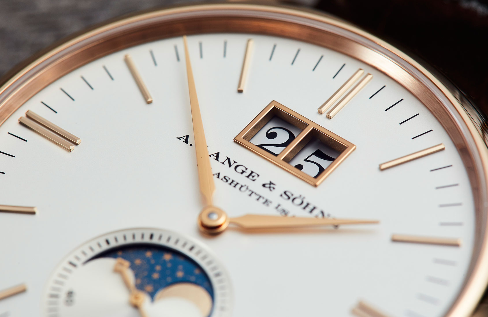
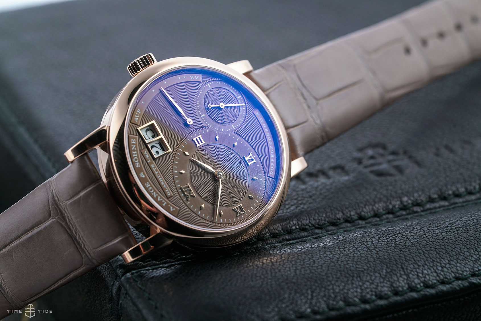
But back to colour. Specifically, those white dials. They’re not really white, and not even the same white as each other, explains Tino Bobe, Director of Manufacture at Lange. “It’s because of the way they relate optically to other materials and finishes – so with a yellow-gold case, it’s a slightly champagne tone; with pink gold and white gold, it is argenté. But they all give the ‘impression of white’.”
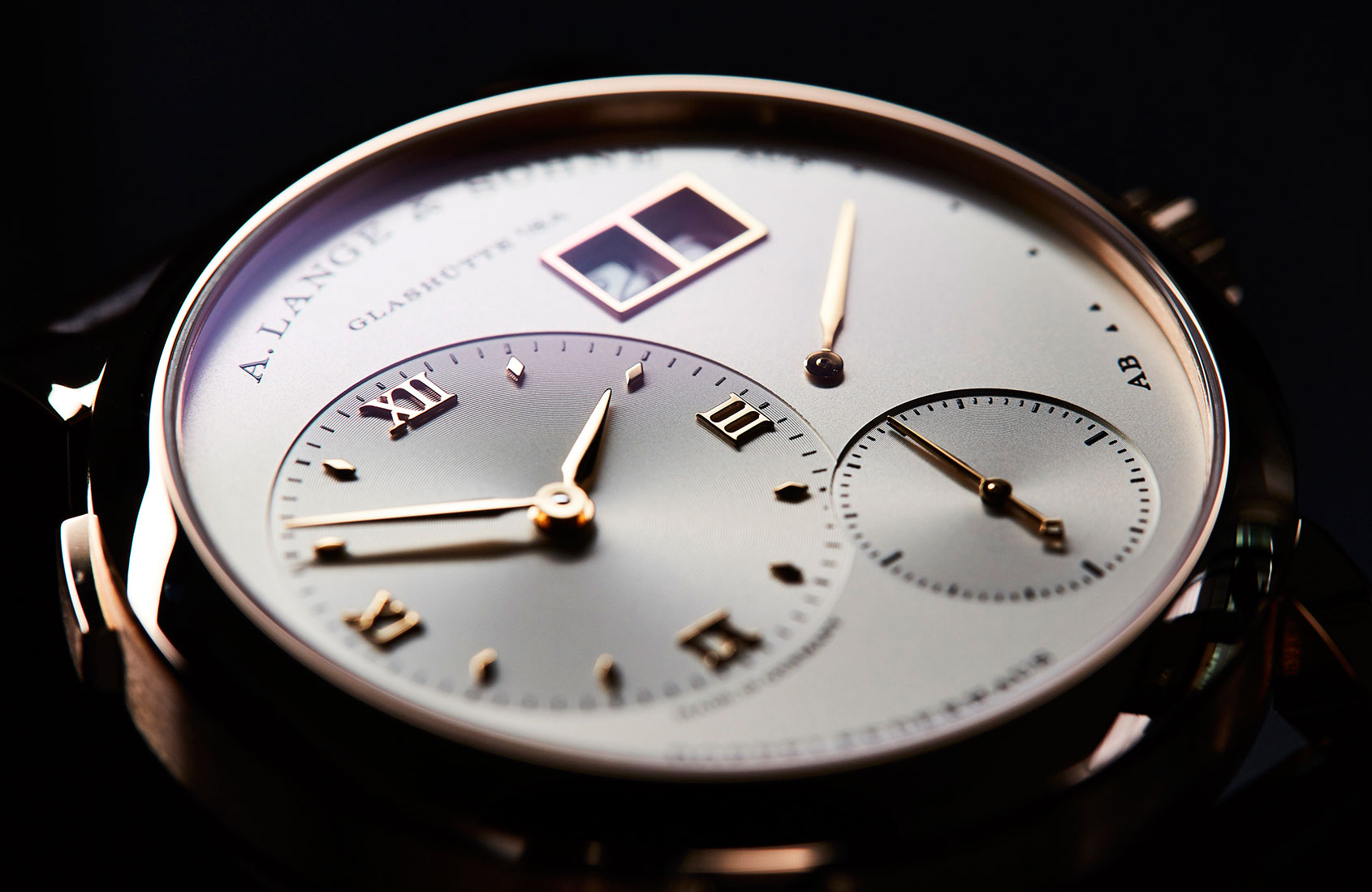
The dials are always solid silver with galvanic colour, never lacquered. This ensures the highest possible colour stability and gives them their characteristically soft warmth, contrasting with the crisply printed numerals or the highly polished metal of applied dial details. (The only exception to the dial rules are solid gold for Handwerkskunst pieces and guilloché dials, mother-of-pearl for some feminine models, and enamel dials for a few limited editions).

“It’s not only a question of which colour to choose,” continues Bobe. “The structure of the surface-coating material influences how light is broken or reflected.” It follows that the design team can’t make decisions about colour at the drawing board stage, or even with a physical prototype part in isolation.
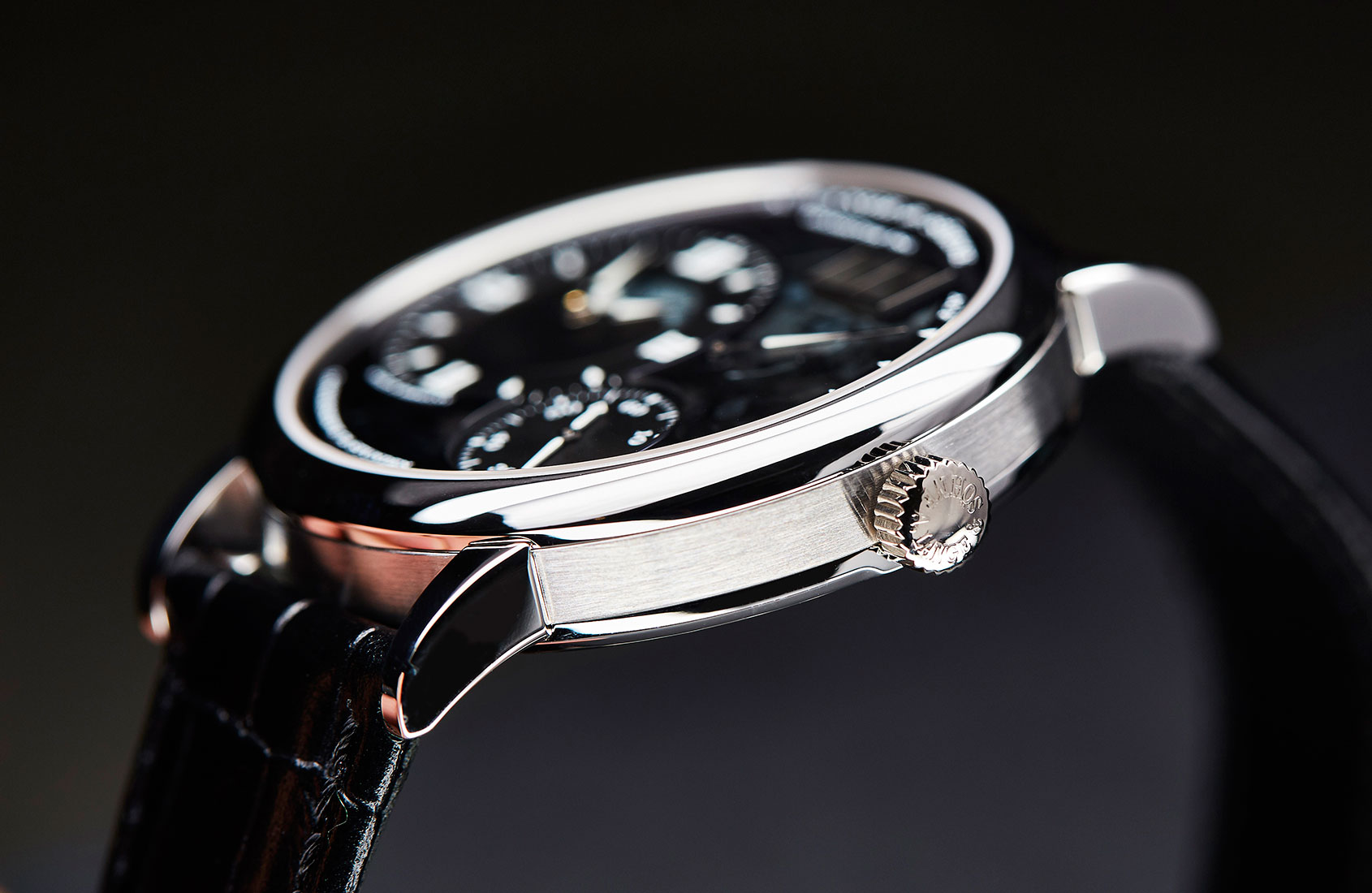
“We have to see every visible element exactly as a watch owner will see it,” says Bobe. “And that means putting everything under a sapphire crystal (which will already have anti-reflective coating on both sides) because that can modify the impression of light received by the eye.”
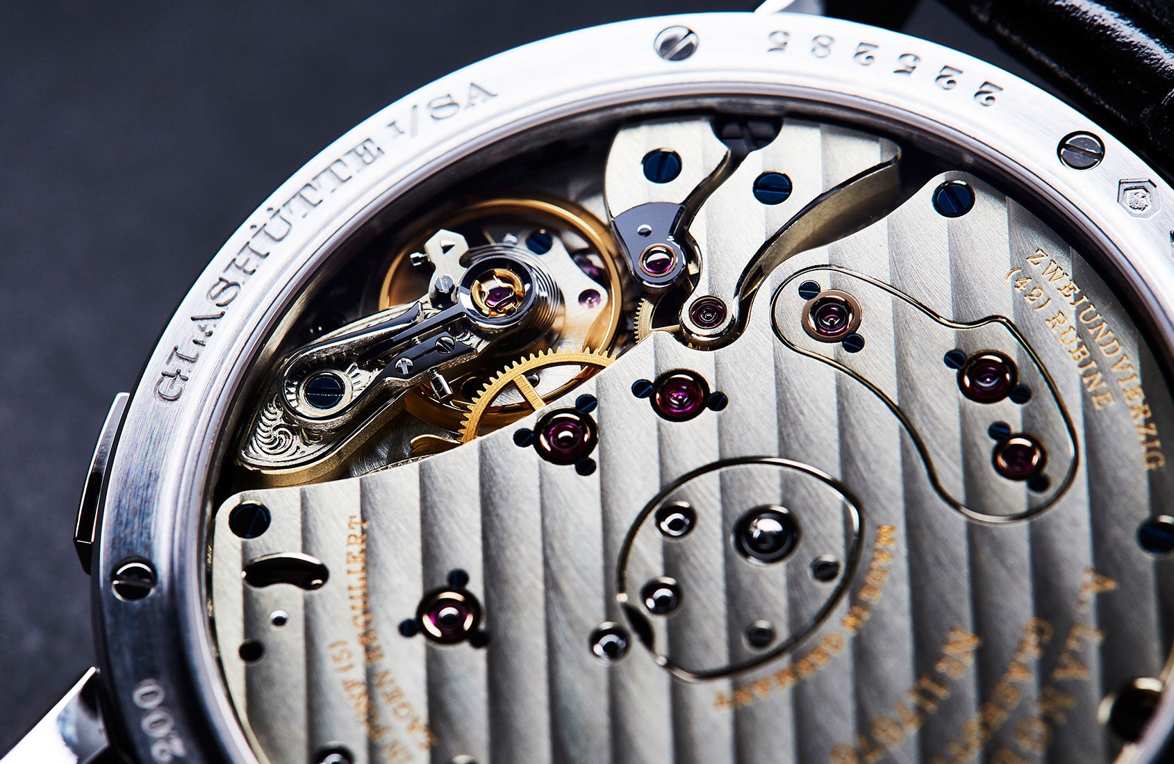
The same aesthetic rigour is applied to the movements, Bobe explains. “For example, if this wheel overlaps that lever, and we change the surface finish of one of them, what will the visual effect be? We have to ensure that the wheel and lever together will be harmonious – not that one is more pleasing than the other.”
Even when Lange is being as out-there as it ever gets, the harmony is still there: the Zeitwerk family and Lumen series are major design departures, yet both are anchored firmly in the Lange canon by the use of colour and texture. The strong geometry and robust graphics of the Zeitwerk are softened in various models by frosting, circular graining, highly polished angles on the ‘Time Bridge’, tremblage engraving, and further tempered by honey gold cases.
An aside: the genesis of honey gold (introduced in 2010) epitomises Lange’s approach to materials and colours. It’s not as if someone in the design department thought it would be a good idea to add a different shade of gold to the palette; the engineering department wanted to develop a more scratch-resistant 18-carat gold. A lot of metallurgical experiments later, ‘honey’ gold was the result, its colour simply the outcome of the material’s science, not of any designer’s wish list.
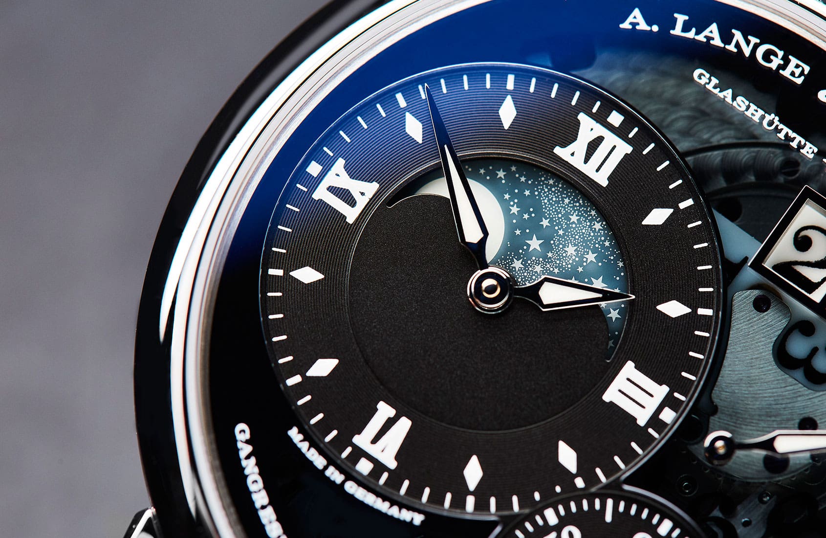
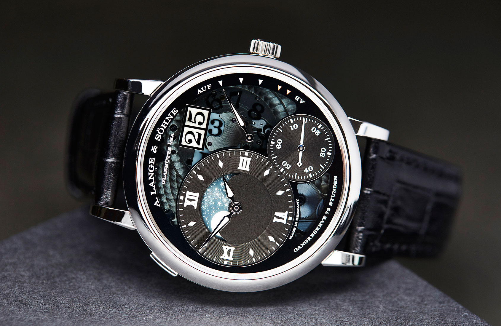
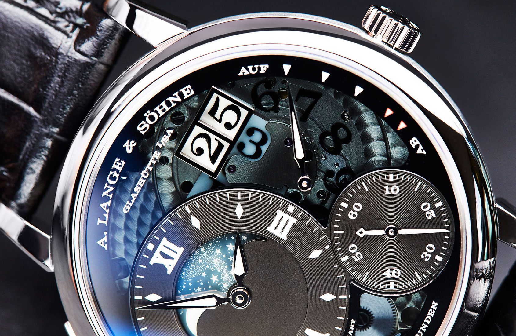
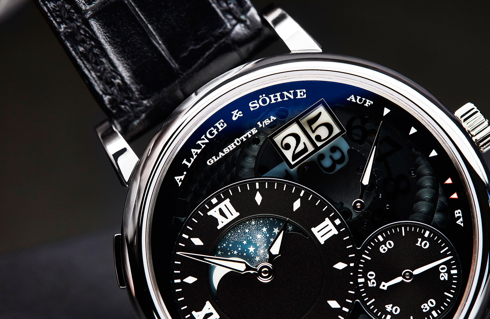
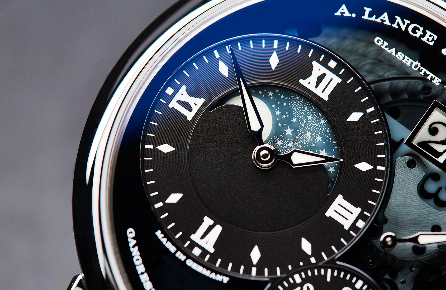
With the Lumen series, Lange have strayed furthest from their usual materials palette (as well as introducing vivid green SuperLuminova). In the Grand Lange 1 “Lumen” (2013) and its 2016 successor, Grand Lange 1 Moon Phase “Lumen” (there was also a Zeitwerk “Luminous”, dubbed ‘The Phantom’, in 2010), Lange wanted to make a bold design statement while revealing something of the secret behind the outsize-date display (not everything, mind – this is still Lange).
Blackened silver was used for the solid time-reading and small seconds discs, while the rest of the dial was made of semi-transparent smoked sapphire crystal, given a special coating that allows only the invisible UV spectrum to penetrate (thus charging the SuperLuminova while still partially obscuring the movement). The coating was the key, explains Anthony de Haas, Lange’s Director of Product Development.
Then came the question of how to illuminate the various components – using standard SuperLuminova. On the date display, the tens cross was coated with lume and the numbers printed in black. On the other hand, the single minutes disc is transparent, with the numbers painted in black, and the disc set above a luminous background.
The Moon Phase disc is not itself illuminated. Rather, it is made of glass, not Lange’s usual solid gold. However, just as for the gold moon discs, the 1164 stars and moon are cut out by laser – allowing the luminous material to shine through from behind.
For A. Lange & Söhne, maintaining a clean, consistent, “essentially Lange” design language does not mean an absence of new colours – and we’ve seen quite a range in the past several years. But, in predictably Lange style, each new shade seems to take an inordinate amount of effort.

Take Terra Brown, introduced in the Saxonia line in 2015. “It wasn’t a case of, ‘Oh that terra brown is nice. Shall we use it for Saxonia?,’” laughs Anthony de Haas. “Instead, the thought process began with ‘a new colour for Saxonia’ and then the questions started: ‘Brown. What possible brown could feel right?’ Chocolate, light chocolate, dark chocolate, earthy … it would need to be discreet, not a loud or hard tone.”
Finally, the colour would have to look exactly the same with both white gold and pink gold cases and appliques – but each of those metals can create an illusion that the dials are a slightly different shade.
Multiply that process by three for the new colours introduced on the Little Lange 1 at SIHH 2018. The colours needed to be timelessly elegant, to suit many different skin tones, to blend with the existing Lange codes, to work with all metals – the usual. Add to that the specific use: every colour is intrinsically linked to the intended finish. It wasn’t a case of, ‘You know that nice grey we already have? Shall we try it for the guilloché too?’ The new grey, brown and purple were developed specifically for the way the light would hit the waves of the engraving. The result: grey with a warm metallic gleam; brown with a rich toffee glow, and purple like the flesh of a plum.
Every Lange announcement of a ‘new’ dial colour or surface treatment is greeted by surprise in much of the watchosphere (Oh! It’s not black/white/grey!) but a little dig in the archives often reveals it to be less surprising after all. While the blue dial announced for four models last autumn is by far the most vivid Lange have proposed for a long time, it was in the catalogue around the turn of the millennium. Similar surprise was expressed at the appearance of guilloché dials – and yet they, too, had been in the repertoire in the 1990s, making brief reappearances for a couple of anniversary models several years ago.
If there’s anything to be learned from this it’s that Lange’s apparently conservative approach to colour, materials and finishes is deceptive. As with the technical developments, the team is constantly experimenting. We just never know quite when or how the results will be manifested on a new dial.