


The Time+Tide team picks their favourite watch brand logos
Borna BošnjakEditor’s note: when the Time+Tide editorial team comes together for our weekly call, we inevitably have our moment while hive-minding where a random, but interesting question, is posed by a member of our team. Rather than keep the discussion private, we often decide to bring the discussion to the site. The latest team battle royale question we answered: what are our favourite watch brand logos?
Zach – Parmigiani Fleurier
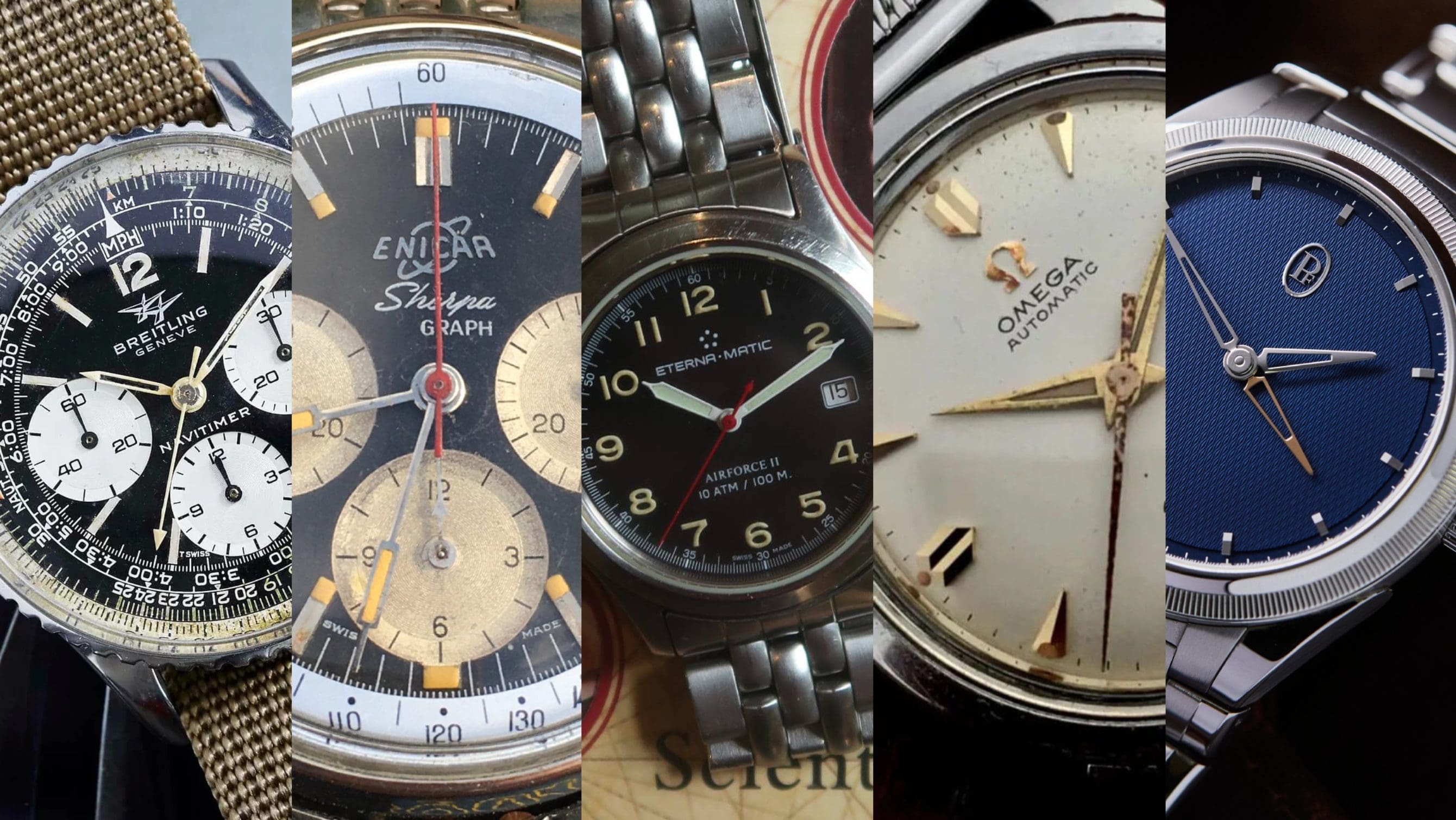
Originally, I would have been basic and picked Rolex, with their iconic coronet, or Vacheron Constantin’s marquee Maltese cross. But, after further consideration, I have to give it to Parmigiani Fleurier’s new ‘PF’ logo, as seen on the latest Tonda PF watches. What this logo does, which is seldom seen in terms of dial branding, is the omission of the brand name. Maybe it was all the parmesan cheese jokes, or far more like Guido Terreni’s keen eye for design, but the less dial text, the better – right? It is cleaner and more crisp. The distinct applied emblem clearly denotes which brand is behind the watch, without needing to write the brand name all over it. I do not have to belabor this point, just look at the image above and try to tell me that is not one of the cleanest dials you have ever seen – and that is in part thanks to the logo.
Borna – Enicar
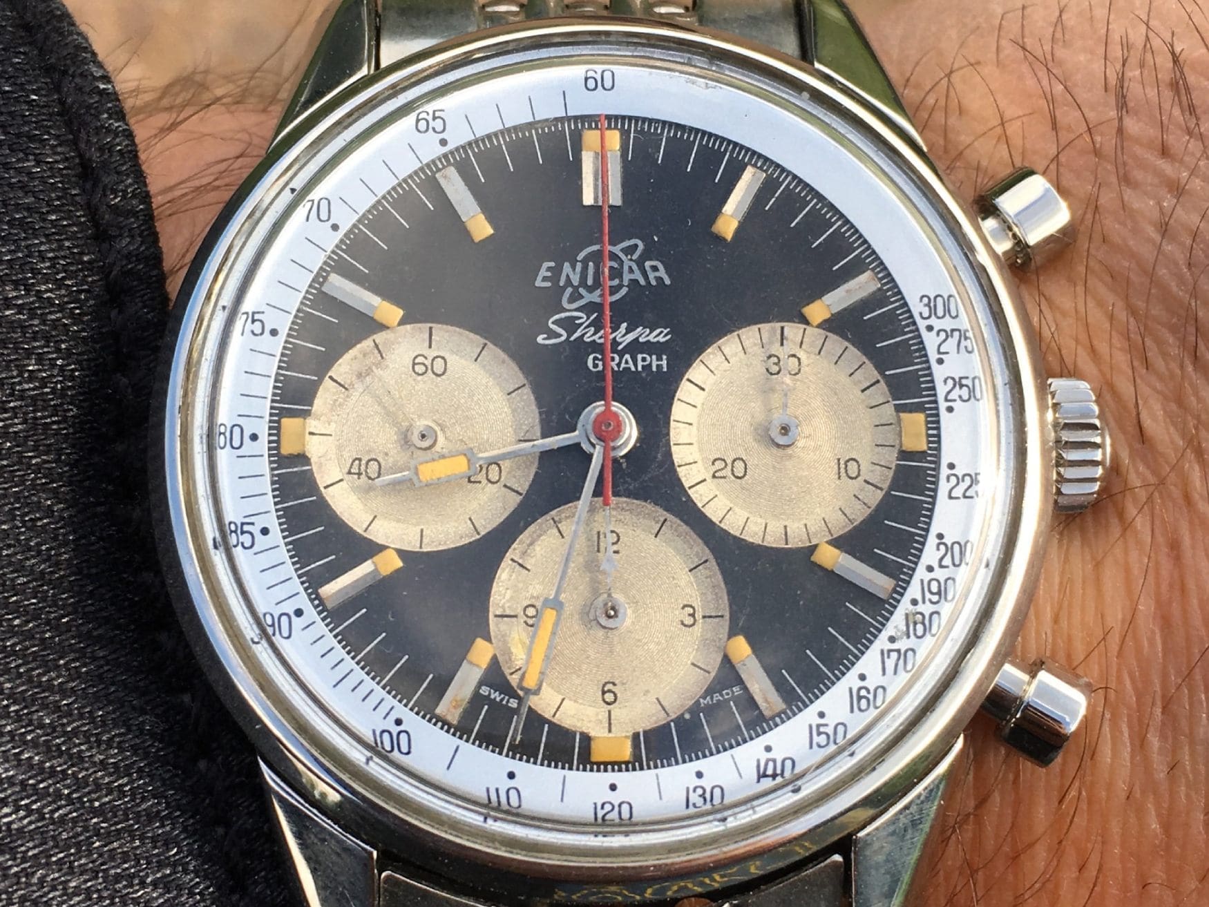
Enicar’s Saturn logo is the very item that sparked my idea for this article. It has an air of whimsy about it that I just can’t see any modern-day watch brands use – save for a Studio Underd0g or similar. The earliest example of the planetary logo is my favourite – this is known as the “combination mark”. It replaced the Enicar script (actually an anagram of the Racine family name that founded the brand) in the late ’40s or early ’50s, and it featured a space-age Enicar font in front of a Saturn outline. This Jetsons vibe is best in the applied variants of this logo, though it’s worth noting they were also merely printed in other models.
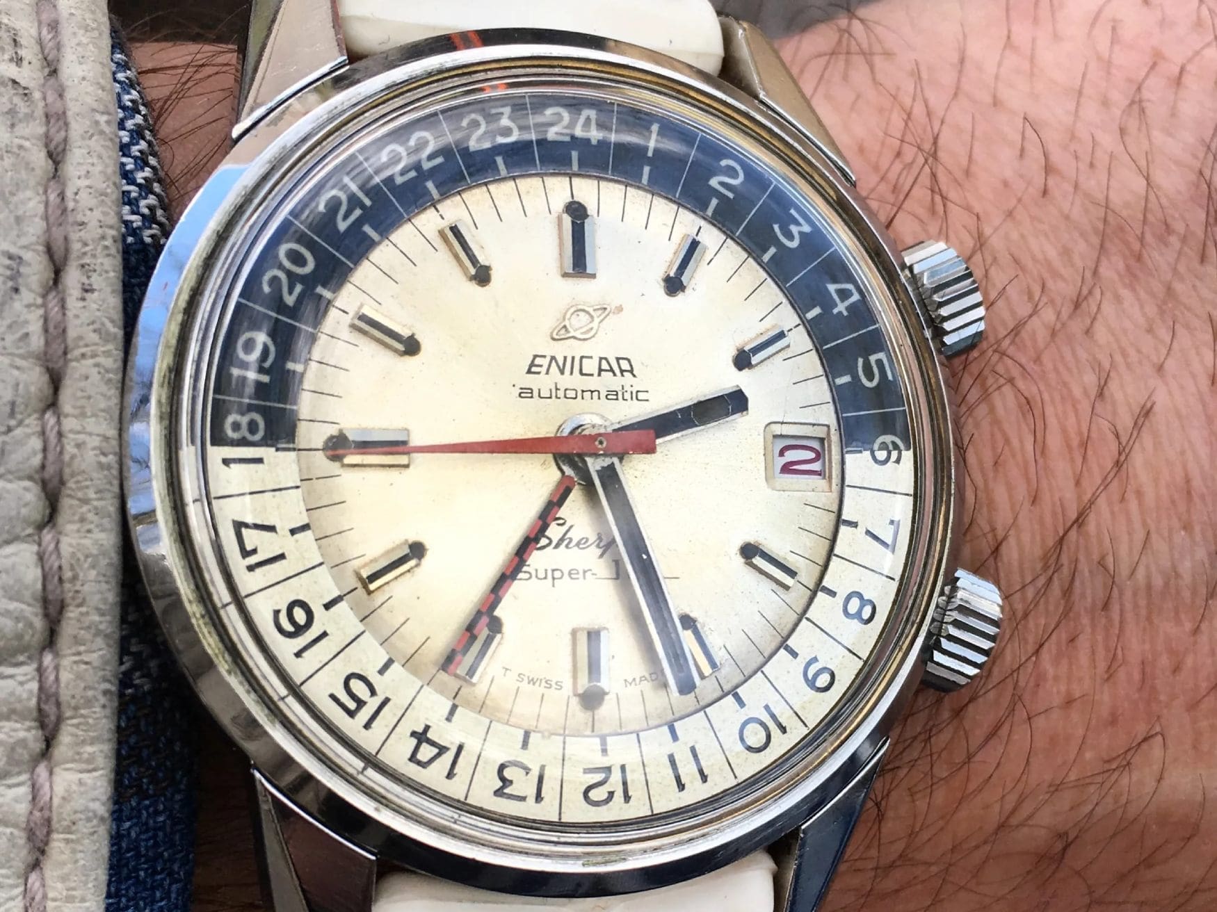
The mid-1960s brought about the split of the Enicar script and Saturn icon. I believe this is also the most widely recognisable logo the brand has used. The funky font is still there, though now only printed, while the Saturn is often applied.
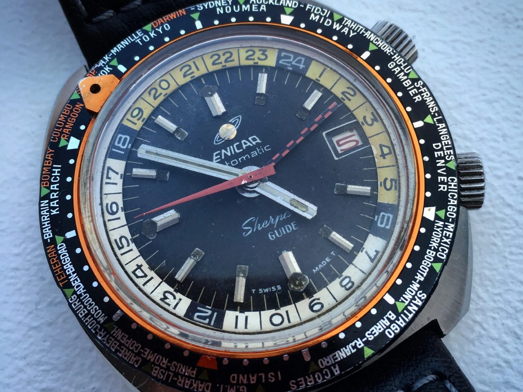
The “golden sphere” was the final planetary logo that Enicar used – not because they changed direction, but because the brand was declared insolvent in 1987. It didn’t signal an end, however. The unused parts were sold to Gerd-Rüdiger Lang, who used them to start Chronoswiss, a brand that still exists today, albeit no longer under Lang’s direction since 2012. Merely a year after declaring insolvency, the naming rights were sold to Enicar’s Chinese distributor Wah Ming Hong Ltd. that still owns them today, producing watches under the Enicar brand. The funky Saturn logo still graces their dials, but if you’re after the same charm as their original models, you’ll have to look elsewhere.
D.C. – Breitling Twin-Jet
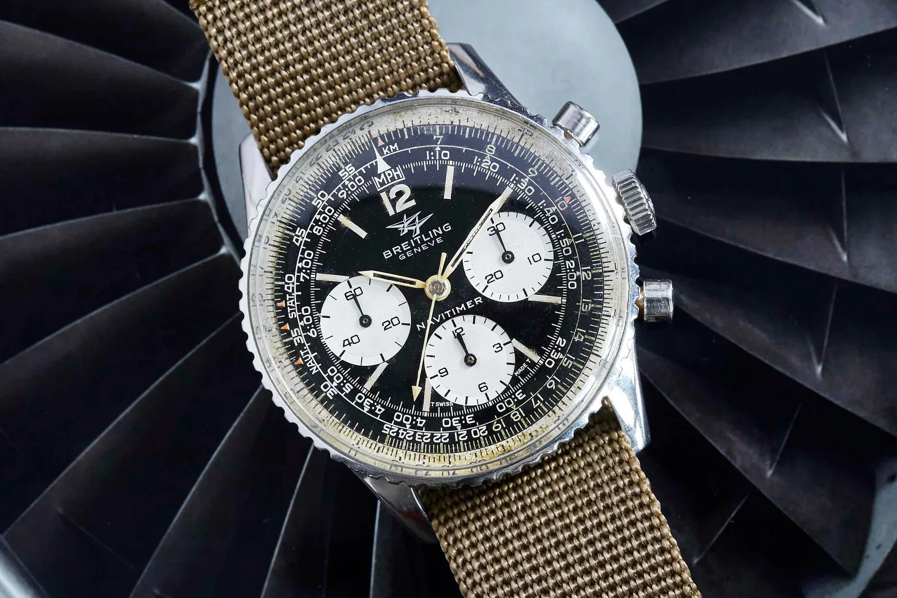
For reasons that should be obvious to anyone who knows me, my favourite logos are Breitling’s. Besides my personal history with the brand, I’ve always found their dial branding to be elegant, telling the story of their intended use as tools. Early Breitlings typically used a simple script wordmark, but as the company evolved, so evolved their trademarks. My love for the Navitimer is strong, going all the way back to the ‘50s when the Aircraft Owners and Pilots Association chose the Navi as their official timepiece, and said watches bore their winged logo. Later versions of the Navitimer utilised the “Twin-Jet” logo, and that’s the one I most closely identify with. Modern variants of the Navitimer lineup use a variety of logos, including the winged logo (sans AOPA branding), as well as the simpler “B”, but my favourite Navis are the Twin-Jet branded models. They evoke the fearless optimism of their time, when the Jet Age, and later the Space Age, made it seem that no obstacle was insurmountable, and everything was possible. The 806 Navitimer (and 809 Cosmonaute) models of the era have a look like no other, futuristic and retro all at once, evoking that streamlined moment in time that urged us to push faster, higher, and further than ever before.
Fergus – Omega
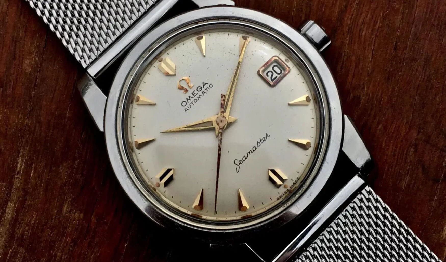
It almost feels like a cop-out answer, but I can’t go past the Omega logo. The winged hourglass of Longines would probably win for me on a logical level, but seeing Omega’s symbol always takes me back to the first time I saw it. The long version of the story was my first published article on Time+Tide, but I’ll just tell the short version. When I needed a watch for my first proper job, I vaguely remembered one we had lying around in the drawer of an old sewing machine. Fishing it out, I saw the discoloured gold of the applied logo and realised it must have been a nice brand. That’s when I learned mechanical watches existed, and began my fixation on them for the years to come. Now serviced and running at +4s per day, my great-grandfather’s 1958 Omega Seamaster is the star of my collection and a valued family heirloom. The logo itself is simple and legible, but you can feel the potency of its ancient significance. Plus, it’s often accompanied by an extravagant engraving of the Omega Hippocampus which I love.
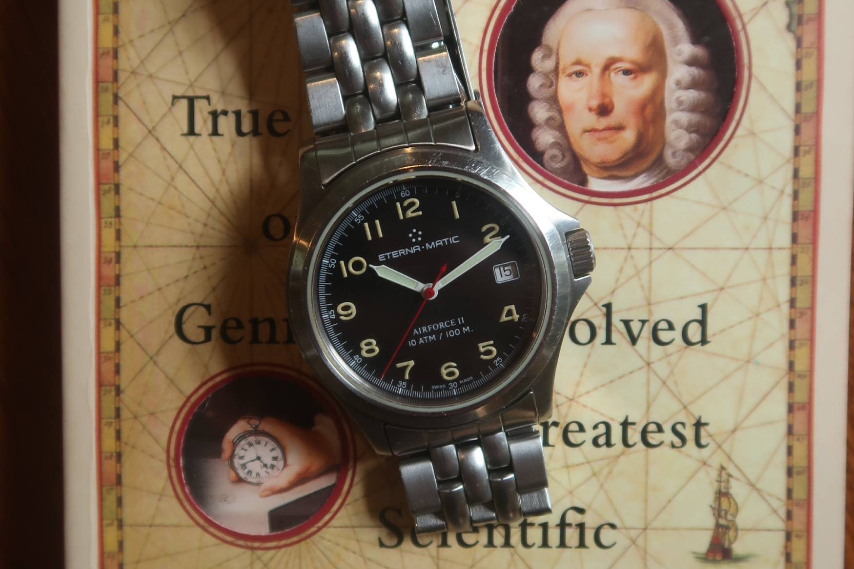
Jamie – Eterna
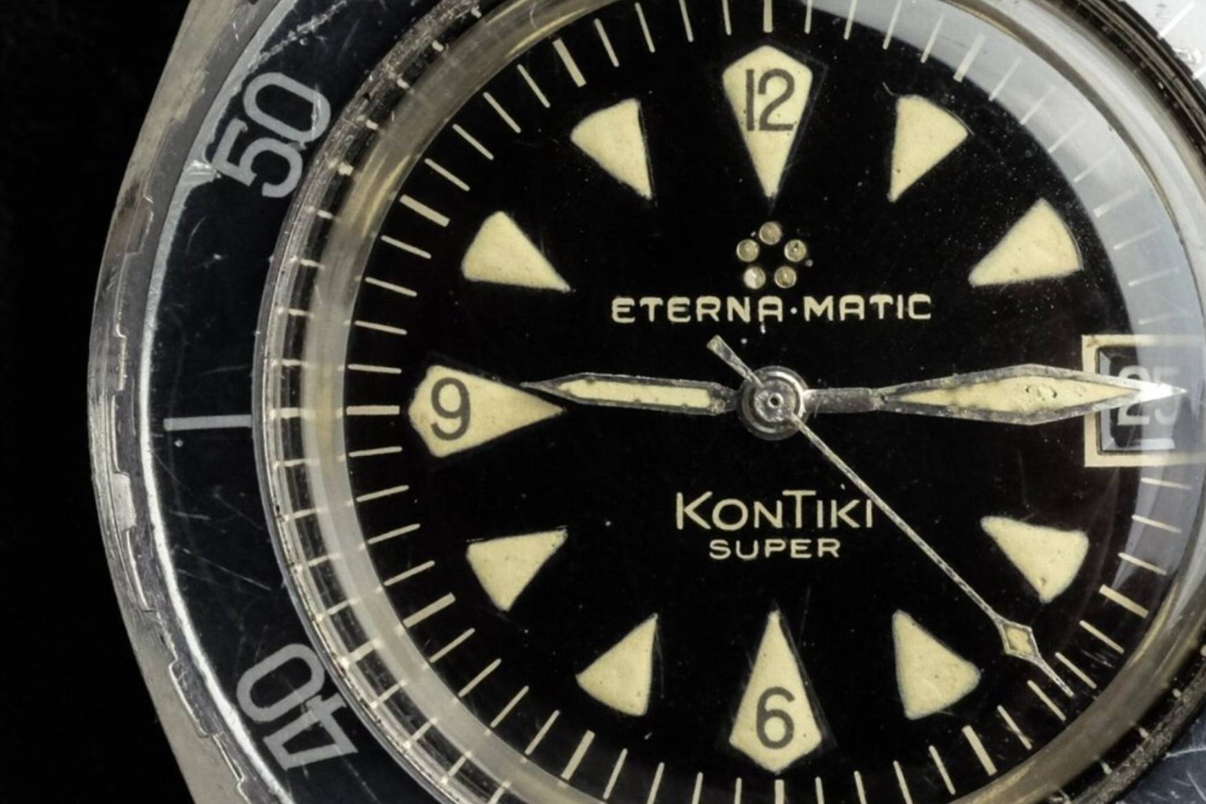
I’ll always have a soft spot for Eterna: my family were the first official distributor of Eterna in Australia, and playing with my dad’s Eterna Airforce II as a kid is what initially sparked my interest in watches. But Eterna is interesting also because it’s a super underrated brand that has been incredibly influential in the development of the modern watch industry (which few people know about) – and they have a pretty cool logo that speaks to that history.
Founded in 1856 in Grenchen, Switzerland as Dr. Girard and Schild Ebauches, Eterna began life as a simple movement manufacturer before diversifying into wristwatch production. 76 years later in 1932, Eterna would split the wristwatch and ebauche businesses into two different entities, with the latter becoming known as ETA. Maybe you’ve heard of them? Without Eterna, it’s fair to say that the Swiss watch industry might not exist today, thanks to ETA’s influence.
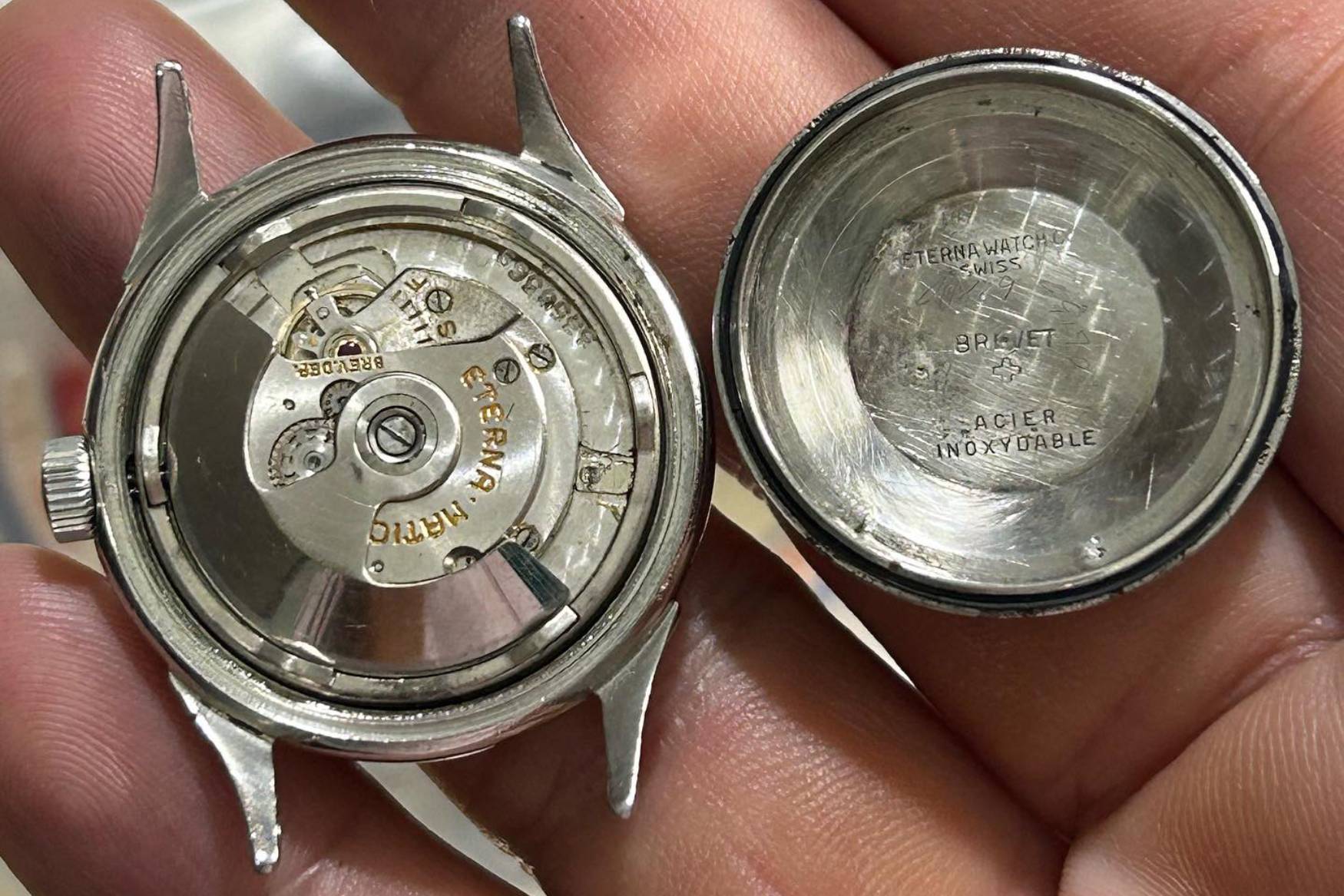
Another key moment for Eterna was in 1948 when they developed the Eterna-Matic movement. This innovative movement used five ball bearings to support the automatic rotor setting, which significantly reduced friction and resistance on the oscillating weight. This design would become the industry standard in the following years, and the five ball bearings would become the company’s logo.
This gets me to my point: not only does the Eterna logo represent the brand’s significant contributions to modern watchmaking, but it’s also highly recognisable, elegant and modern. It’s like a minimalist star – traditional, yet timeless. When thinking about what my favourite watch brand logo was, it occurred to me that so many watch brands’ logos are simply typefaces. Eterna’s isn’t (although their typeface is pretty banging too): it talks to what’s under the hood; there’s a degree of substance to its style.