MY WEEKEND WITH: the RADO Hyperchrome Ultra Light Limited Edition Automatic XL
Andrew McUtchen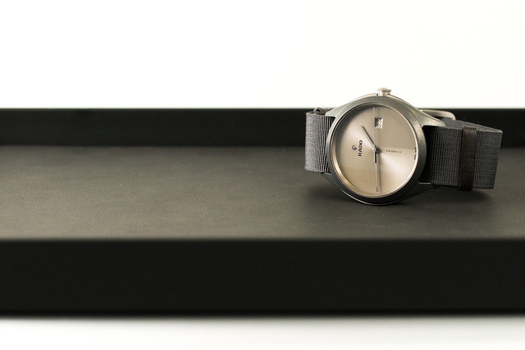
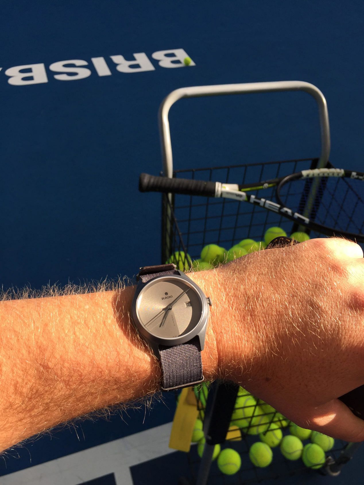
When I opened the box in the hotel room, after arriving in Queensland for the Rado-sponsored Brisbane International tennis tournament, I was taken aback. This was not the watch I was expecting. Perhaps years of indoctrination and the current advertising campaign – with a ball bouncing around in a 3D model of a Match Point dial – made me assume it would be a Hyperchrome chrono of some kind, but nevertheless it was a pleasant surprise. Considering the program includes actually playing tennis and that my suitcase was full of laid-back summer clothing, a simple, ultra-light (the name does not lie) three hander on a grey canvas strap was just right.
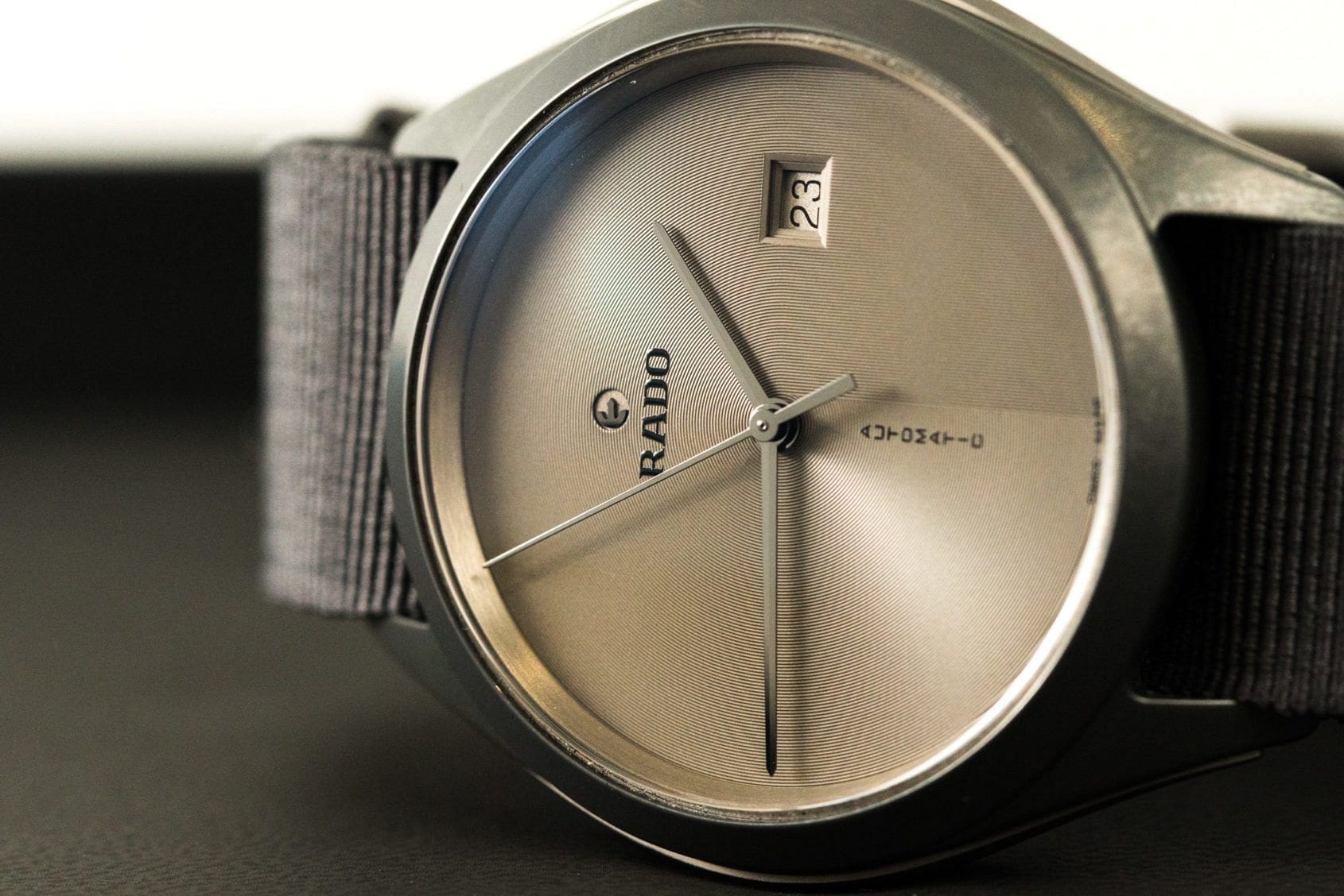
My first impression was… What? This is Rado? Although we shot this watch at Basel 2016, it had slipped under my radar. A closer inspection revealed a very cool concentric engraving pattern on the dial and the trademark ‘floating’ logo; some nice nuances to the overall sporty, simple design.
Once I put it on I felt… Comfortable. This is a watch that’s extremely light, but not unsubstantial; it’s still solid enough. The light ceramic case construction and canvas strap make it extremely comfortable and appropriate for summer, when bulky clothes and bulky watches are the last thing you want on. It was also brilliant to wear playing tennis. Andy Murray always used to take off his Hyperchrome chrono and D-Star when he played. I think he’d leave this model on. You honestly don’t even know it’s there.
Looks-wise… it has a very strong aesthetic appeal. While there is a minimal design ethos at work here, it’s clearly a very considered piece. It’s definitely sporty on the canvas strap but it dresses well with smarter casual summer clothing. Some of the design nuances also place it in the avant garde column, harking back to the wild and wonderful ceramic creations I remember seeing on my dentist’s wrist when I was young and first laid eyes on the brand.
What stood out to me was… the cool sweep of the engraving on the dial which is like a reverse ‘p’, which creates a bit of a visual puzzle for the eye to solve. Rado goes as far as to liken it to “soothing patterns sculpted in the sand of a zen garden.” Either way, it’s fun. The matt grey ceramic case is also very much on trend.
I’d wear this with… any warmer weather summer clothing. A pressed polo with shorts and a belt, tennis-wear, or even linen pants and a shirt with rolled-up sleeves. And in the colder months, you could layer this into a neutral toned outfit and the grey would work well.
If I could change anything… I’d probably have gone the whole hog and made this a proper Nato rather than a Nato look with tang buckle. The extra loops and double thickness of the strap would have given it a mite more heft and presence on the wrist too, which wouldn’t hurt as it’s a fairly slight piece. Not as neat and tidy as this combination, but just that tiny bit cooler.
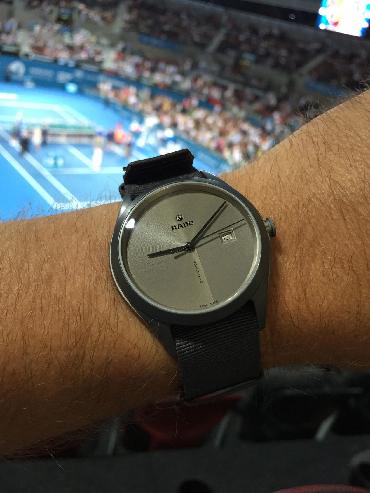
By the end of the weekend… when I put my own steel watch back on, it felt heavy! I also realised I hadn’t sweated at all in it, through several days of mid-30 degree temperatures and a strenuous tennis clinic on a sunny morning. It’s a very practical and stylish summer watch with the added twist of being a limited edition and carrying a reliable calibre to guarantee lifelong enjoyment. I’d look forward to trying different strap options, too – perhaps a nice padded sailcloth or coloured leather.