


A design that divides – the Patek Philippe Calatrava Ref.6007A-001 meets its lookalikes head on
James RobinsonPatek Philippe’s first wristwatch of 2020 didn’t go down quite as well as the complicated models that have followed this week to practically unanimous praise. By contrast, the Calatrava Ref.6007A-001, limited to just 1000 pieces and made to celebrate the legacy brand’s new manufacture was met with many more brickbats than bouquets.
Why? Well, according to many it didn’t quite manage that delicate dance between being inspired by existing models and, uh, borrowing too heavily from them.
But are the criticisms well founded? Without deferring a judgment entirely (I’ll certainly get to that), the truth really is in the eye of the beholder in cases like this. Personally, it’s not what I’ve come to expect from the world’s greatest watchmaker. So, to get into it, and to see the comparisons side by side I present to you the three most cited models the Calatrava Ref.6007A-001 apparently owes a debt to.
Jaeger-LeCoultre Polaris Date limited edition
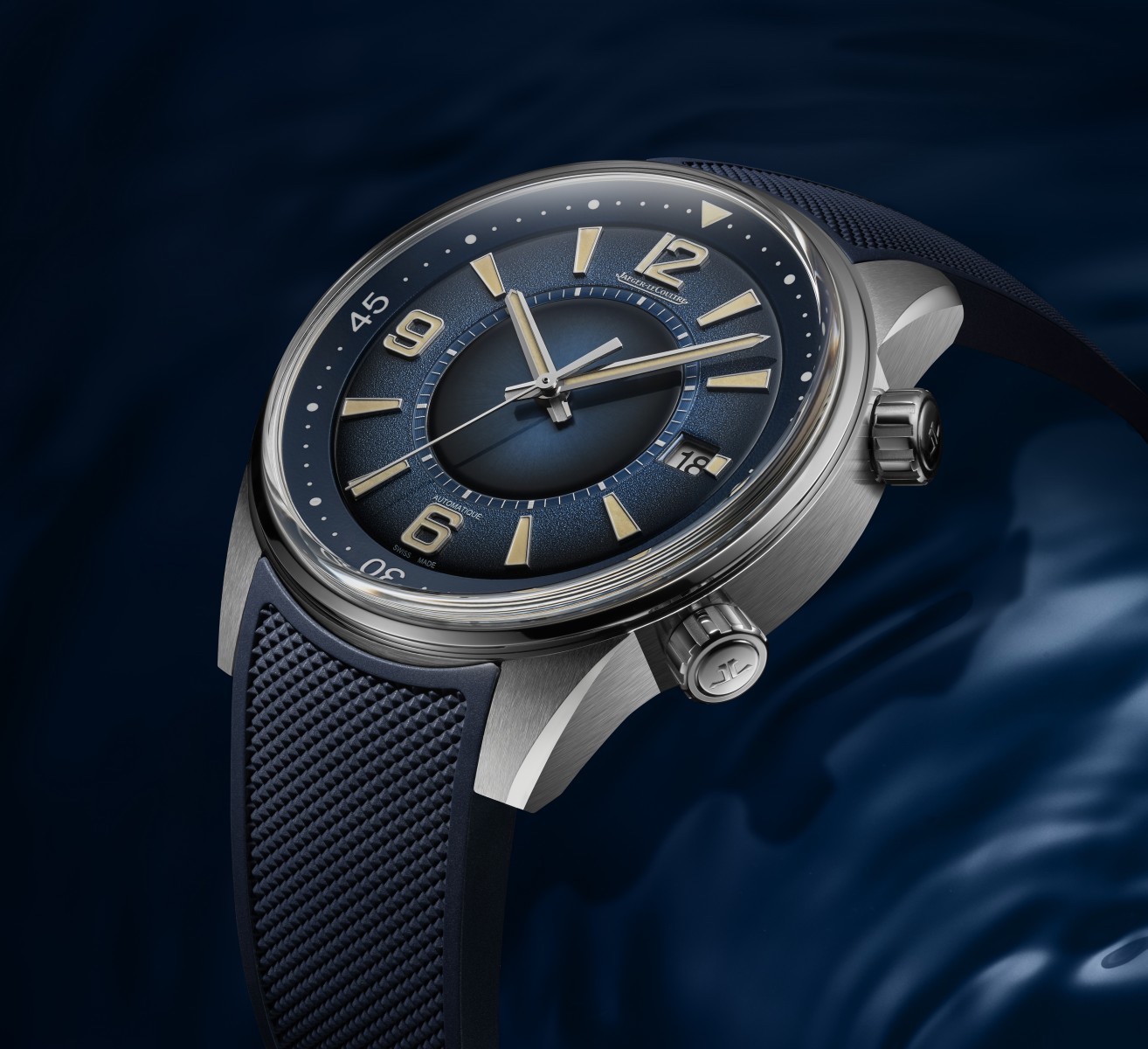
Hmm … has the best watchmaker on the planet straight out copied the “watchmaker’s watchmaker”? While we’ll openly admit that there are some stylistic elements that are similar – the inner recessed chapter ring, the wide flange, the centre dial – and the dial of the PP does share some design similarities with JLC’s Polaris Date LE, the overall aesthetic of both watches are markedly different. For starters, the Calatrava doesn’t share the same creamy fauxtina lume on the handset, Arabic numerals and indices that the JLC does.
Patek has opted for a crisp white lume that makes the 6007A look, to my eyes, a much fresher and resoundingly more polished proposition. Then there’s the sheer difference in size, width and design of these two watches’ cases. The JLC is — and there’s no other way to say this — a bit of a chunky unit, measuring 42mm across and more than 13mm thick. And the lugs and flanks of the JLC’s bulky case are brushed, giving the watch a much more utilitarian vibe.
By contrast, the Patek measures in at a lissom 40mm across and just 9.07mm thick, and it’s polished all over. Make no mistake, of the two watches, the Patek is, emphatically, a more luxurious package. We reckon folks have gotten these two confused mostly because they’re both blue … and that’s a pretty silly way to look at things – you can paint a Volvo red, but it doesn’t mean it’s a Ferrari.
Ophion OPH 786 Vélos Blue Guilloche
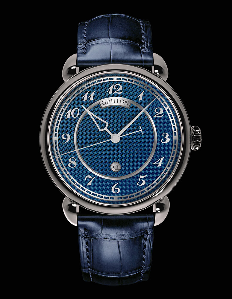
OK, so proportionally and aesthetically, these two watches are far more similar than the JLC. The Ophion’s stainless steel case, for example, is polished all over, just like the PP, and it measures a comparable 39mm across and 10.45mm thick. Likewise, it would appear that the shades of blue of the dials are quite similar. And both dials even feature cross-hatch guilloche … although the pattern is quite different size-wise, the cross-hatch on the Ophion is much finer.
Side by side, though, it quickly becomes obvious just how different these two watches are. The most glaring distinctions of Ophion should be obvious enough for anyone to note, but for those who can’t – the teardrop-style lugs of the OPH are nothing like the PP, the applied Breguet-style Arabic numerals aren’t even close to the numerals of the Calatrava, the handsets couldn’t be more different and, perhaps most glaringly, the Ophion doesn’t have a date aperture at three o’clock.
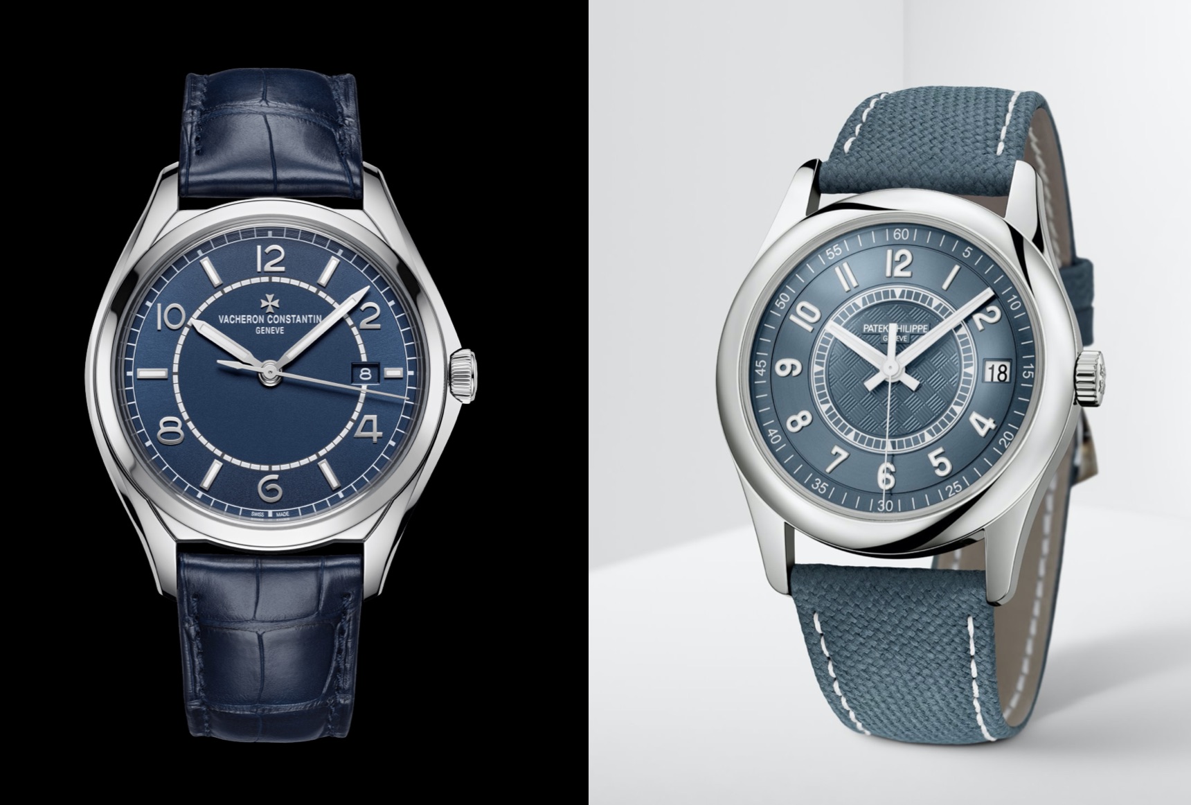
Vacheron Constantin Fiftysix Ref.4600E/000A-B487

Well … it seems that Patek Philippe isn’t the only card-carrying member of the Holy Trinity that likes this particular aesthetic. Vacheron Constantin’s Fiftysix in blue certainly has, to the uninitiated, an air of familiarity. However, I would still argue that there’s more difference than similarity between this and the Calatrava.
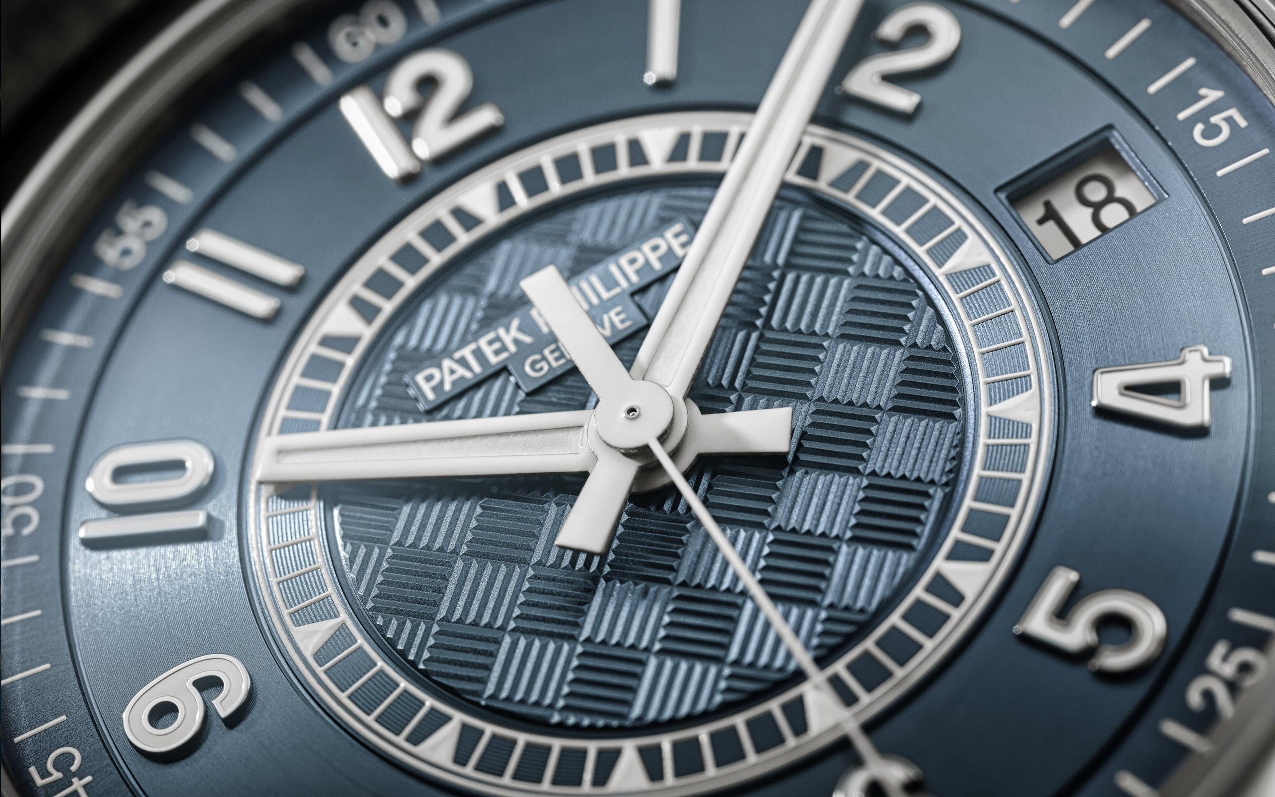
The dial colour, for instance, appears to be far more matt than the Patek’s multifaceted, metallic finish. And the granular texture of the VC’s dial is quite different, too. The minute track is also nowhere near as sporty as the Patek; it’s far more restrained and maybe even a tad on the straight / boring side. Though the biggest differences between these two are, rather obviously, the VC’s lack of lume on the applied Arabic numerals and the Patek’s embossed “carbon” pattern seen within the smaller white railway track scale.
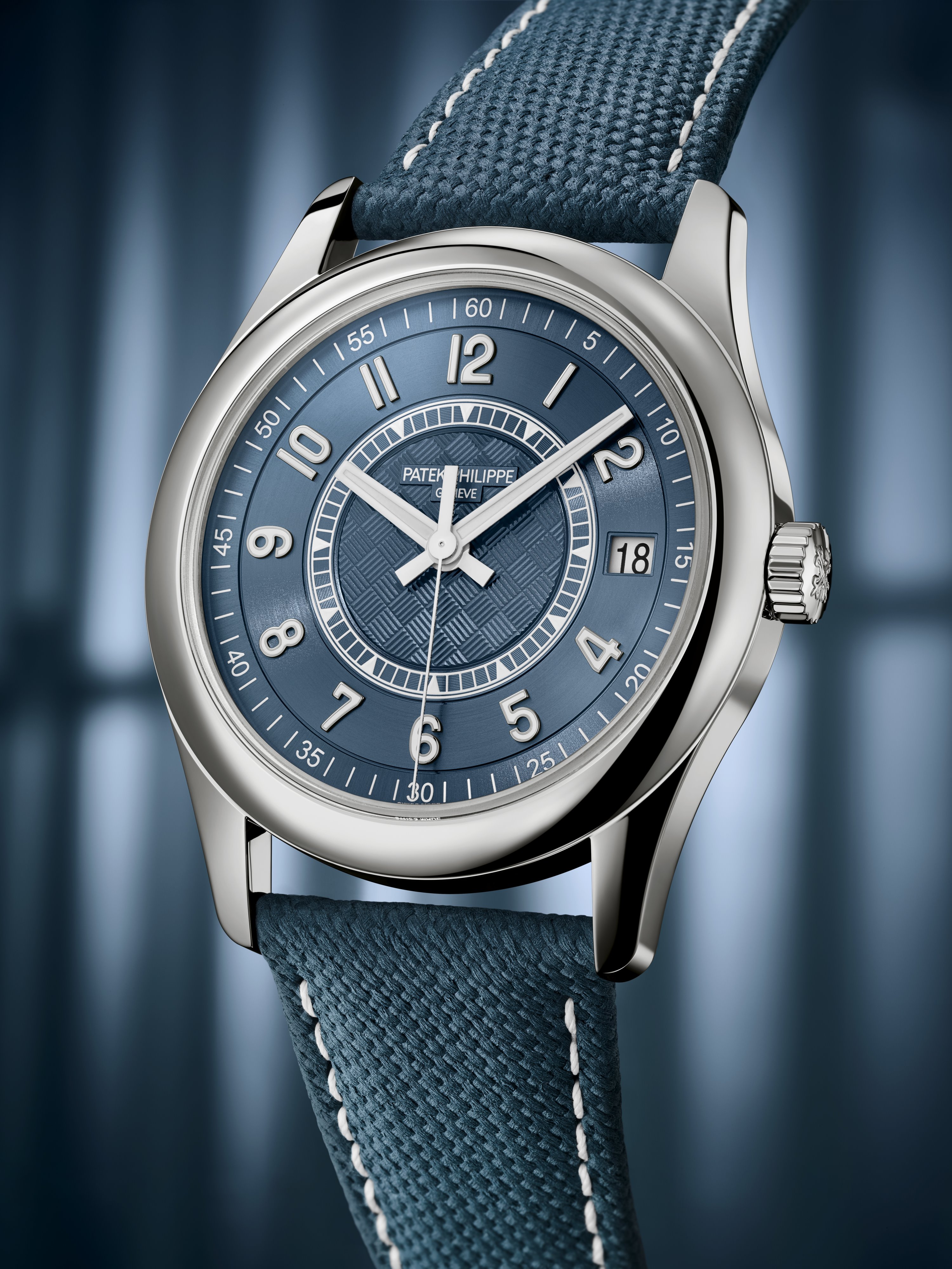
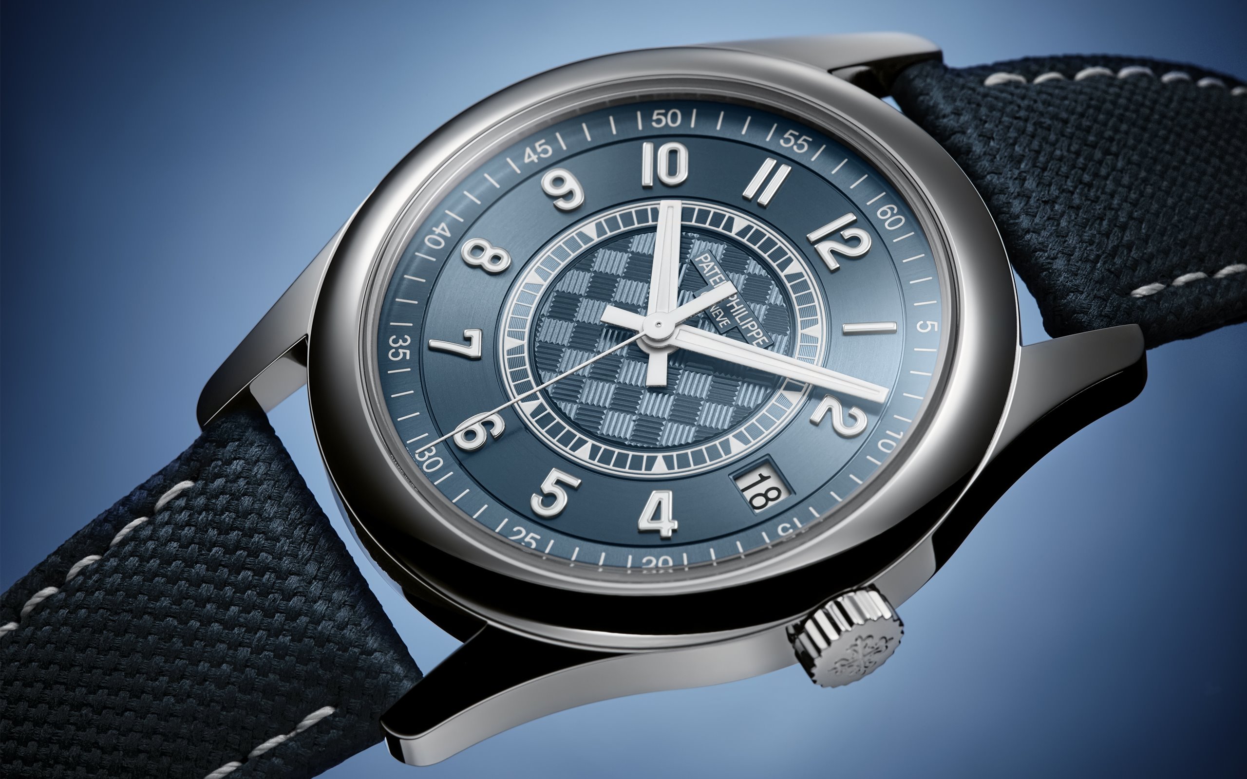
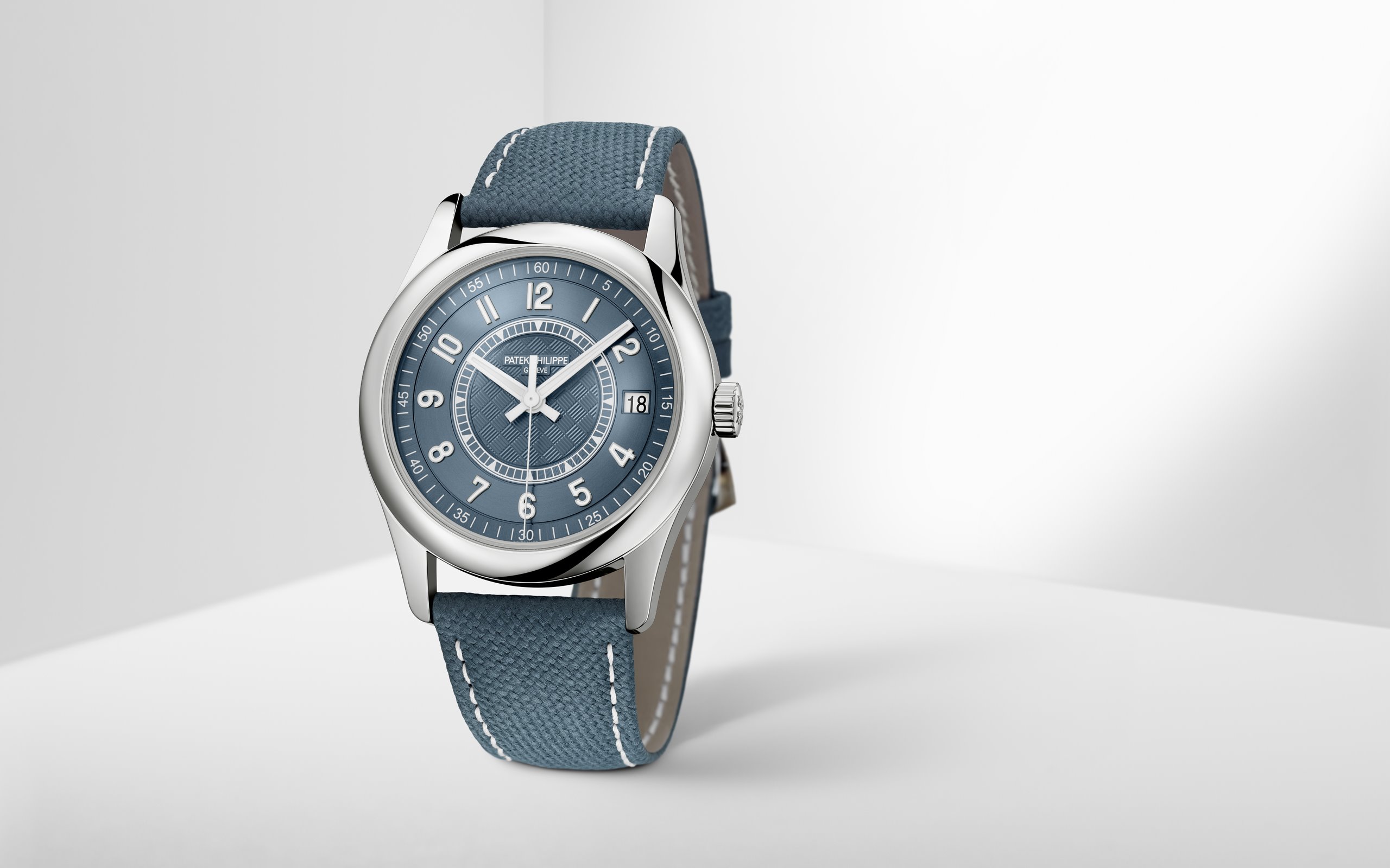
Patek Philippe 5208T

Now, this watch does look very, very similar to the Calatrava Ref.6007A-001. And there’s a very good reason for that – the Patek Philippe 5208T was the inspiration for the new Calatrava. Originally created for Only Watch in 2017, the 5208T was a Grand Complication juggernaut that featured styling we’d never really seen before from PP. It was a smash hit at the time, selling for an absurd CHF 6.2 million (nearly 10 million Aussie dollars), and it didn’t receive anything like the hate that the 6007A has received.
The verdict
So, in conclusion: no, Patek Philippe hasn’t copied anyone … except themselves. Their design is unique (and quite good-looking, too). The fact of the matter is: in traditional wristwatch design, there’s only so much that hasn’t already been done. Sure, you can chop and change, mix and match, and that’s what most watchmakers do. But, at the end of the day, unless Max Büsser has made it, most wristwatches, especially to a layman, look largely the same.