INSIGHT: The craft of Van Cleef & Arpels
Sandra LaneVan Cleef & Arpels have long been recognised as one of the world’s most creative high jewellery houses. Taking inspiration from nature, magic and fairy tales, the Parisian Maison creates complex jewels of unusually high technical and design content – so that even the most extravagant pieces have a lightness, charm and wit.
In recent years, Van Cleef & Arpels have also become recognised for their artistic and highly creative watches. But it is no mere arriviste in the world of horology. In the 1920s the famously elegant Louis Arpels designed the Ruban (‘ribbon’) watch, with a rectangular case that formed an unbroken line with the links of its gold bracelet. A 1927 pocket watch with a double retrograde display featured a robed Chinese Mandarin on the dial, whose arms indicate the hours on one side and the minutes on the other.
Having coined the phrase “Jewels that tell the Time”, Van Cleef & Arpels have always endeavoured to blur the lines between high jewellery and horology. However, a decision made in 2006 has radically changed the Maison’s stature in watchmaking. Stanislas de Quercize, then the CEO, asked Nicolas Bos (Creative Director at the time, Bos succeeded de Quercize as CEO in 2012) to develop a new strategy for the Maison’s timepieces.
Bos’s idea was clear: “to rethink our interpretation of time” – to develop an approach that would be distinctively ‘Van Cleef’ in both spirit and content. The overall notion was the ‘Poetry of Time’ and “it would be driven not by the technical element of the movement but by what can be executed on the dial, and what story can be brought to life [there],” Bos said. Key to expressing this approach would be the Poetic Complications.

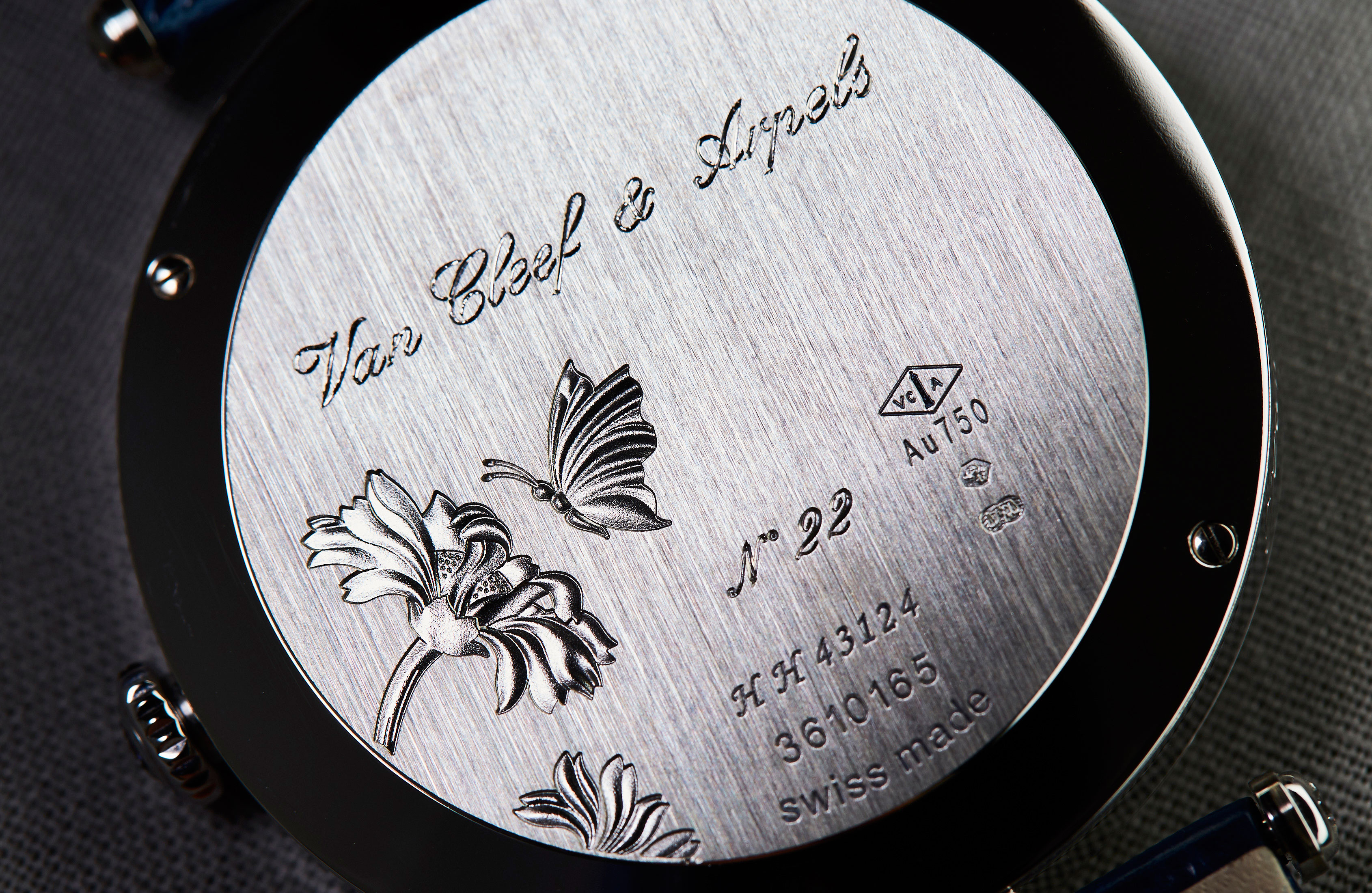
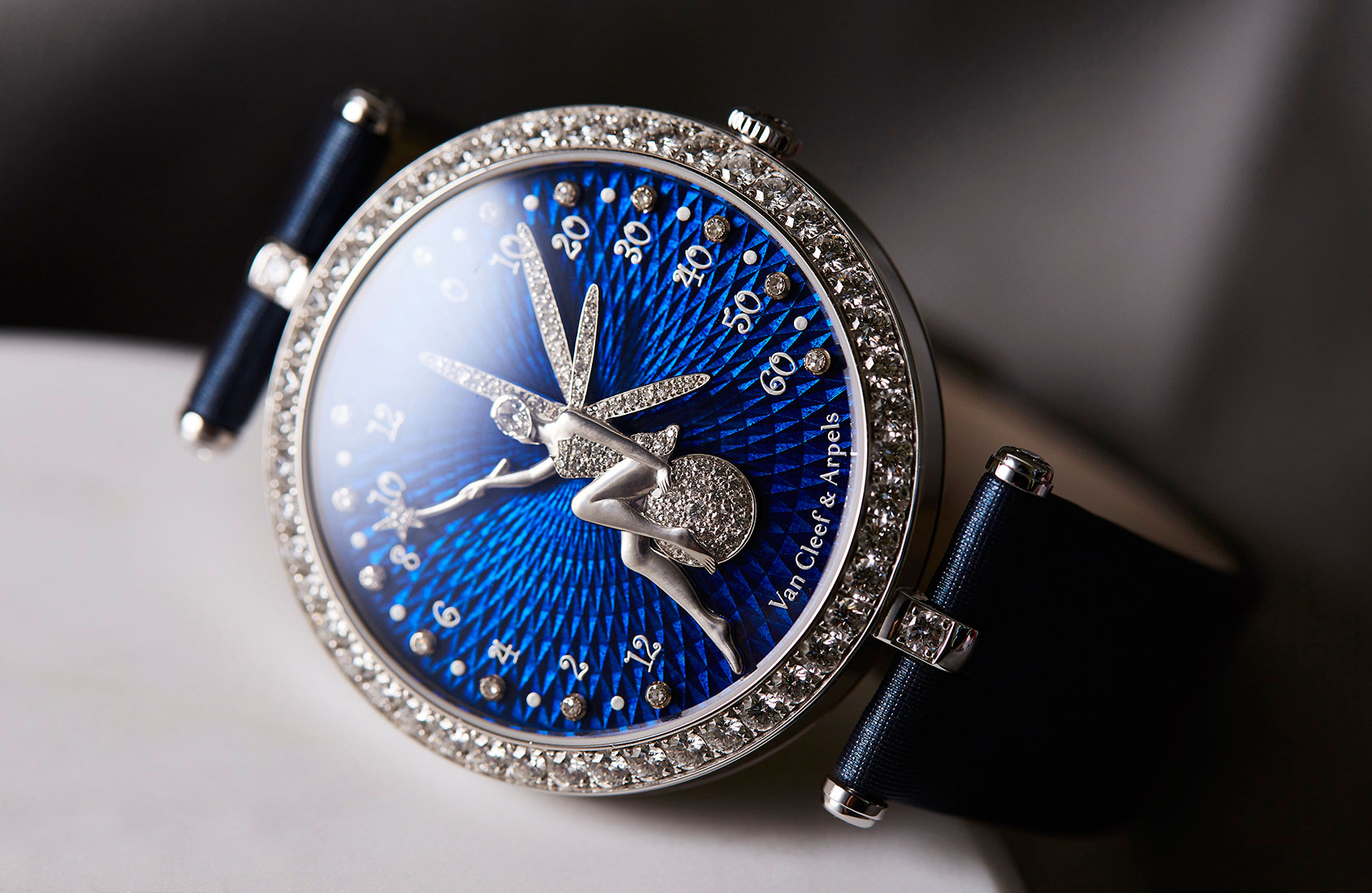
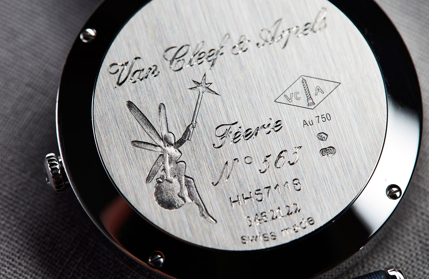
The Lady Arpels Féerie, launched in 2008, was one of the earliest outcomes – and it remains a core piece in the collection today. The Maison took inspiration from its watch archive – the time display of that 1927 ‘Chinese’ watch – while the fairy on the dial was modelled on a brooch from the 2005 Midsummer’s Night Dream jewellery collection.
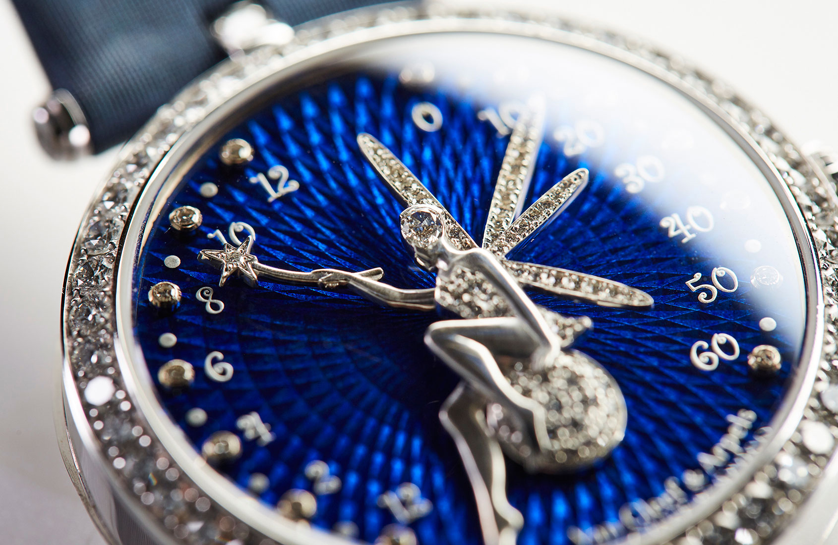
Van Cleef & Arpels commissioned Jean-Marc Wiederrecht of Agenhor to develop the double-retrograde complication, which would enable the fairy to use her star-tipped wand to indicate the hours, while the longest of her four wings would point to the minutes.
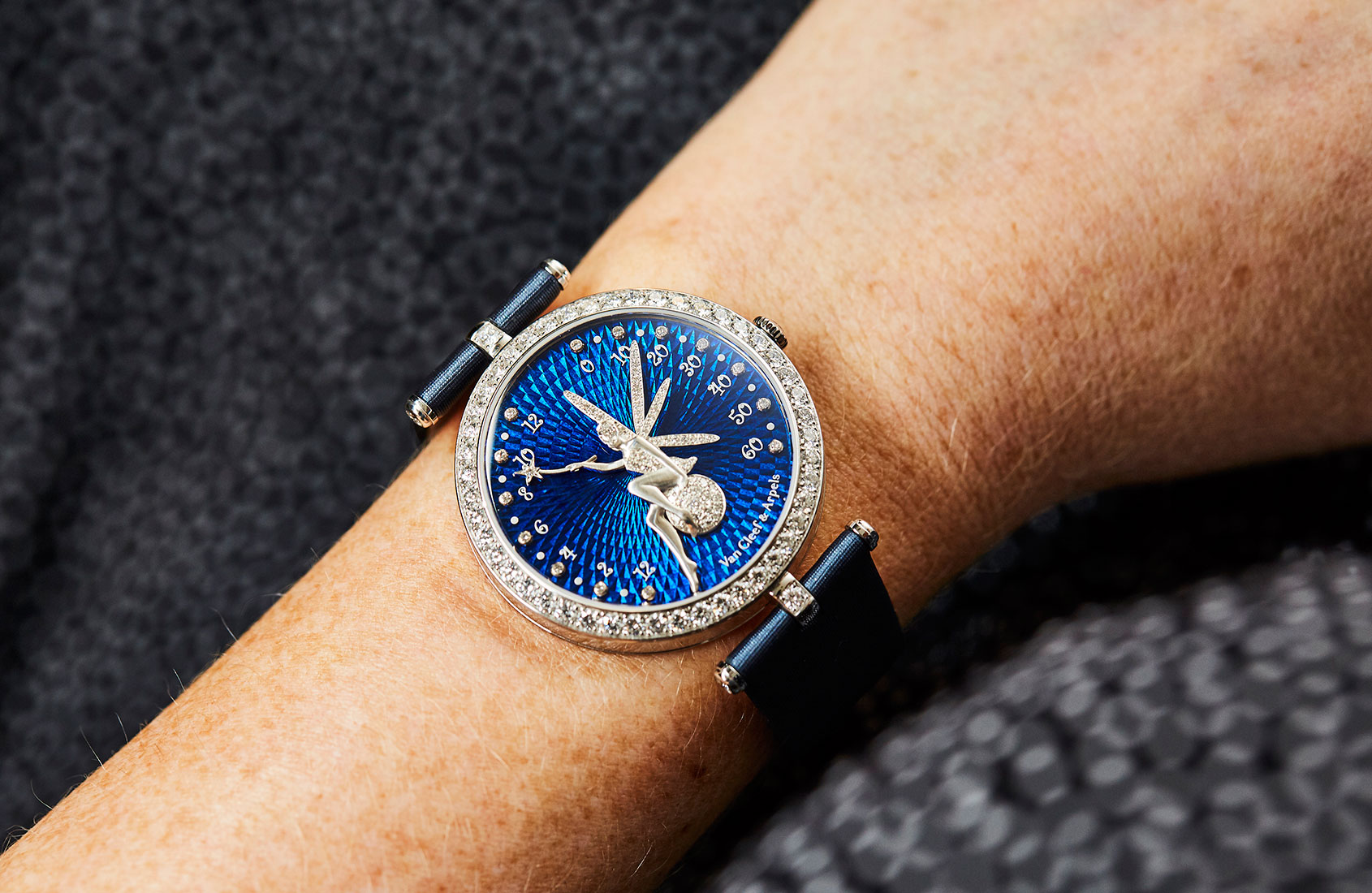
In a classical example of high jewellery craft, the fairy is sculpted by hand from a solid piece of gold; a pear-cut diamond forms the oval of her face and the four wings are set with round-cut diamonds. But this exquisite little jewel created a technical issue: both the wing and the arm holding the wand are far heavier than normal watch hands, requiring a lot more energy to move (not to mention the ‘snap’ of energy needed by all retrograde complications). The solution: Agenhor combined its complication with a specially adapted movement based on the Jaeger-LeCoultre calibre 864. But in the world of Van Cleef & Arpels, such technical achievements are never made obvious; they exist simply to serve the apparent magic on the dial.
While the Poetic Complications have become a cornerstone of Van Cleef & Arpels’ watchmaking, the technically simpler pieces of the Extraordinary Dials (Cadrans Extraordinaires) collections allude to the stories told by the complex pieces, while also addressing the poetic themes that run through everything the Maison does in both jewellery and watches.
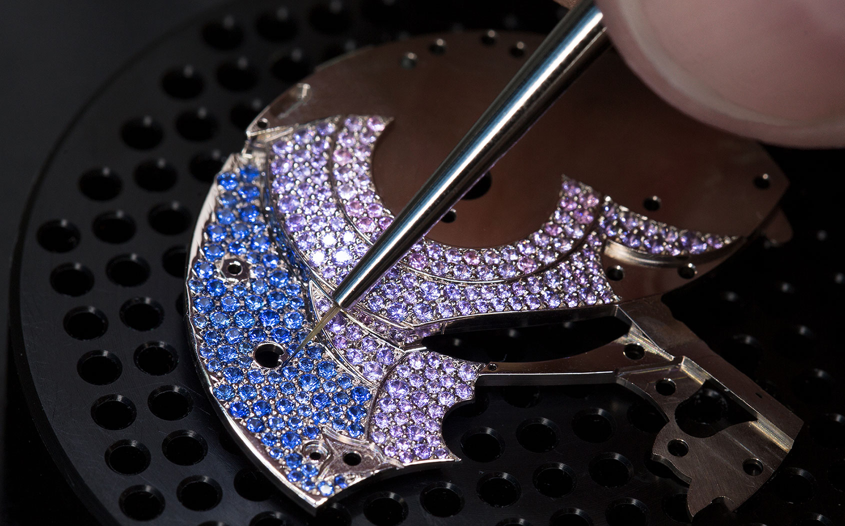
In all cases, however –whether driven by a technically complex movement or focusing on the dial itself – the approach is the same: to harness jewellery techniques and other refined crafts for maximum effect. In practice, this means an intricate layering of elements, partly for pictorial purposes but also to engage the eye through the play of light on different textures, and to add visual intrigue through great depth of detail.
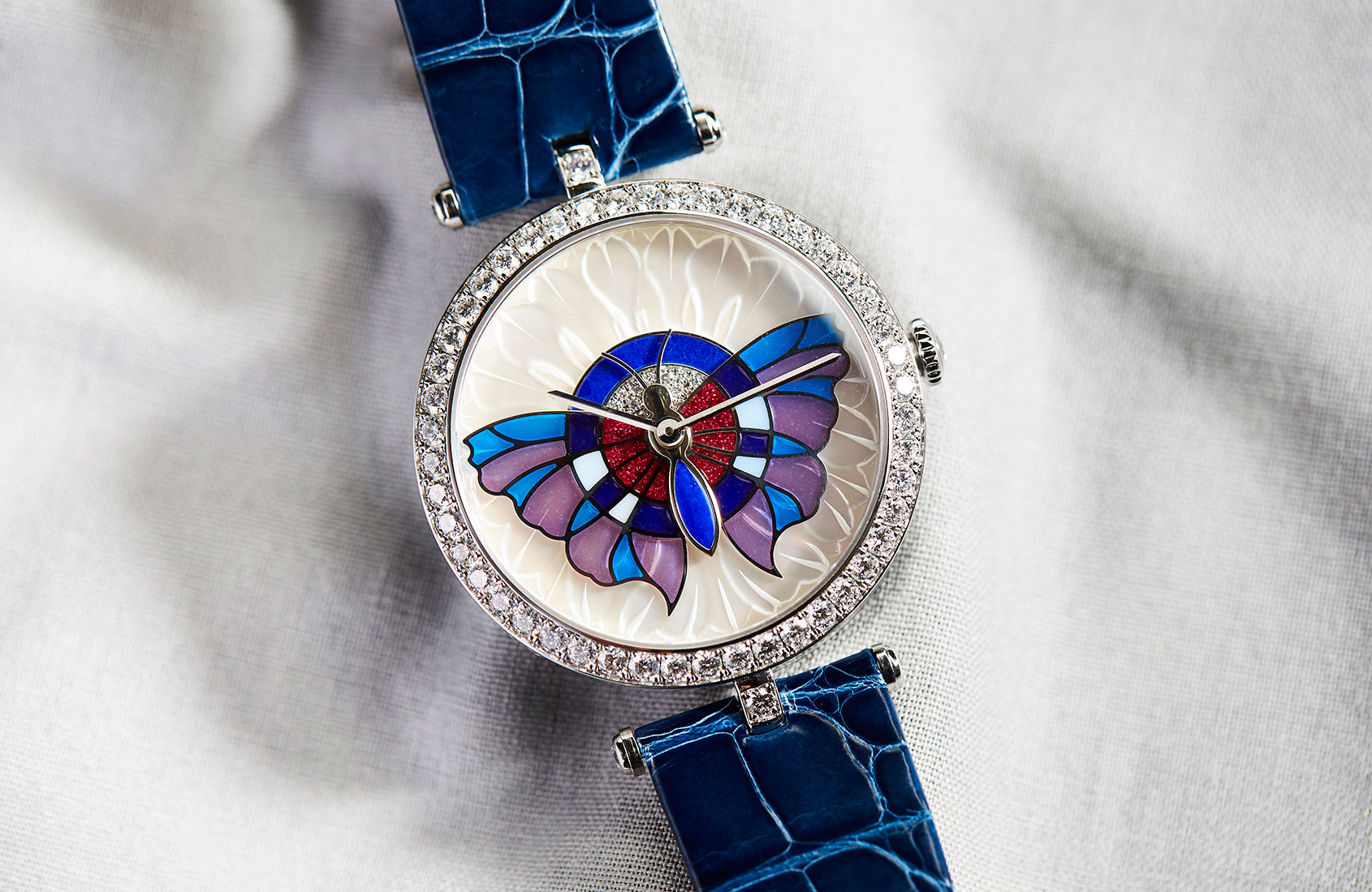
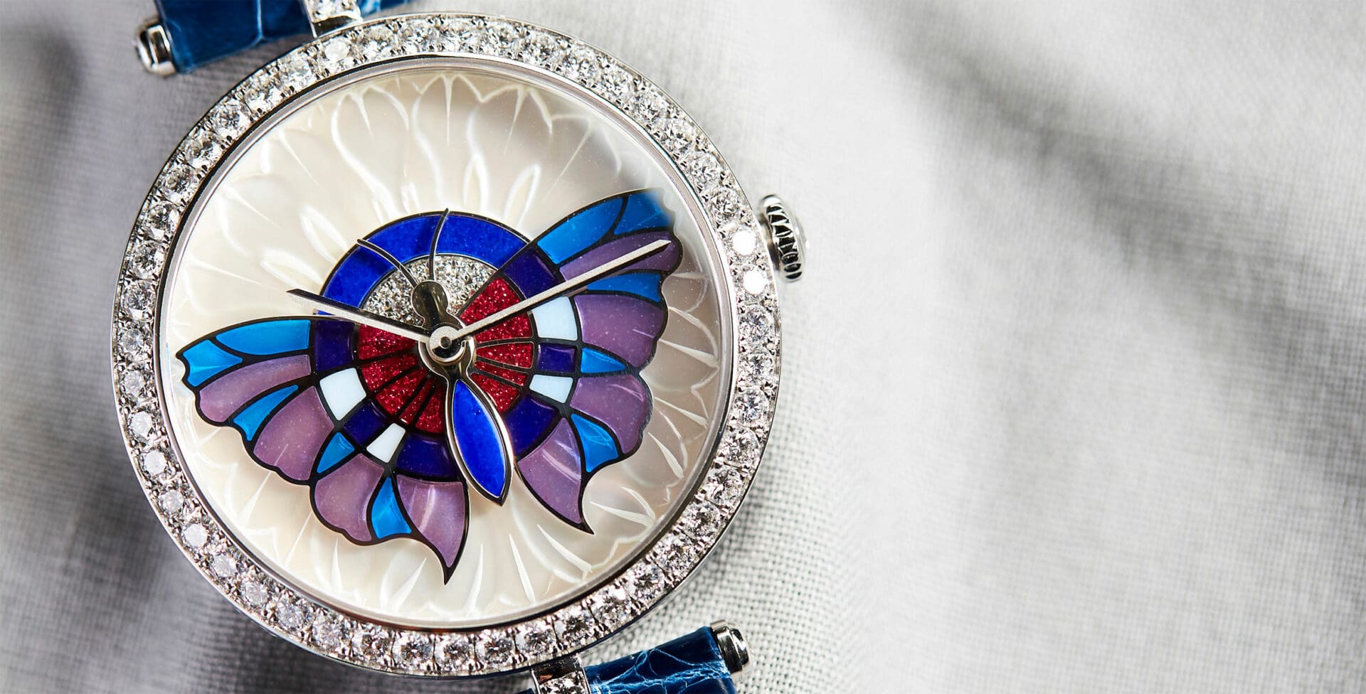
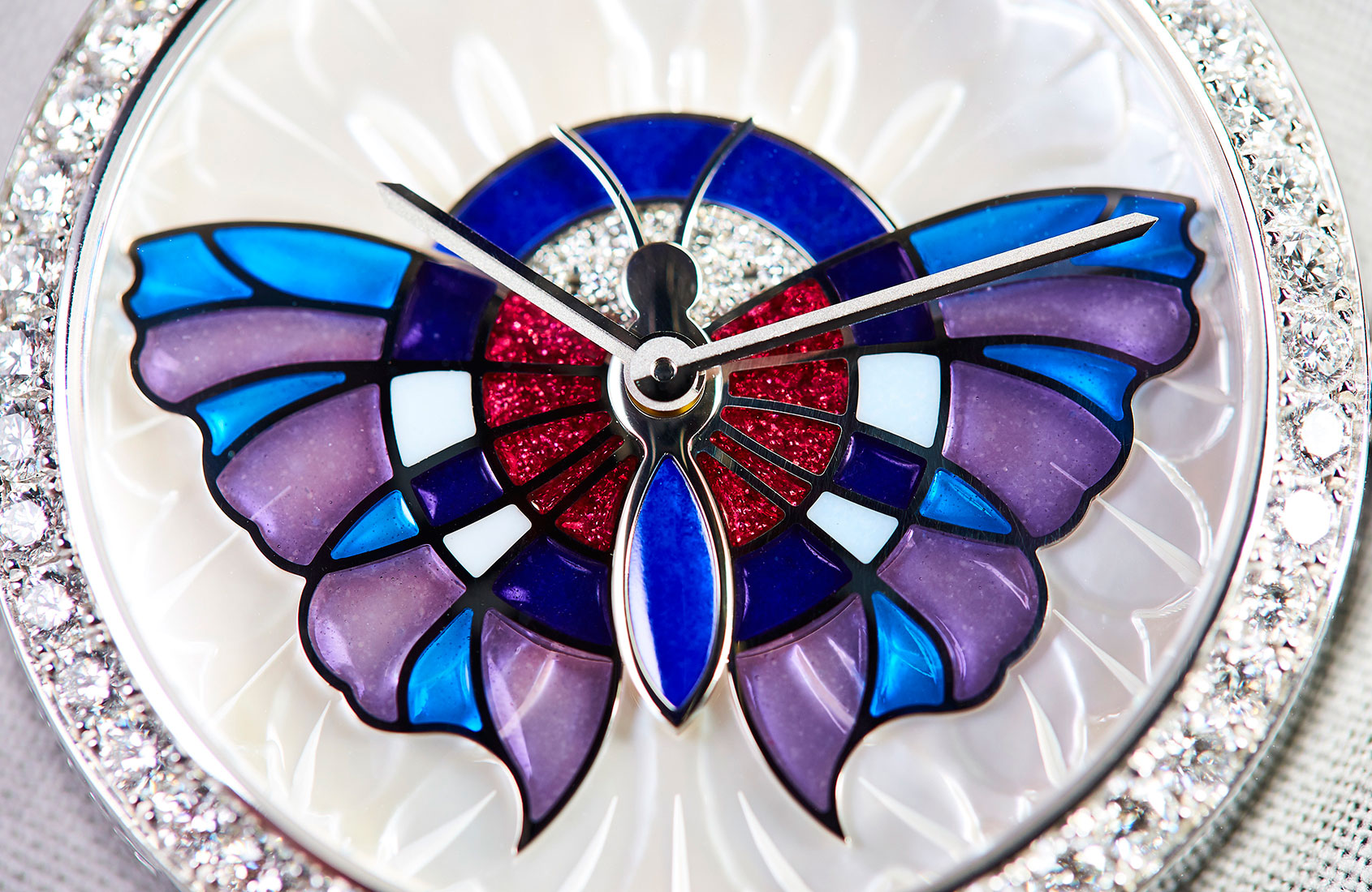
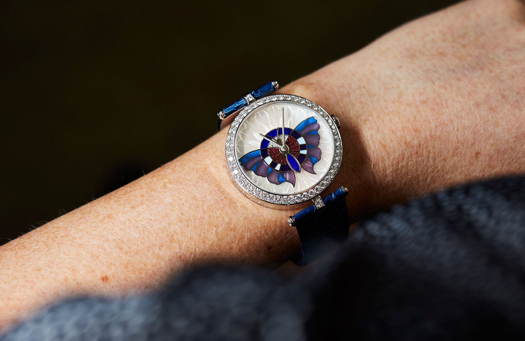
Thus, on the Papillon Extraordinaire, it wasn’t enough simply to hand-paint a butterfly on the dial – lovely as that may have been. Instead, the butterfly wings are made using the plique-à-jour enamelling technique, which creates an effect similar to that of a stained-glass window. The fine ‘skeleton’ of the wings is sculpted from gold and the spaces are filled with differently coloured, translucent enamels before firing at high temperature (above 600C).
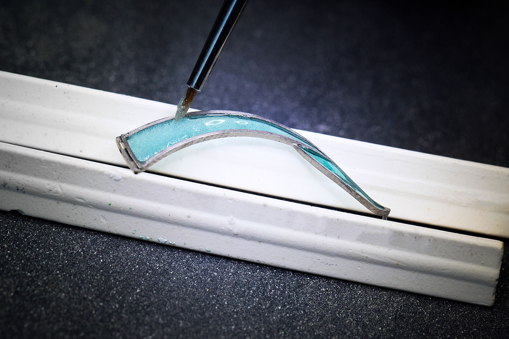
The completed wings are set on a dial that comprises a diamond-set centre surrounded by a vividly coloured ring – also made in grand feu enamel, to match the enamelled body of the butterfly – and an outer ring of hand-carved mother-of-pearl.
The effect is one of great depth and richness – and yet none of these elements is much more than a millimetre thick. Thickness on the dial means adding height to the watch case – never desirable in watchmaking but taboo in the refined world of Van Cleef & Arpels.
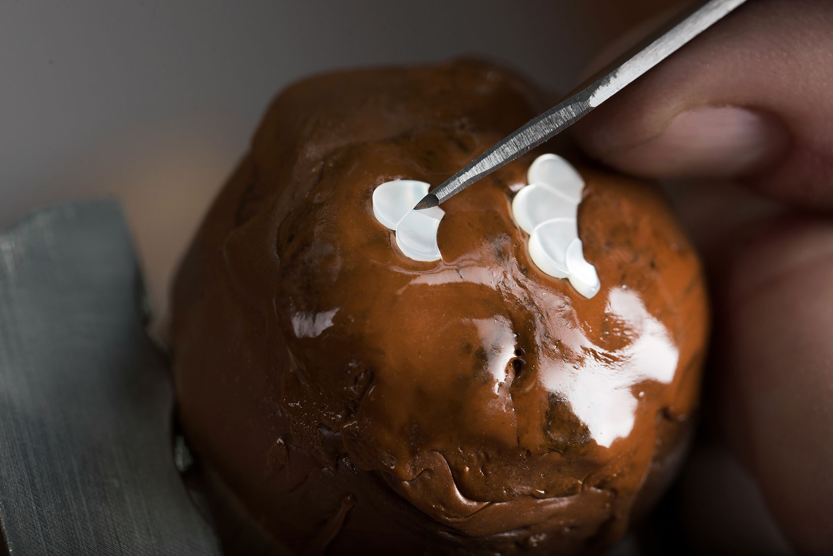
The solution is to create optical illusions of depth – hence the delicate operation of hand-carving an extremely thin ring of mother-of-pearl to add texture, rather than opting for a flat surface (even though the material is already notable for the way it refracts the light).
On the Féerie watch, the illusion of depth is created by the flinqué enamel background of the dial. One of the more complex enamelling techniques, flinqué reached its apogee in the hands of the Russian court jeweller Peter Carl Fabergé but then was almost forgotten until the 1990s, when a few craftsmen began painstakingly to revive it.
First, a pattern is engraved on the gold base-dial using the guillochage technique – in this case, a pattern of geometric lozenges diminishing in size towards the centre. Then, translucent coloured enamel is layered over the surface with grand feu (high heat) firing after every layer. The goal of all flinqué is to achieve not only luminosity but also a brilliance that can be compared to a faceted gemstone and the Féerie watch is a masterful example of the craft.