How colour theory affects your watch collection
Fergus NashGiven the huge variety in colours, gradients and and textures on dials these days, it’s more important than ever to understand how colour actually works. You may think of it as being as simple as applying pigment equals colour, but there’s really a lot more going on both in the factories and in your eyes. If you’re going to make informed decisions about the watches you buy and how to wear them, then here are some points about colour theory to keep in mind.
Colours are affected by their surroundings
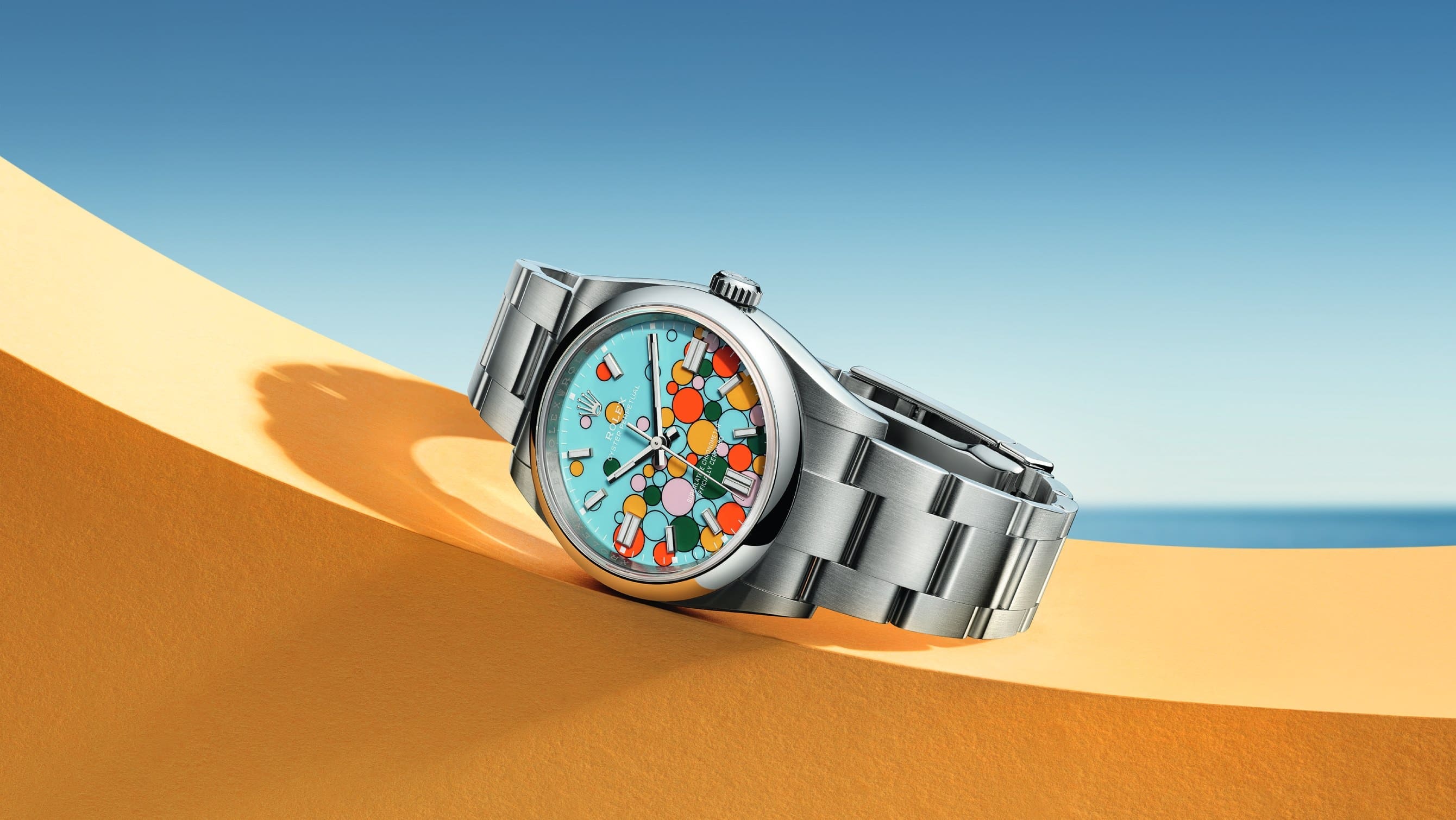
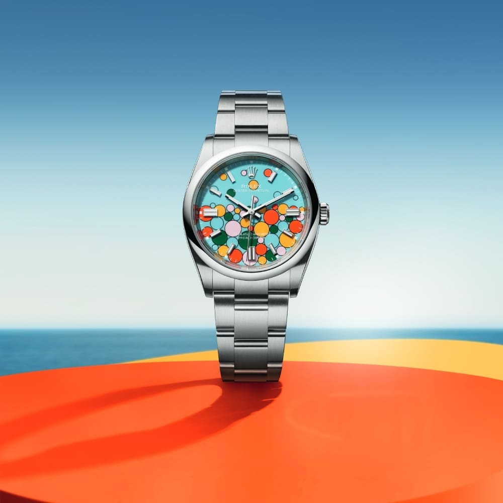
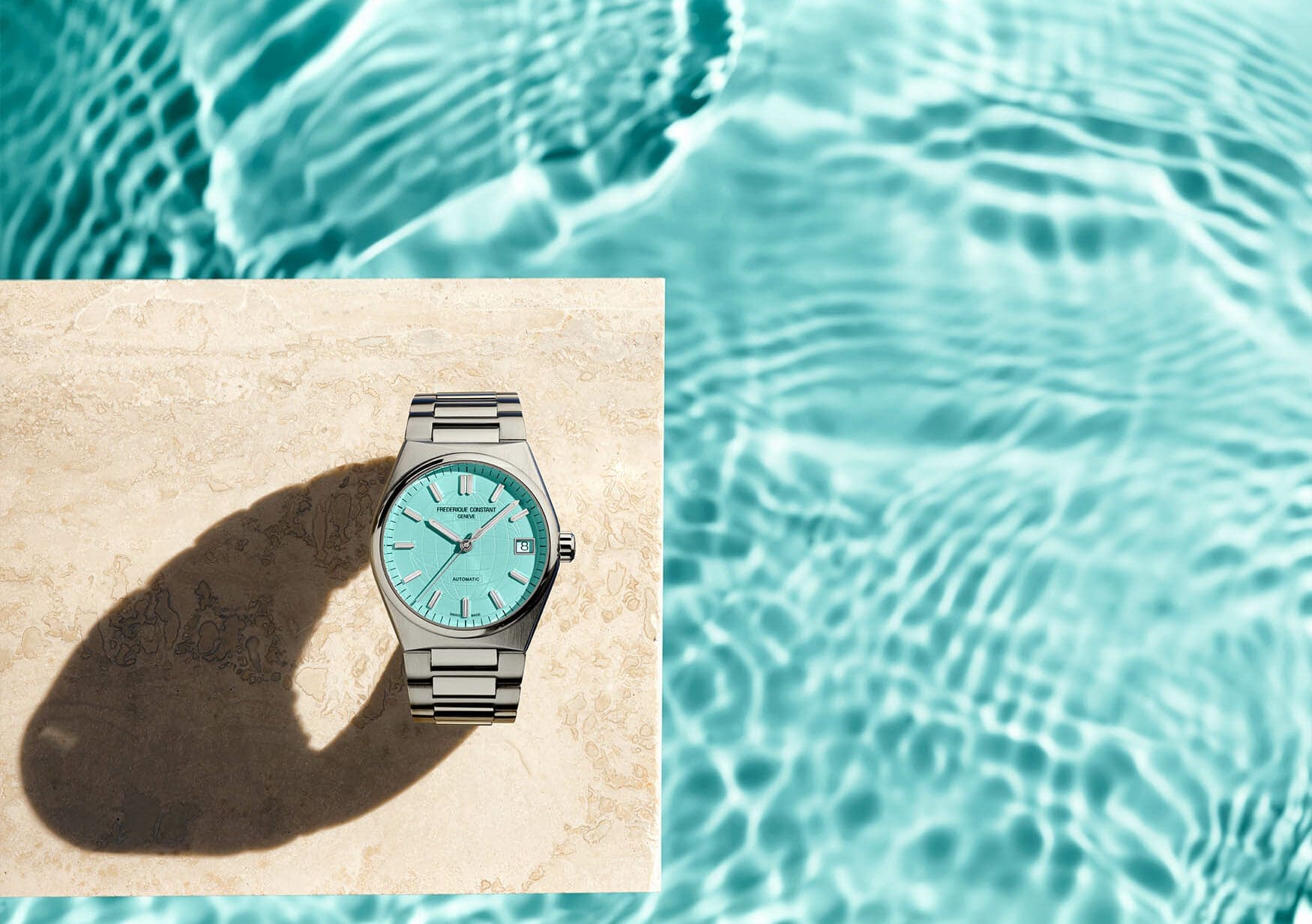
Because nothing actually has an inherent colour from a physics perspective, the human perception of colour can be altered incredibly easily. How an object reflects, absorbs, emits and interferes with light can all affect its perceived colour, and its surroundings do change those aspects. If you take two identical green circles and put one of them on a blue background, the one paired with blue will appear significantly brighter than the other green circle. This exercise also applies to watches in so many ways. The hour markers can be affected by the dial, which can be affected by the bezel, which can be changed by the case material. Even the look of the case will change depending on both your skin tone and the kind of strap or bracelet that’s fitted to it.
Not all colours are created equal
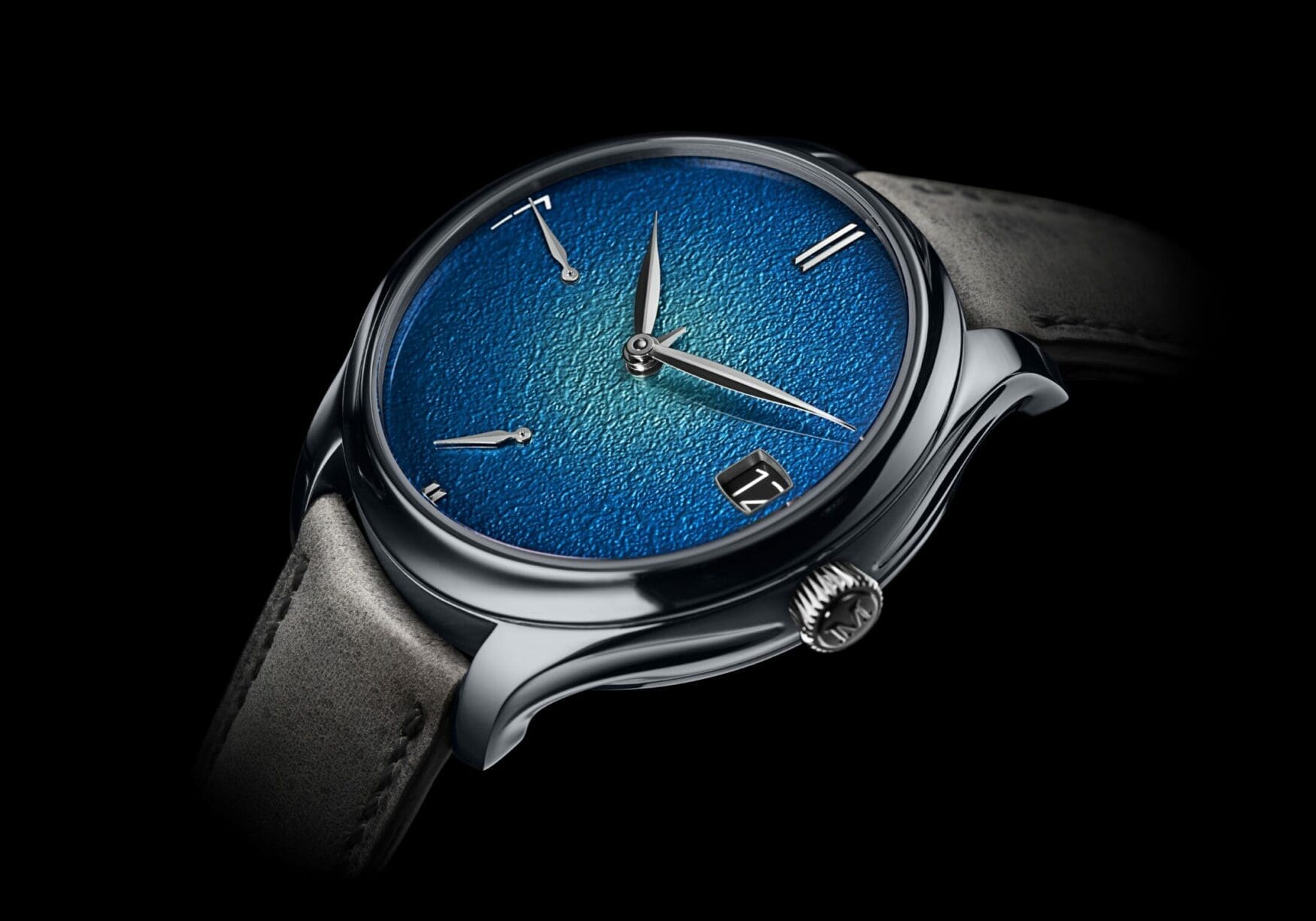
If you were playing around in Photoshop adjusting hues and brightnesses, it’d be pretty easy to come up with unique colours and shades for just about anything. Computer screens are excellent at displaying colours because they’re mixing light directly, but working with solid media has always been much more difficult. The outdated belief is that you can mix the primary colours of red, blue and yellow to achieve any colour, however if you’ve ever tried mixing paint yourself you’ll know that isn’t true. Because colour only exists in our perception of light, the physical reactions between different pigments don’t always align with how different wavelengths of light interact. That’s why certain dials, especially ones made from high-end lacquers or enamels, can demand huge prices when it’s an uncommon colour without a well-known recipe. Ceramic cases are another perfect example of this, with bright colours being especially difficult to manufacture in a stable and consistent way. It even extends to metal cases as well, with some luxury brands creating their own kinds of steel to perfect the tone and lustre they’re after.
Buying online can be misleading
As we’ve established, computer and mobile screens are much better at mixing colours than pigments. That said, the way that they emit light instead of absorbing or reflecting it means that some things can get lost in translation. A photograph (especially a digital rendering) might give you a rough approximation of what it will look like, but it can never replicate exactly how that real product will be interpreted by your eyes and brain. That’s why most reviewers would recommend that you visit a watch in person before committing to buy it whenever possible, as you could be disappointed by a colour when it’s not being hit by a specific kind of lighting or angle.
You may be colour blind
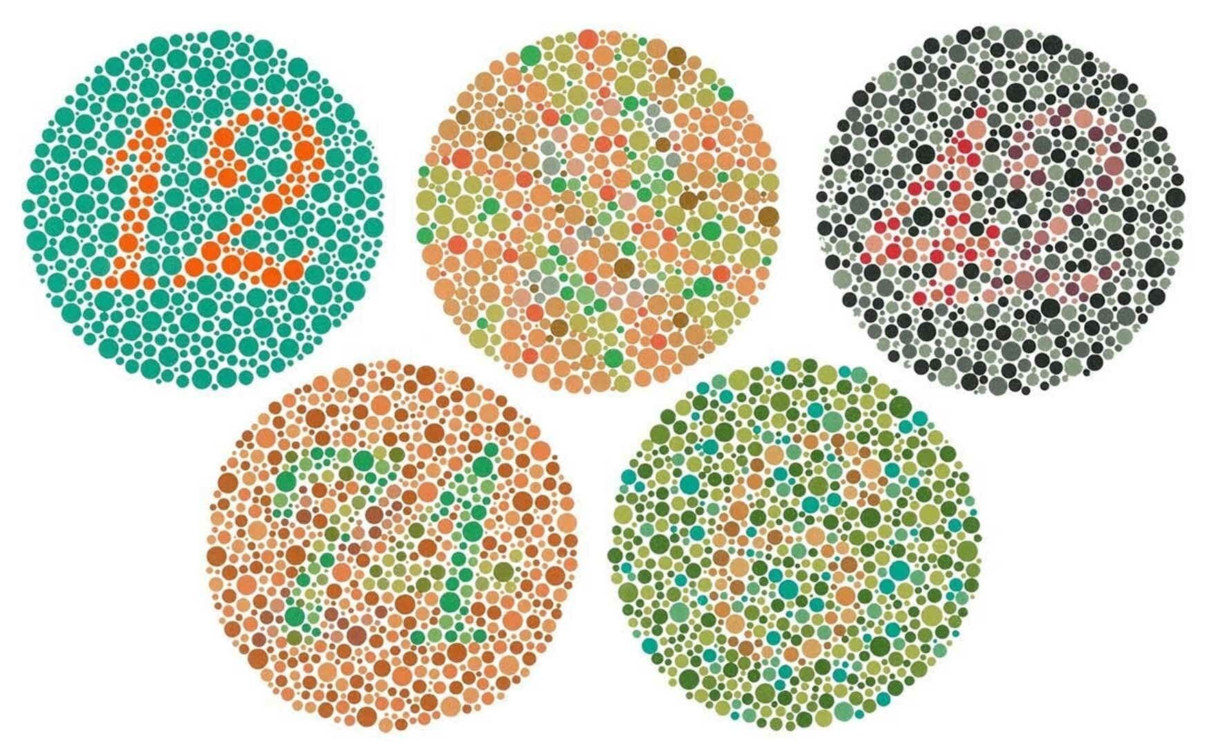
Unless you’ve taken a colour blindness test at an optometrist, there’s a pretty decent chance that you may be colour blind and never known. Approximately 8% of males are colour blind while the statistic is only 0.5% of females, but in terms of the global population, those are incredible numbers. This disability isn’t always like seeing in black and white like its often cartoonishly portrayed, but rather limits with your ability to distinguish colours from each other in varied ways depending on the person. For example, I struggle with the difference between reds and browns, and when the two are near each other they tend to just blur into one. If you’ve always found orange text on blue dials hard to read or similar experiences, maybe it’s time to take a test and see where you stand.


