


OPINION: Why typefaces and logos can make or break a watch
Dan KaufmanWhen buying a watch, most people think about issues such as accuracy, water resistance or power reserve – but for me, it’s the typography that matters most.
Before I go further, let’s start with a mini lesson: the words font and typeface are not synonymous. A typeface is a family of fonts (ie Times New Roman, Helvetica, and the beloved Comic Sans) whereas a font is more specific, taking on extra details such as the weight, size and style (italics, bold, etc).
Most people don’t know about this distinction because, quite frankly, most people don’t care about typefaces. And yet they should: after all, the text on your dial is one of the most obvious parts of a watch. Think of it as being like the lead singer of a band. Sure, the drummer might be magnificent but if you have a slob fronting the band, it’s not going to go far. (OK, in retrospect maybe that is a lame analogy.)
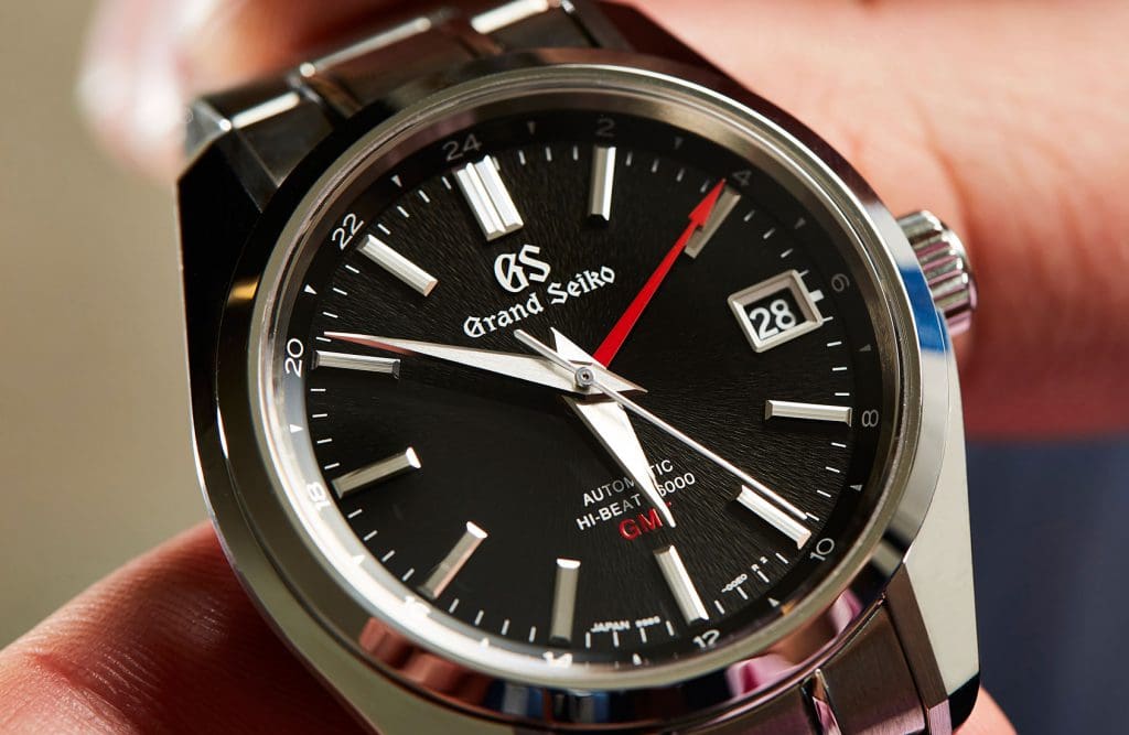
For example, I have long admired the craftsmanship and movements of Grand Seiko – but their gothic typeface makes me shiver, and not in a good, gothic horror movie kind of way. What adds insult to injury is how they then add the initials GS on top of their logo, as if offering their name in two different ways will help the wearer identify their watch. This is a brand that does almost everything else perfectly – except logos, such as when they print it on their exhibition casebacks. Trust me: when it comes to your logo, less is more.
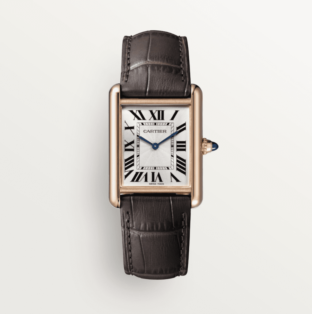
Cartier, on the other hand, doesn’t wow me with their movements (though their haute horlogerie range is obviously an exception) – but I do want to buy a Tank one day because the dials are just so damn elegant and minimal. Like Grand Seiko, they do repeat their name twice on the dial – but they do it cleverly by disguising it within the 7 numeral. Rather than being in your face, it instead becomes a design quirk.
Lesson number two: the text part of a logo is called the logotype. The image part of a logo is the logomark. Combine the two together, and you have a cluttered dial.
Let’s take Baume and Mercier as an example. Sure, they don’t have the cachet or demand of Rolex, but I am obsessed with my 2013 model Clifton because I love what is (and what isn’t) on the dial.
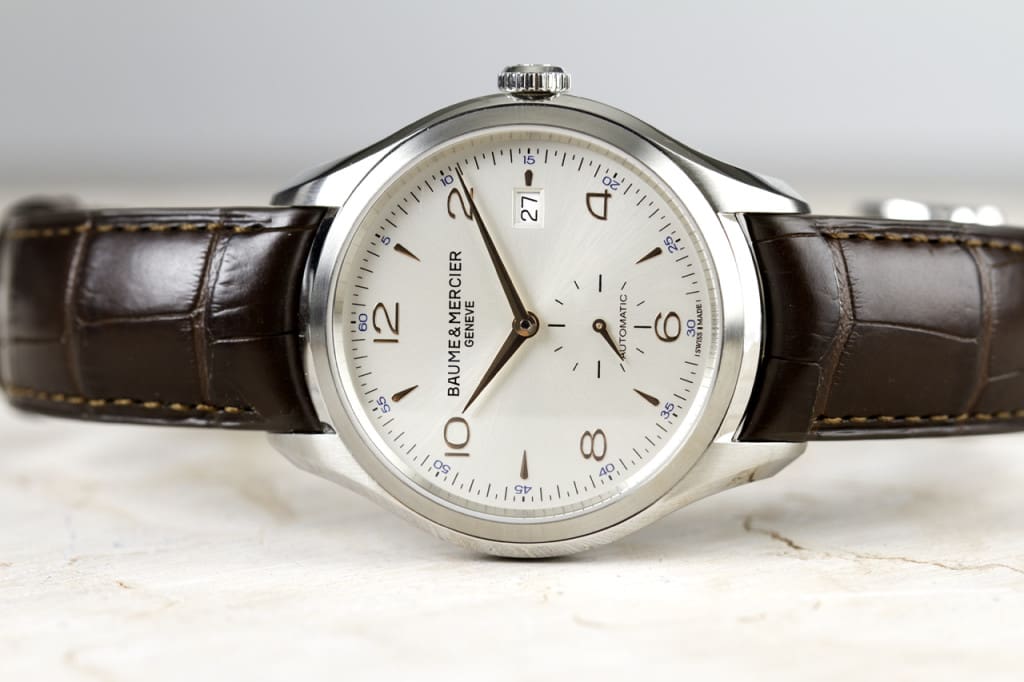
Unlike later models that added a logomark, the original Clifton simply had its logotype rendered in that beautiful and timeless Baume & Mercier typeface, which I believe is as elegant as any text you’ll see on any watch – Cartier included.
But now they offer the Baumatic, which has a far superior movement – but also that unnecessary logomark (the Greek letter Phi) hovering unwanted above the text.
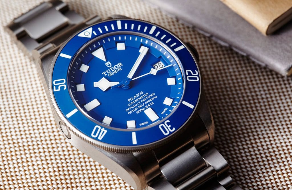
Having said that, some logomarks are more attractive – or at least unobtrusive – than others. For example, and I realise this is hypocritical, but I actually like Tudor’s logomark and think it adds rather than detracts. Then again, having a short brand name means they can get away with adding something extra to the dial. (Before I sound too complimentary, I should add that the Tudor Pelagos is the War and Peace of watches: it has seven lines of text, not counting the Swiss Made at the bottom, that tells you everything from the fact it has a rotor to that it’s officially certified.)
Which leads to my next point: space. Some people think there shouldn’t be any text at all on a dial, but a blank dial isn’t pristine: it’s empty. It needs something, but that something needs to be small, printed in a beautiful typeface, and preferably be no more than two lines – except if there are no subdials, in which case an extra line or two of text in the lower half can work, even if it does say something borderline meaningless such as automatic or chronometer. The words themselves don’t actually matter – they’re just there to balance the dial – but the typeface does.
A notable exception is H. Moser & Cie, which produces stunning minimalist dials that don’t even state the obligatory “Swiss made” because it would be a shame to cover them with meaningless text.
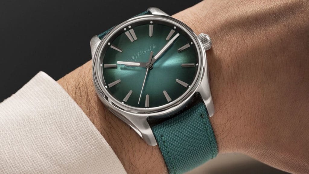
There used to be a joke in marketing that if you want to please the client, you make their logo larger. The thing is, they’re the only people who care about their logo. In this light, it’s hard not to admire H. Moser & Cie for making their logo transparent on its Mega Cool watches so it only appears … well, in a certain light.
Another exception is Anordain, who not only create beautiful enamel dials that are justifiably bare, but also custom typefaces for their numerals. This is a brand that cares about every aspect of the dial because they realise it’s what people look at the most – which sounds obvious and yet, oddly enough for an industry that prides itself on obsessing over details, most brands don’t seem to do this. They should.