Doubling down on two-tone – the Tudor Black Bay Chrono S&G
Sandra LaneTwo years can be a long time in the life of a product – long enough for it to go from controversial to comfortably accepted, or even loved, as its challenging elements become softened by familiarity. That’s certainly true for two of the watches introduced by Tudor in 2017, which attracted attention and controversy in equal measure.
For the Black Bay Heritage S&G, it was a matter of aesthetics: the (then) courageous reintroduction of two-tone – a stylistic blast from the past that was either cool or cringe-making, depending on where you were during its previous heyday, the 1980s. The other was more than skin-deep: the Black Bay Chronograph [read Felix’s review here] is a mash-up of diver’s watch and chronograph – and purists don’t like hybrids (remember the howling that greeted the Porsche Cayenne when it made its debut in 2002?). The rotating bezel of the dive watch became a fixed bezel with a tachymeter scale and the square tip of the snowflake hour hand – so great for underwater visibility – conceals part of the chronograph minutes register between 2 and 4 o’clock (shock!).
Skip ahead to 2019 (a world where genre-fluid watches have become almost as familiar as crossover cars) and Tudor has combined those two 2017 models into the Black Bay Chronograph S&G. That really should have come as no surprise, given the company’s penchant for mixing and matching of its historic iconography.
This is not just a straight ‘paint job’. The slightly slimmer case is a significant difference, in terms of both wearing comfort and what it took Tudor to get there: the sapphire crystal is slightly thinner and is domed, with the dial and hands lifted closer to it, meaning that the whole movement can be raised and the case slimmed down as a result.
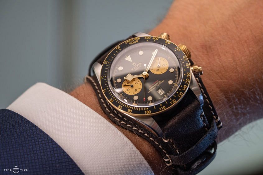
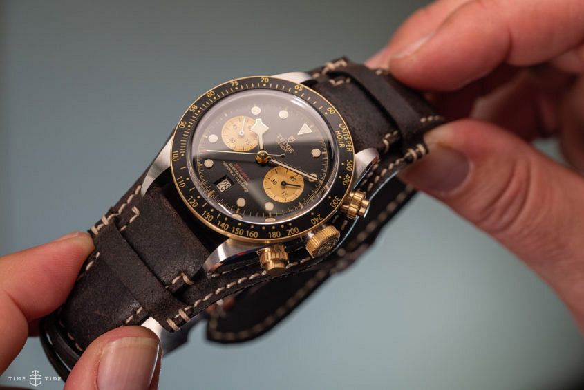
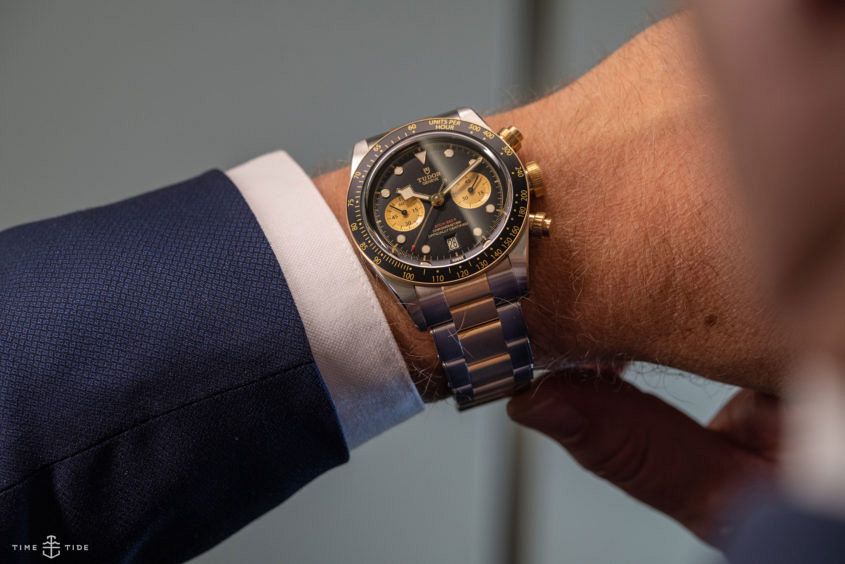
By now our eyes have become accustomed to bi-metallic watches and our hearts have embraced them – and the S&G Chronograph delivers a big hit of gold: the crown and pushers, the chronograph sub-dials, the markings on both bezel and dial, the hands and hour markers, the central links of the bracelet and the bezel itself. (The first link of the bracelet and the bezel are solid gold; the other elements are gold-capped, which is a thicker and more durable finish than electroplating.)
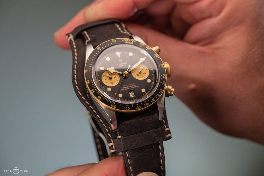
All of that gilding might have looked too much if it wasn’t tempered by the steel and black elements – a clever balancing trick that Tudor’s designers have pulled off very well. The steel cools down the yellow metal, while the gold lettering really pops against the matt black of the dial and the anodised aluminium bezel insert. The look and feel is completely different from its all-steel predecessor – much warmer, more alive, and dressier.
At a glance, it looks closer to the 2017 Heritage S&G, rather than the previous chronograph, with which it shares all the same details. On the case, the contrast between the brushed surfaces and the high polish of the chamfered upper edges of the lugs and the bezel edge adds a spark to the steel chrono and – surprisingly – seems to have even more impact, rather than ‘disappearing’ on the visually more complex S&G. And there’s a really nice visual tension between the satiny smoothness of the brushed steel and the glowing gold of the fluted chronograph pushers.
On the dial of the steel chrono, the applied gold index dots are filled with bright-white luminous material, matched by the pure white of the date wheel; for the S&G, Tudor has warmed up the white to harmonise with the yellow gold – and has taken care that the date wheel matches exactly. On the all-black dial of the steel chrono, the recessed sub-dials add visual depth; on the S&G, the use of gold not only amplifies that effect, it emphasises the symmetry of the overall dial layout and the well-judged proportions of the various displays. The snowflake hand still obscures part of the minutes register but it hardly seems to matter any more, since you’re unlikely to wear the S&G on your next scuba outing – and the uses most of us put our chronographs to are probably not confined to the hours between two and four.
And let’s not forget the part you can’t see: the same movement shared by the S&G and its steel predecessor, calibre MT 5813 – one of the products of the collaboration that Tudor and Breitling announced in 2017. A vertical clutch column-wheel chronograph based on Breitling’s esteemed calibre B01, it has a Tudor regulator, including a free-sprung, adjustable mass balance (for improved stability of rate over long periods) and a silicon balance spring (for greater magnetic resistance).
The S&G comes on a choice of three straps: woven jacquard fabric, aged leather (with a detachable Bund pad) and two-tone metal bracelet. Each of them subtly shifts the character of the watch and all three look equally good – which is quite a feat for a design as strong and distinctive as this. With the Black Bay S&G chronograph, Tudor has, once again, mastered the art of picking and mixing references from its past, striking just the right balance between sporty and posh, modernity and a touch of nostalgia.
[tt_in_content_assets_2]


