


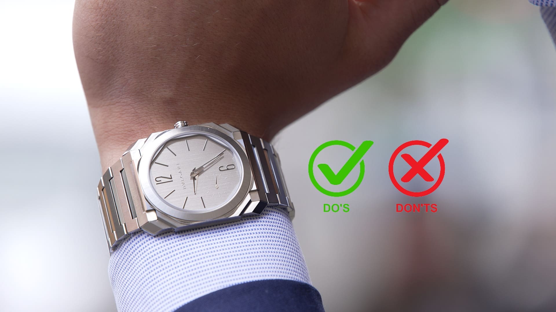
The ‘do’s and don’ts’ of Octo Finissimo design with Bulgari’s Fabrizio Buonamassa Stigliani
Zach BlassOf all the people we get to interview in my line of work, the most interesting people to sit down with are the watch designers themselves. To hear the philosophy behind a design from the creator, provides key insight into the past, present and future of a collection. Unfortunately, by the time I joined the industry it was not possible to have a sit-down with deceased legendary watch designer Gerald Genta – who gave birth to icons like the Royal Oak and Nautilus. But, dare I say, the Gerald Genta of the present could be Fabrizio Buonamassa Stigliani, Bulgari’s Product Creation Executive Director. The man behind the Octo Finissimo – a watch widely considered to be a modern icon – Fabrizio’s eye for design is among the best in the business. I had the pleasure of sitting down with him during Geneva Watch Days, and, while I was unable to find out if he was willing to sketch a Finissimo on my inner arm so I could run to the nearest tattoo parlour, I did get to dig into the ‘do’s and don’ts” of Octo Finissimo design with him.
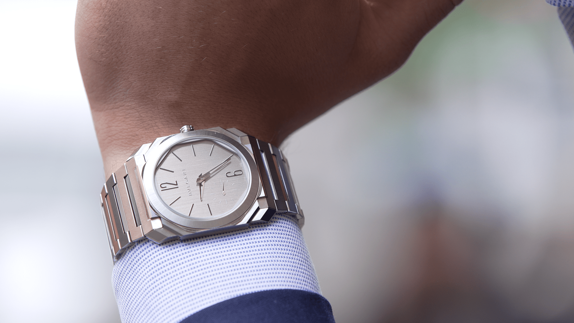
The do’s of Octo Finissimo design

Respect the framework
With its status within the watch collecting world, it is no longer an issue of establishing the Finissimo as a desired collection. It is more an issue of working to maintained its well-earned reverence. New models therefore need to walk a line between preservation and innovation.
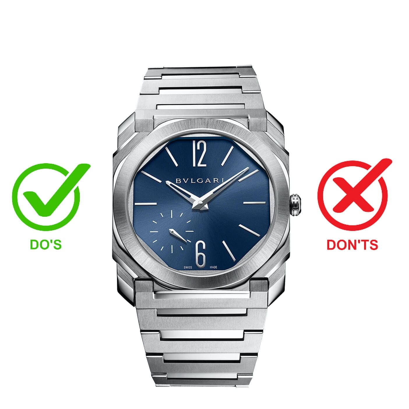
Asked what the parameters were for this, Fabrizio explained: “Honestly, I think it’s just to respect certain proportions, to respect the octagonal design… I’m very open to play with the Octo, but you have to respect some rules. The octagonal shape. That doesn’t mean that the shape of the watch must be the same. But when you see the watch, for example, you see the Octo Finissimo Ultra. It’s an Octo, but it’s totally different from the Octo Finissimo. So you have to respect this kind of proportions and the geometrical rules. And after that, you have to respect the way to play with materials and the way to play with movements.”
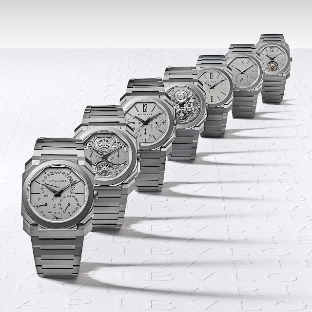
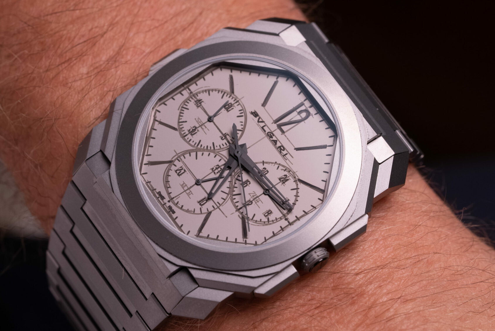
Complications are developed to meet the design, the design is never changed to meet complication

Fabrizio further elaborated that the design of the watch is not modified to meet the needs of complications. In fact, it is the opposite. “The watchmakers come into the office,” Fabrizio says, “And ask me which kind of complication I would love to have.” Most brands, and their designers, are given parameters to work within from R&D. Complications, however, must meet the design of the watch at Bulgari – their design-first philosophy a point of difference for the brand.
This philosophy, and incredible watchmaking know-how, is the reason the Finissimo line has broken so many records over the years – packing complication into an ultra-thin timepiece. And, it is not as simple as just squeezing the complication in. The use and display of its indications must be easy to use, another central tenant of Fabrizio’s Finissimo design rules.
The don’ts of Octo Finissimo design

No dial colours for the sake of adding colour, it must fit the story of the design
With regular colour trends it is easy to hop on a bandwagon. This, expectedly, is not Fabrizio’s style. In fact, when I broached the subject of popular dial colours making there way into the Finissimo, he mentioned how these days, when people request something, it is usually indicative that somebody else has already done it.
“We receive some requests from the market, ‘We would love to have a green dial.’ And I reply, ‘Please tell me why you need a green dial? Is there a specific meaning behind your green dial or is just because other brands make a green dial?’ Sometimes I have to fight because it’s very easy to sell today a green dial.”
This aversion to what has already been done before, in my view, is a core tenant that keeps the Finissimo’s status as a distinguished, innovative, and record-breaking collection.
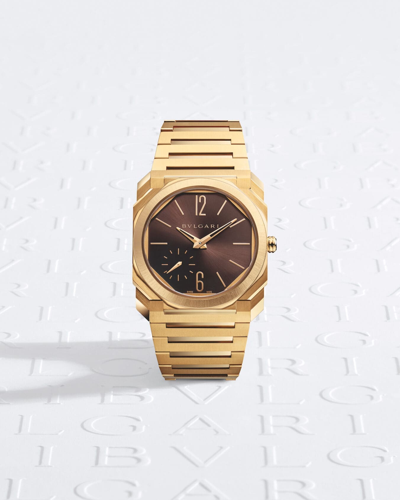
He did, however, give me insight into his thought process around coloured dials when I noted dark brown is not usually paired with yellow gold – as seen on their new limited edition Octo Finissimo for the US market. “Yes, green, it’s okay. But green and rose is a bit too much. Dark grey is a bit sad, so we have to find the chic colour, the sport-elegant colour, that talks a bit about ‘Italianity’ and the Italian way to mix and match colour,” Fabrizio says. “And dark brown, I think it’s okay because it means something interesting in our history. It comes from the earth, the tobacco dial, this kind of thing. It’s very elegant.”
Don’t hold your breath on Tiffany-stamped Finissimos
I must confess, part of me asking this question about co-branded dials was an attempt to manifest it into reality. But, while I may have initially been disappointed, his reasoning makes complete sense and has the utmost integrity. Fabrizio explained: “It doesn’t make sense for us. For Patek, it makes sense because it’s a long history with the dial, with the different logo, with the retailer. It is not a part of our, or the Finissimo’s story.” Will it never happen? Never say never I guess. But, if it were to happen, it would be safe to bet it was not Fabrizio’s idea.