


The best dials of 2020 – Part 2
Thor SvaboeEditor’s note: If you missed Part 1, make sure you check it out as it includes the likes of Moser, Chopard and Greubel Forsey. In the best dials of 2020 Part 2 we keep the eye-catching dials rolling, from affordable microbrands all the way to the most haute of horology. Enjoy!
anOrdain Model 2
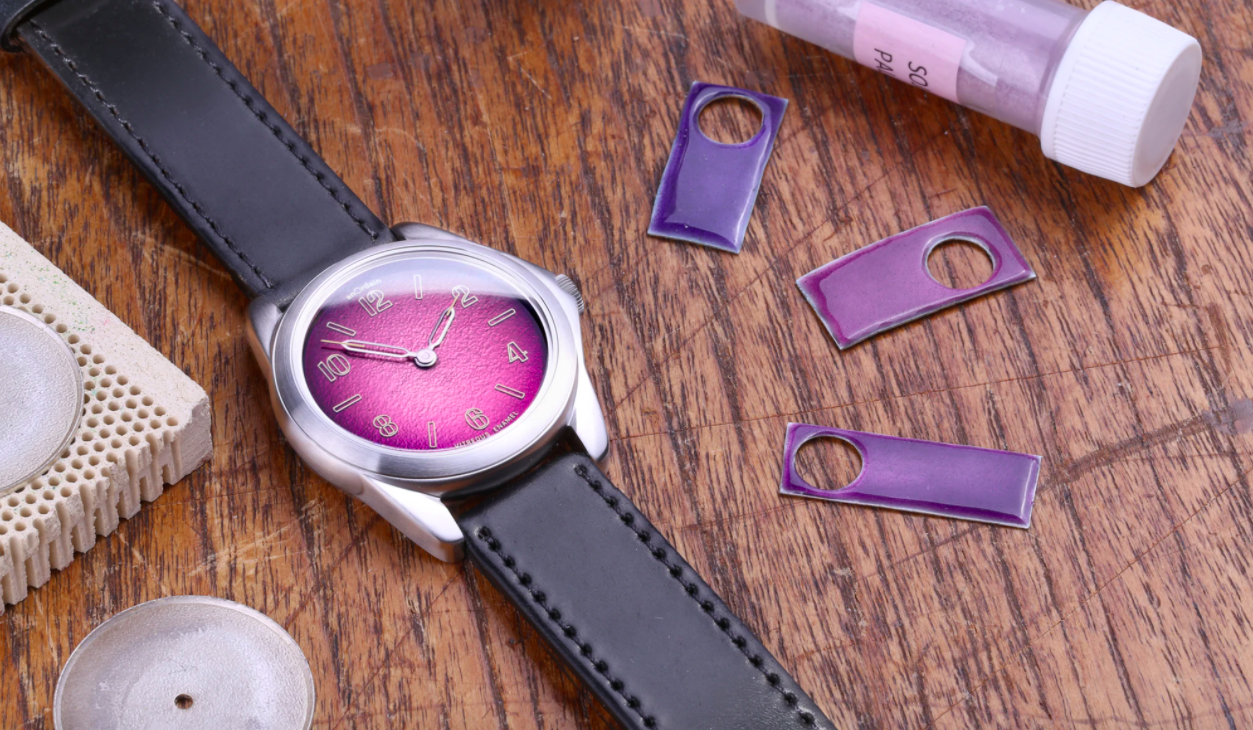
Time-consuming vitreous enamel with a high breakage quota, and a Scottish microbrand producing time-consuming small batches of 36mm watches. This quirky combination must have been a hard sales pitch to secure funding from the bank managers, but had they seen the end result, the arguments would be swiftly silenced. The deep lustre of the candy-coloured enamel dials of anOrdain has gained them a steady stream of followers, and it’s easy to see why their models sell out quicker than a hypothetical steel Sub in an AD’s window. Here is the purple fumé version of the Model 2 with its pebble-smooth 36mm case, a charmingly pointed crown guard of sorts, and that pretty face.
Find a good macro shot or YouTube review and you’ll be spellbound by the surface depth perception; glass being the closest likeness to the vitreous enamel, also known as Grand Feu. It is a labour-intensive process that takes a minimum of 12 hours in-house with quite a few discarded dials, but the ones that make it through alive are dazzling. A fat font marks the hours on the minimalist dial for a combination of fun and good legibility, and the skeletonised Swiss-produced hands seem to hold the thin luminous tip like the nib of a fountain pen. The delicious purple is but one of an array of colours, and inside the smooth case sits a solid hand-wound Sellita movement, under a caseback with the apt wording of Old Craft – New Hands. RRP: £1500
Ferdinand Berthoud Chronomètre FB 1R.5
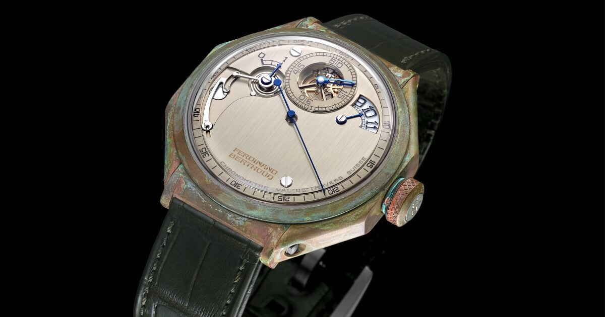
Octagonal cases, large marine chronometer inspired regulator dials, Haute Horlogerie to an exponential degree that most will not have had the pleasure of strapping to their wrists. This is technically not a 2020 dial, but as it is available now within the strictly limited editions of FB, it needs to be included. I can assure you, there are several pages to write on the exquisite details of the movement within this resurrected halo brand in the portfolio of Chopard, so back to the dial. The raison d’être of Ferdinand Berthoud is bringing back the knowledge of another time, where FB was the epitome of marine chronometers, with the regulator display an important part of the story.
As you have already noticed, the large dial consists of a calm surface of minutely striated, brushed nickel silver, with the large bronze blued seconds hand stretching into the slim rehaut, underlining the passage of time. The minutes are shown in a delicate open sub register at 12 with a blued 18k gold intricate minute hand. The hours pass quietly by in a beautiful crescent-shaped window at 2, with a fixed blued hand pointing to a traditional font on a rotating sapphire disc. There is a wonderfully engineered power reserve between 8 and 10 o’clock, which is as mesmerising as the large sweeping seconds hand. There are several visible screws on the dial, though these are bevelled and hand-polished to such a level as to transcend the fastener category entirely. This is craftsmanship on a level complex enough to save the movement for another full article, lest I fill several pages more.
Suffice to say, the complications include a tourbillon with a fusée and chain. My glossary might need a full reboot for the continuation were I to do this stupendous maritime timepiece justice. The typical octagonal case of Ferdinand Berthoud is delicately wrought, but envisioned through what I can describe as Haute Horlogerie vs Marine Steam Punk. The case is an intriguing mix of heavily patinated bronze as if rescued from an 18th century frigate, while the dynamometric crown has a titanium insert. The caseback is also titanium with a sapphire, or, as Ferdinand Berthoud puts it, the case is fitted with two watertight portholes in glare-proof sapphire crystal. I challenge you to look through the rear porthole for less than five minutes … it cannot be done. Price: USD$254,000
Grand Seiko SBGW262
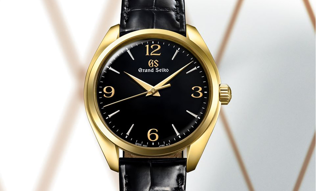
How can we include a Grand Seiko with a black dial? From the masters of polished details, texture, renditions of freshly fallen snow on Mount Iwate and dazzling colours? This is not meant to undersell the Japanese masters of intricate watch dials, but this solid gold SBGW262 is where black just isn’t black anymore, and applied numerals are made from the stuff of dreams. Grab a loupe and join me, where you will see how surfaces are not how they first appear. The case framing this seemingly simple black dial is a perfect solid gold case from the Grand Seiko Elegance line, the latest shape from Grand Seiko skirting the boundary between round and tonneau: a dressy slim 39mm and svelte 11.6mm case.
The heart is the spectacularly good 9S64 calibre, but this time it is about the dial, and you are still seeing only a demure black circle. Loupes on. The blackness has a depth of gloss unlike most shiny black surfaces you will ever lay your eyes on, courtesy of the Japanese Urushi lacquer technique. The Urushi lacquer is a natural substance from the lacquer tree, and the finest type Grand Seiko could source. This natural lacquer is mixed with iron to give it the deep, hypnotising blackness we can see here, an artisanal hand application that creates a magical perception of depth and a glossy surface. But missing here are Grand Seiko’s famed applied indices, hand polished to surgical-grade sharpness. These gold and silver coloured markings look printed … this is surely a lesser kind? This is Maki-e, a technique that can translate as “sprinkled picture”.
The raised arrowhead hour markers are made by applying powdered platinum, while the GS logo at 12 o’clock and the Roman numerals are also applied using the Maki-e technique, this time in pure powdered gold. Gold brushed and polished hands complete a dial that has now left you – if you are of even a slight horological fascination — in awe. A fleeting glance could not in any way be able to introduce you to the intrinsic level of craftsmanship that lies behind a seemingly traditional simple black dial. But stop, look closer and you will find one of the reasons Grand Seiko is close to our hearts. Price: AUD$45,000
Hublot Big Bang Sang Bleu II
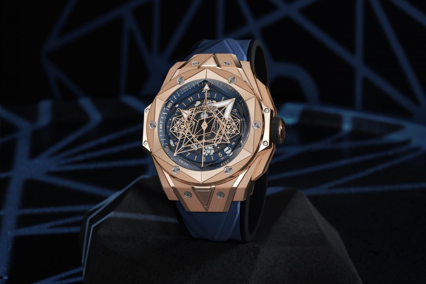
Blue dials, along with green, have been the strongest suits to wear in the wrist arms race this year as far as colours go, and gold has made a welcome return. As an antidote to clean lines and minimalist vintage aesthetics, I attest to sometimes enjoying the heady mix of cutting-edge modernism with a bit of maximalism thrown in for good measure. In Maxime Plescia-Büchi, with his multi-media slash tattoo studio slash art project, the Hublot Big Bang has been reborn as the Sang Bleu, here in its second iteration. The Sang Bleu II was presented this summer with a strong blue tint, an untold number of curiously cohesive angles, shapes and bevels, and in solid gold. Who cares if the bezel screws in this magical piece don’t line up perfectly with each other, my eyes are darting back and forth finding new shapes on the complex case construction, and that dial.
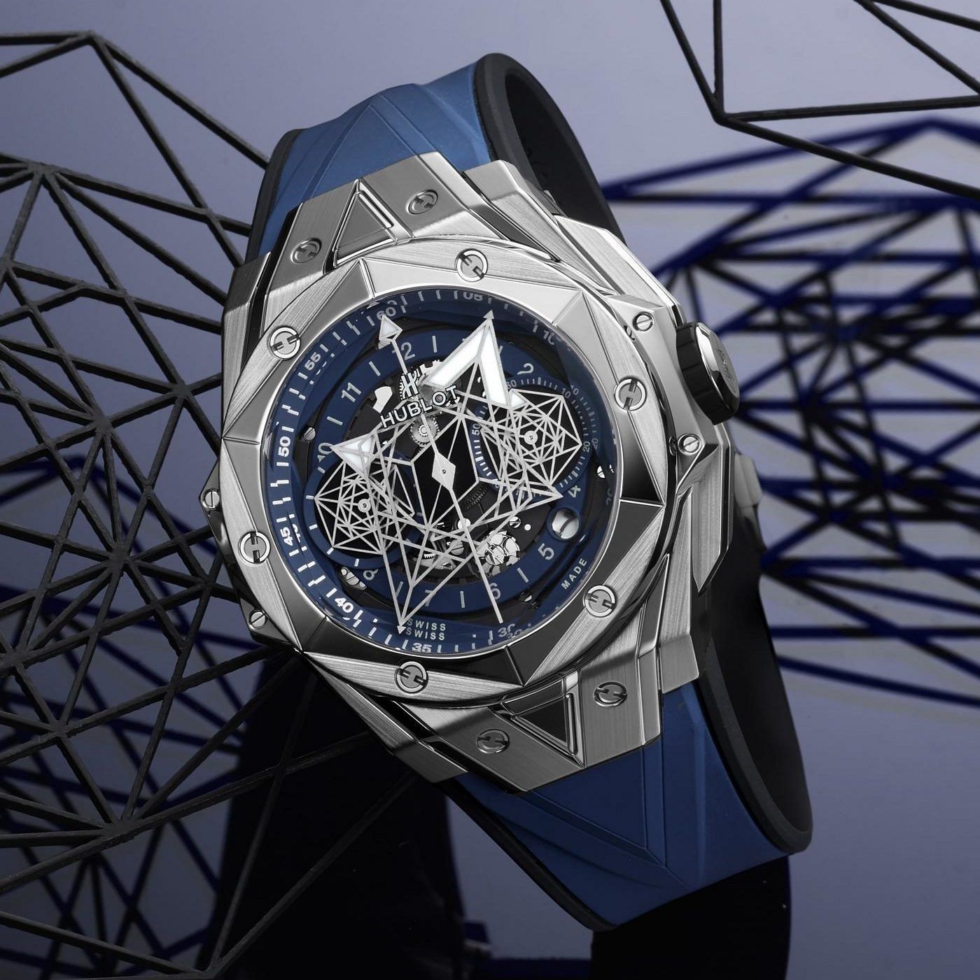
This is a skeletonised dial, in a deep blue to match the integrated rubber strap, with clean gold print for numerals and minute markings. That’s where normality ends (the case should have given you a clue). Intricate patterns make out the small and large rotating rhomboid skeleton shapes that constitute hands, with a semblance of readability with large lume-filled triangular ends clearly marking hours and minutes. Once you realign the association patterns in your hypothalamus to include these large objects as hands, you’re OK, but save the large central seconds hand, the chronograph function is more of a challenge to read. But — and this is a large but — it is an intricate and bold move even for Hublot, and it fascinates me deeply. See another King Gold Sang Bleu reference here, to see the way it plays in true light.
The Sang Bleu reference is, of course, associated with nobility, meant as a statement on contemporary culture and the altered perceptions of royalty and class. No matter which way you look at it, this is a statement piece and a horological work of art more than a teller of time. The Hublot HUB1240 caliber does a fine job pushing the large “hands” around the deep abyss-like blue, and at 16.6mm tall this a rather large 45mm watch, and in the limited King Gold version has got me hooked. Price: USD$47,300 in King Gold, USD$25,200 in titanium.
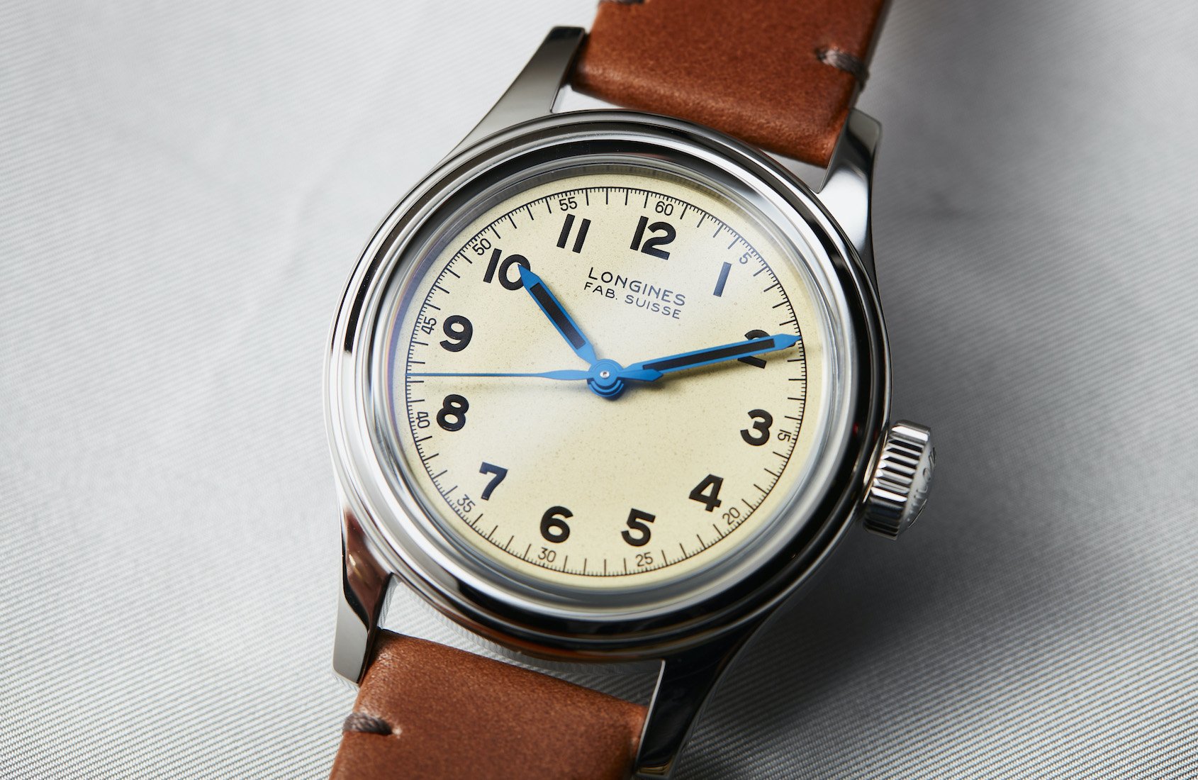
Longines Heritage Military Marine Nationale
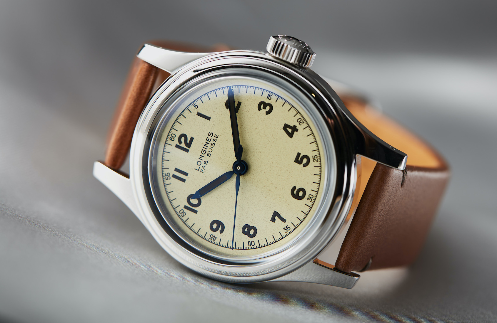
I will end my piece on the best dials of the year with beauty in seemingly simple form, of a cream and speckled nature. From the large, complex nature of Hublot, we turn the dial down plenty of notches to the Longines Military Marine Nationale covered in an article by James Robinson. This small and unassuming watch is for me a pitch-perfect symbiosis of proportion, history and a crisp dial with simple yet beautiful details that flatters its humble inspiration. This is a simple brushed case in steel with a polished top and bezel, deeply inspired by a Longines military timepiece made 80 years ago for the French navy. A 38.5mm diameter with a fat chunk of a crown makes for a perfect companion and time-telling tool, but that dial!
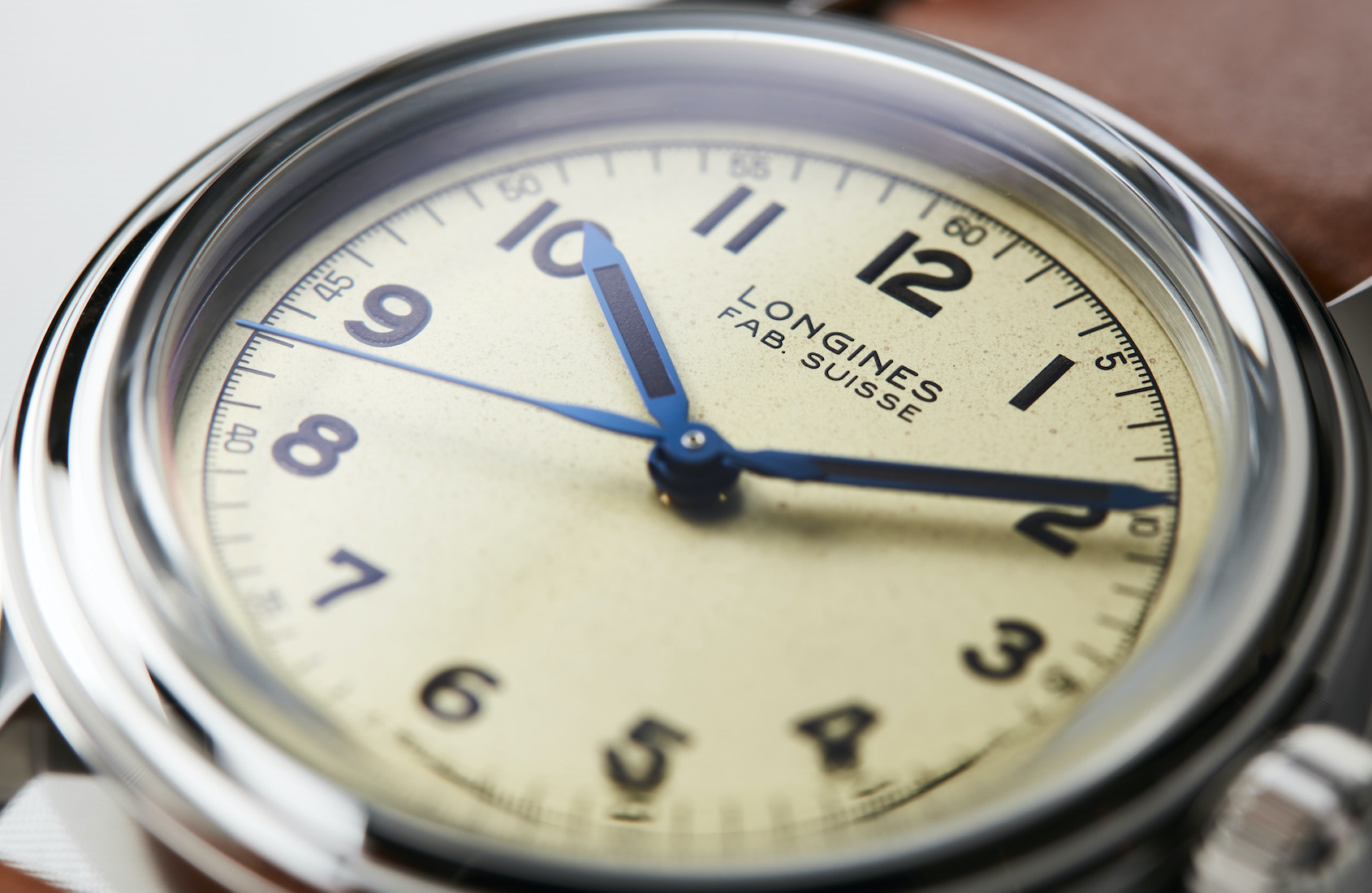
This is a cream-coloured dial of a slightly speckled finish, meant to evoke a faded military tool – yet in this guise somehow feeling luxurious. A very telling fact about this dial is that each one is unique. That’s right, Longines have perfected a manufacturing technique that effectively sprays the speckles in a random pattern that also intimates a layering. With this comforting palimpsest of time on the dial, a perfect match is found in the numerals and minute rail printed in black – a traditional font opening a small window to a bygone era, with large Roman numerals printed in functional black Super-LumiNova.
The elegant simplicity is underlined by the small discrete hand set in a very dark blued steel, black at first sight then glinting bright blue with a passing ray of sun. These are also filled with a matching black Super-LumiNova, extending simple elegance into functionality. Longines has also resurrected one of its simple yet beautiful fonts and the Fab.Suisse denomination as a final mark on what, to me, is worthy of a place in a compilation of beauty and complexity. Yes, God is in the details. May they be simple as well as precious and complex. Price: AUD$2950
I will conclude with a wry observation and one of strong hope for the future. If these dial visions can come out of the immense struggle that 2020 has been, with the downturn in Swiss exports and the temptation to play it safe, I can only imagine what 2021 will bring. For a dial man, the future is bright, glossy and spectacular.