Our sexiest watch shots of 2020 plus five tips to take better watch pics yourself
Thor SvaboeOK, honesty time: I’m a self-confessed dial obsessive. Don’t get me wrong, the hypnotic ballet of a tourbillon still tugs my heartstrings so much it hurts. But have that poking out of a masterful dial and I’m ready to sell my BMW. The dial is the face, the first impression and, for me, the absolute numero uno. A beautiful movement or a delicate brushed white-gold bracelet, somehow they don’t do anything for me without an equally stunning dial. So here goes. These are my favourite shots of watches Time+Tide published in 2020 and they include one of my own with a few tips. Dial-centric, moi? Yes, guilty as charged …
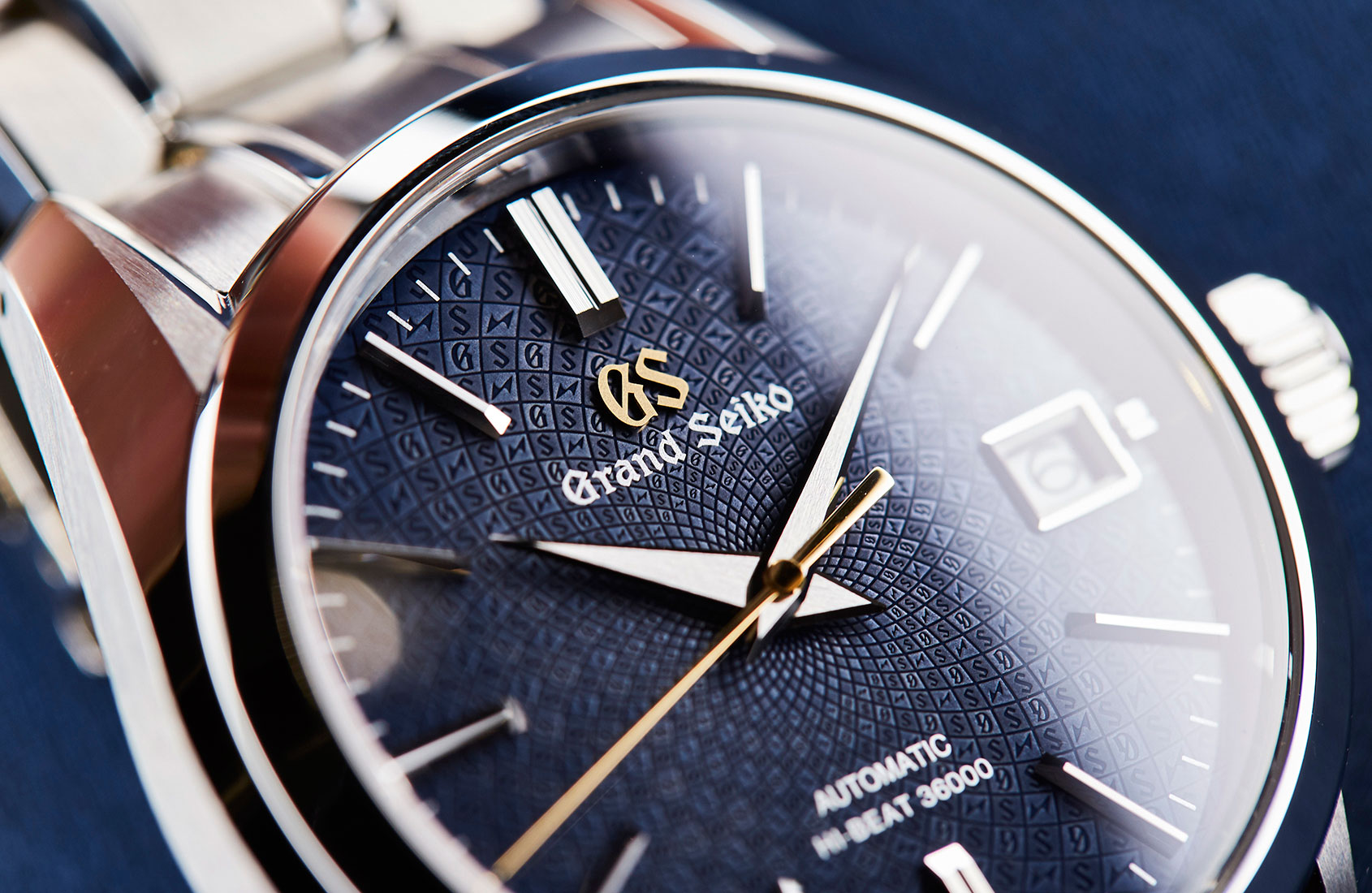
Japanese hypnotism: Grand Seiko SBGH267
Admittedly, this dial might not originate in 2020, but the story does, so technically I’m in the clear, plus you’ll forgive me anyway with that dial. One of my all-time favourite beauties from the Japanese dial wizards at Grand Seiko, it draws you in like a deep ocean whirlpool. Like all Grand Seiko dials it looks radiant even from a distance, but get closer and be prepared for a massive involuntary jaw drop. Yes, those are the GS initials and the Japanese Suwa symbols (Suwa Seikosha was the only Seiko factory to survive World War II) somehow caught in a mysterious maelstrom of deep blue. This shot profoundly encapsulates the incredible intricacies of Grand Seiko dials and why they repeatedly manage to deliver that knockout punch.
The return of the depths of Onyx: Girard-Perregaux Laureato Infinity Edition
I will confess to having the traditional Laureato on my wish list and it took all of five minutes with it on the wrist to fall in love. The delicious smooth brushed case and intricate bevelling carried onto one of the softest, most slender integrated bracelets plays brilliantly with the Clous de Paris intricacies of the dial. But then this version was shown during the Geneva Watch Days and left me spinning. With the unusual choice of the mysterious deep black of Onyx, and rose gold details, it blew me away. It simply elevated the Laureato to a special tier of glamorous, minimalist splendour with a certain je ne sais quois that has led me to look at the images and video time and time (and time) again.
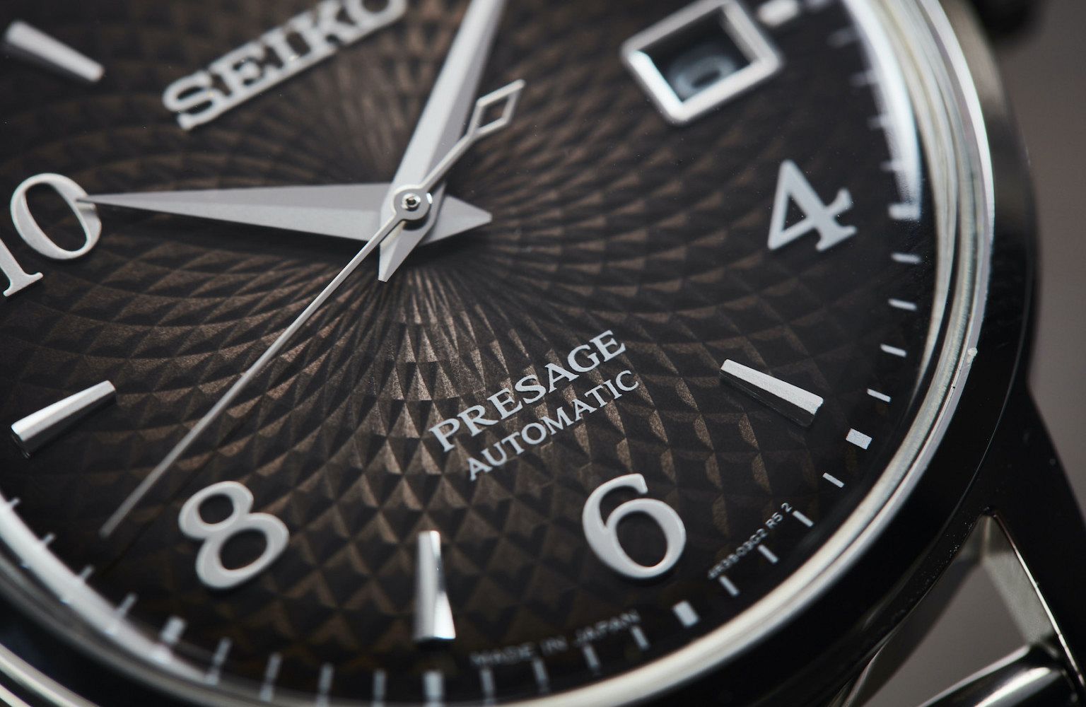
Chocolate delight: Seiko Presage SRPF39J
This shot illustrates perfectly how Seiko, in some mind-boggling way, manages to make sub $1500 watches still punch a long way above their weight. Last year saw the Presage series finding its feet as a grown-up brother to the mythical Zaratsu-polished references from Grand Seiko. The intricate dials on these three new Presage models have a combination of a fumé colouring, a dynamic three-dimensional structure and applied details that Jason Reekie has captured perfectly in this dark chocolate dial (which also happens to be my favourite).
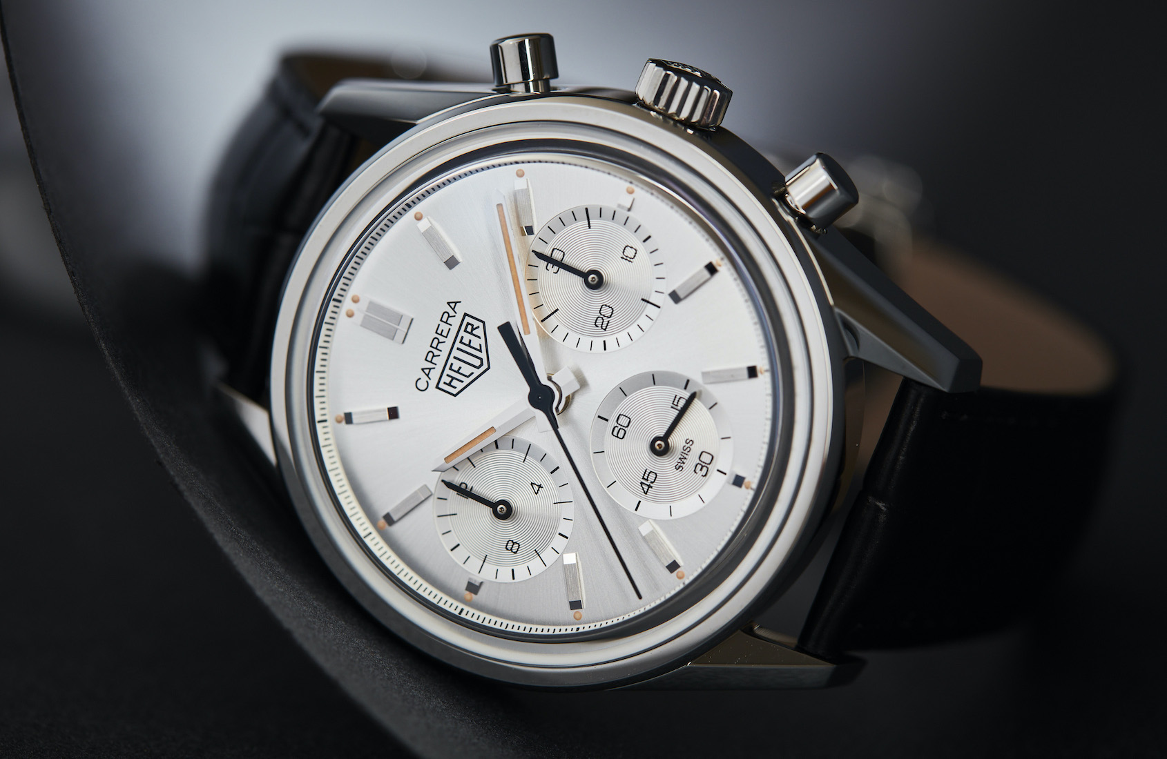
Silver service: TAG Heuer Carrera 160th Anniversary
Last year filled me with a renewed faith in TAG Heuer and this shot of the Carrera 160th anniversary reference in silver has a lot to do with it. TAG Heuer just might have produced one of the best sunray silver dial finishes of the last 10 years. It’s crisp with a capital “C”. With just the right amount of white in the silver mix, and a smooth not-too-glossy sunray finish, it captures the clean design and original spirit of the late ’60s Carrera to a tee. With the clean sharp case it might even be the perfect all-round watch design from TAG and is as sexy as it is photogenic.
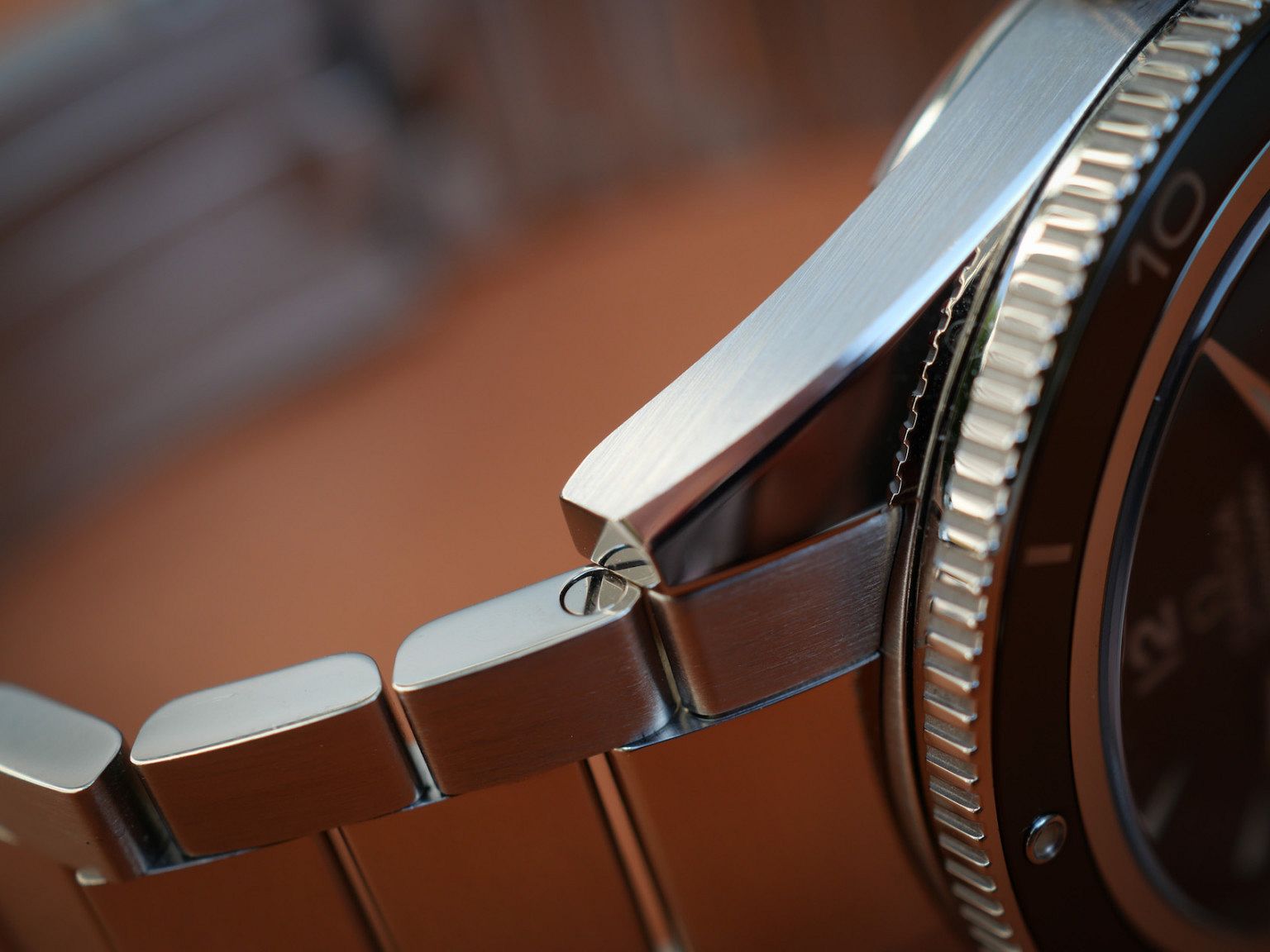
Extreme close-up: Omega Seamaster 300
Why is this shot of mine here, where you can’t even see the dial? And why am I cheeky enough to include one of my own? Well, photo tip time … This Omega Seamaster 300 was sharp, compact and proper delightful on the wrist, more so than I expected (OK, I loved it!). But the anti-reflective coating on the crystal made it a difficult beast to capture, so here are a few tips that made this possible.
1. Buy a polarising filter for your camera. Placed in front of the camera lens this will help you to manage reflections or suppress glare and make watch photography a lot easier.
2. A macro lens is absolutely vital to make the quality features of a watch come alive. They enable you to “feel” the textural details and highlight every surface and rivet. The Seamaster macro shot was in natural light with a micro four thirds 30mm 1:3,5 macro lens on a Lumix GX9.
3. In terms of lighting, the best-case scenario is sunlight, but outside and in a corner with no direct sun rays (boy, can they mess up any shot).
4. Brush, polish and check for any flecks of dust. If possible get an aerosol air-duster – it will really help. This cleaning process was necessary to capture the finer details of the lug/bracelet, and I managed to catch the screw-pin reflection in the square-cut end of the lug.
5. Less is more – you don’t need to capture an infinite number of angles. As a watch photographer once revealed on a podcast, which rings true for me, you’ll only ever use a maximum of 20 shots, and with this watch I’d shot probably 72 frames, while ending up with nine to 10 good ones to run through Lightroom. Personally, I’m an honest hack keeping the edits to a minimum and preferring to spend more time dusting and lighting the shots than cheeky photoshop edits.


