OPINION: Is this the most important (and overlooked) element in watch design?
Felix ScholzCase profile. There, I said it. It might not be as sexy as the movement or the dial, but in terms of real-world user-friendliness, it’s the kingmaker or deal-breaker.
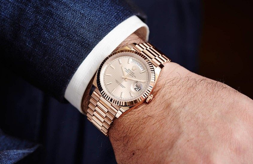
The problem is, watchmakers and fans are conditioned to a very top-down visual approach of watches. Look at any brand’s site, or most of the watches on Instagram, and what do you see? Dials. A whole lot of dials. And, honestly, it makes sense. The top-down dial shot encompasses most of what a watch is about. The dial is the visual star, and a typical wrist shot at least gives you some sense of what a watch looks like on the wrist, but it doesn’t really give you any sense of what it’s like to wear a watch on the wrist, because —and this seems bleedingly obvious to state — a watch is a three-dimensional object.
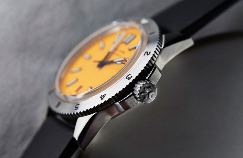
At T+T we’re pretty big on trying to get you as close as possible to what a watch is like IRL, which is why we spend a lot of time on our video reviews, and are occasionally guilty of the odd bit of wristroll spam. Because proportion matters, and in an age when we’re buying watches online, sight-unseen, understanding those proportions matters more than ever. I won’t name names, but I can easily think of half a dozen watches that I love in theory and in pictures, but as soon as I strap them on my wrist, my heart goes cold. Sometimes you can understand the watchmaker’s decision — they might have a tall movement and hand stack to deal with, and be limited by what they can do case-wise. That’s an understandable compromise. But in other examples it’s just bad design.
Look at a watch in profile, see how that profile works on an actual wrist. That’s how you separate the wheat and the chaff of watch design.
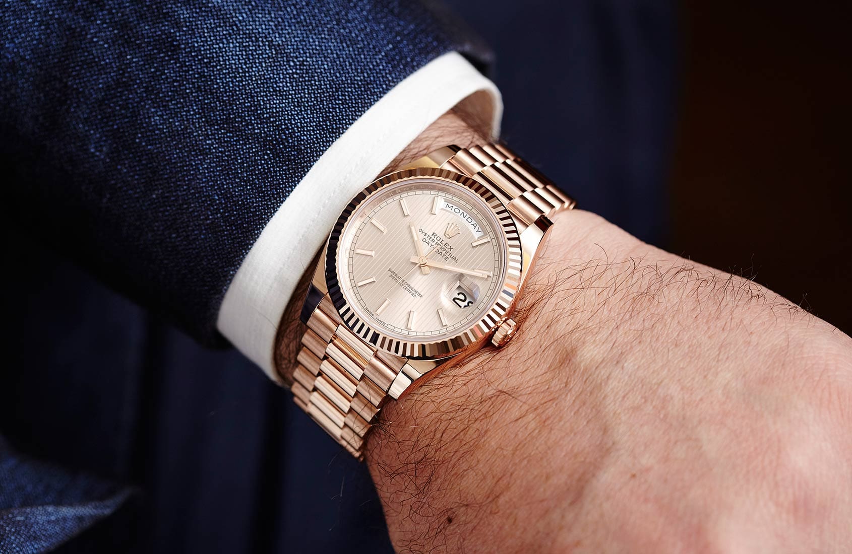
But it seems that thickness and profile are finally getting the attention they deserve. Rolex, who really understand the importance of the on-the-wrist feeling, gave their DSSD a fairly nominal upgrade at Basel this year, making the bracelet wider and tweaking the proportions a little. The result is a watch that, to my unscientific mind, feels exponentially better on the wrist.
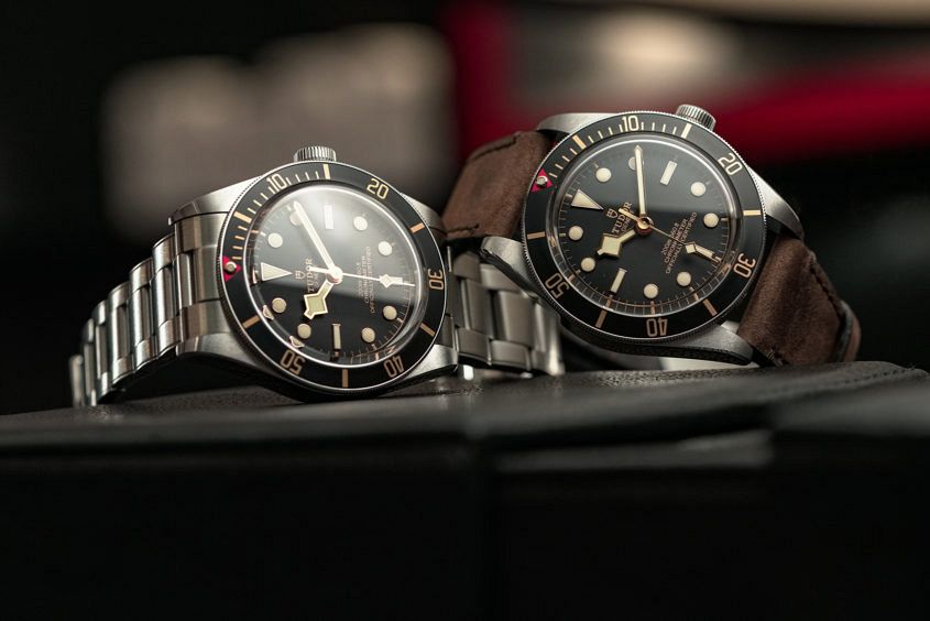
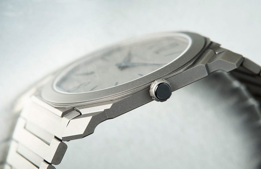
The same can be said about Tudor, who pleased critics with the introduction of the Black Bay Fifty-Eight, and while the slightly smaller diameter is a great option, most people I know are *really* excited about the slimmed down, far less slabby case design. And if you want to take things to extremes, how about Bulgari? Their Octo Finissimo is a watch with barely any case profile at all, but when I spoke to their design boss Fabrizio Buonamassa Stigliani about it, he said they could have gone thinner, but they wanted the Octo Finissimo to be a watch that you could actually wear. And, by golly, he’s right — that barely there Bulgari comes down on the right side of the thin v fragile line.
But don’t take this as an indictment against thick watches. I’ve got nothing against having a tall watch on the wrist. What I object to is a badly designed thick watch. Sometimes you can turn a chunky, barely machined slab of steel on the wrist into a deliberate design decision (like this), but otherwise there’s a lot to be said about smartly engineered case backs and lugs that ensure the comfort matches the heft (Panerai Radiomir, take a bow).
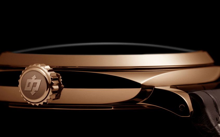
I guess I’ve got two main messages here. First of all, to the consumer: wherever possible try a watch on the wrist first. Wearability is key, and case height and profile is a key factor in that equation. My second message is to the people making watches: never forget that the things you make are intended to be worn. And while in a few cases I’m willing to concede that watches can be ‘worn’ in the same way as haute couture is worn, that is the exception. You want people to love and buy your watches and to wear them proudly? It’s not enough to pop an in-house movement in and mix it up with some new dial options and a new marketing angle, you need to make watches that work on the wrist.


