INSIGHT: Designing A. Lange & Söhne – part 2, the detail in the dial
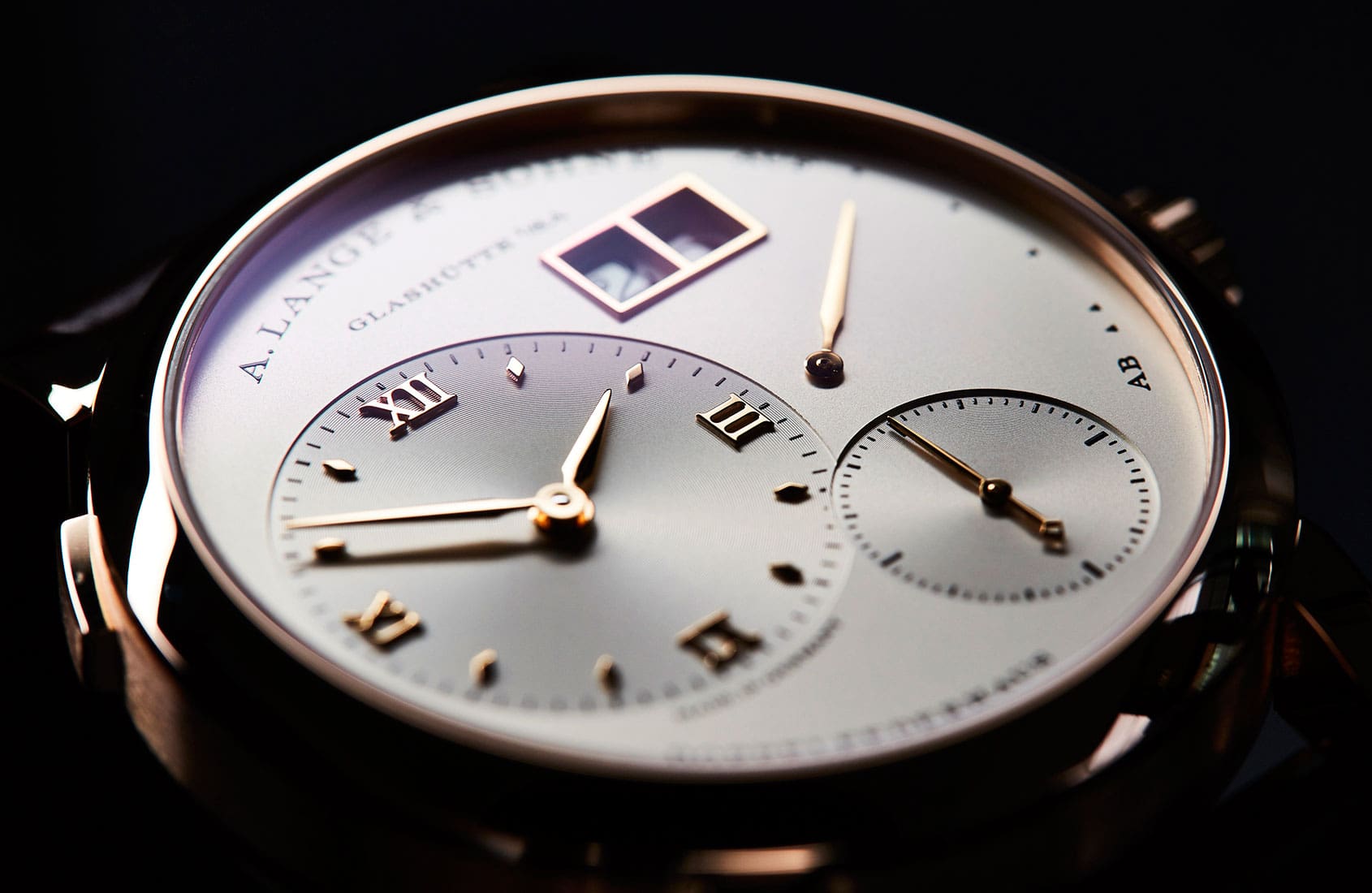
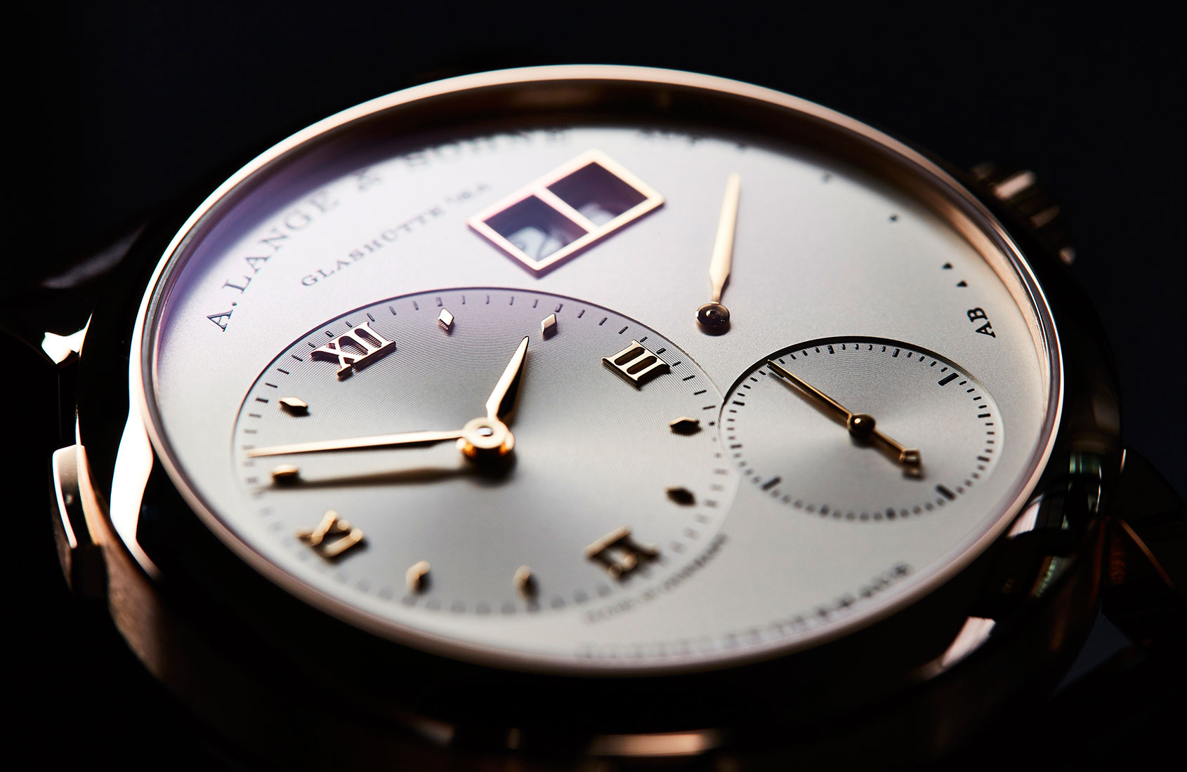
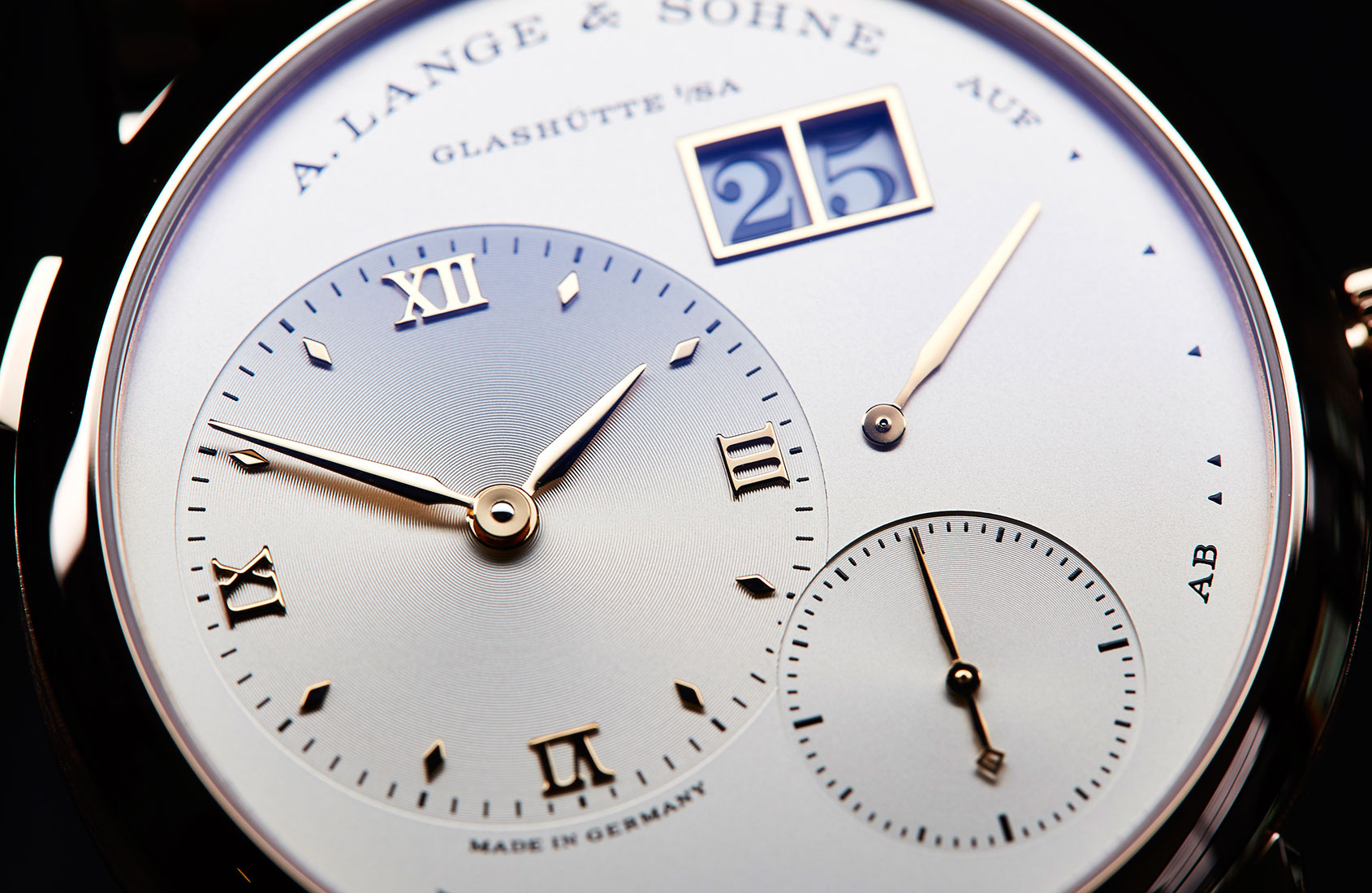
Felix ScholzThere are few dials as instantly recognisable in the world of modern watchmaking as that of the Lange 1. This circular watch, with its off-centre hours and minutes dial, subsidiary seconds, power reserve and that instantly recognisable big date. In the opinion of Caragh McKay, watches and jewellery director at Wallpaper* (and founder of McKay Gurney), this distinctive dial is a real classic. “The Lange 1 is the core model for me … the codes are such – clean, big, sublime finishing – that you’d always recognise a Lange design across a watch-crowded room. I’m always drawn to the sheer clarity of their dials – the proportions seem slightly out of kilter, but work as a whole.”
A modern icon then? Well, the ‘i’ word is a loaded one in watchmaking, prone to hyperbole and abuse. Anthony de Haas, Lange’s Director of Product Development, has issues with it:
“People say we design icons, but we don’t. By definition, that is not possible. If a watch becomes an icon it happens over time – or it does not. The most we can do is have a good feeling about the design.”
And while it’s hard to disagree with de Haas’ sentiment, the feeling, in 1994, about the design of the Lange 1 must have been very good indeed.
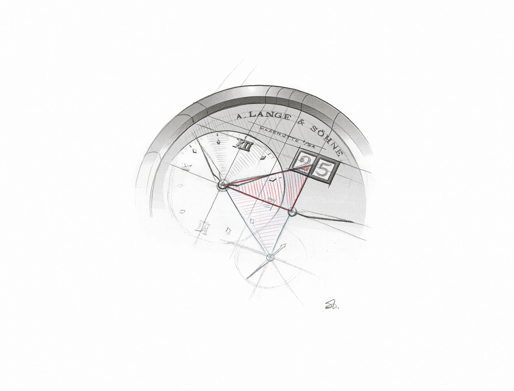
The dial is key to the success and appeal of the Lange 1, though from first blush the success of this odd, decentralised and unbalanced face seems far from a sure thing. Look closer though and the foundations for the Lange 1’s success become apparent: the golden mean, a mathematical equation expressing a geometric relationship. This ratio appears in both nature and in design, and is generally agreed to lead to harmonious, aesthetically pleasing design. After all, if it’s good enough for Le Corbusier, it’s likely good enough for Lange. But again, Anthony de Haas stresses that while this by-the-book approach to good design is important, it isn’t the be-all and end-all. “We understand the importance of the golden ratio, but while we look at it, we don’t work with calculations to achieve it. It’s a question of how it is to the eye.” But it appears that the eye – at least the highly trained eyes at the Lange manufacture – don’t lie. “You can line up 10 watches on a desk and the one you will pick up as being somehow more pleasing, more ‘right’ is because of the work done with the proportions.”
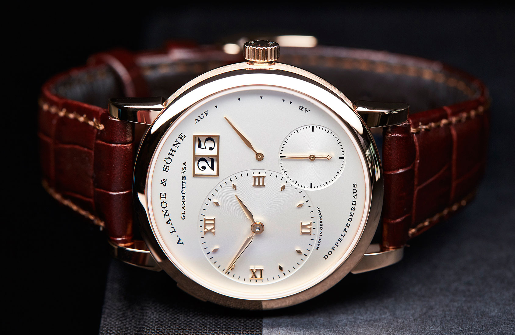
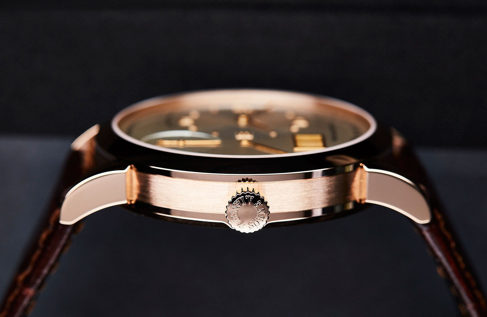
The design constraints for the dials of the Lange 1, for example, are unforgiving. Tino Bobe, Director of Manufacture, explains: “There are very strict rules for Lange 1 dials. Isosceles triangles link the central points of hours and minutes, seconds and date. The asymmetry is balanced and anchored by the ring of text around the circumference of the dial.” The strength of this design means that the watch is an exceptional blend of classic and contemporary.
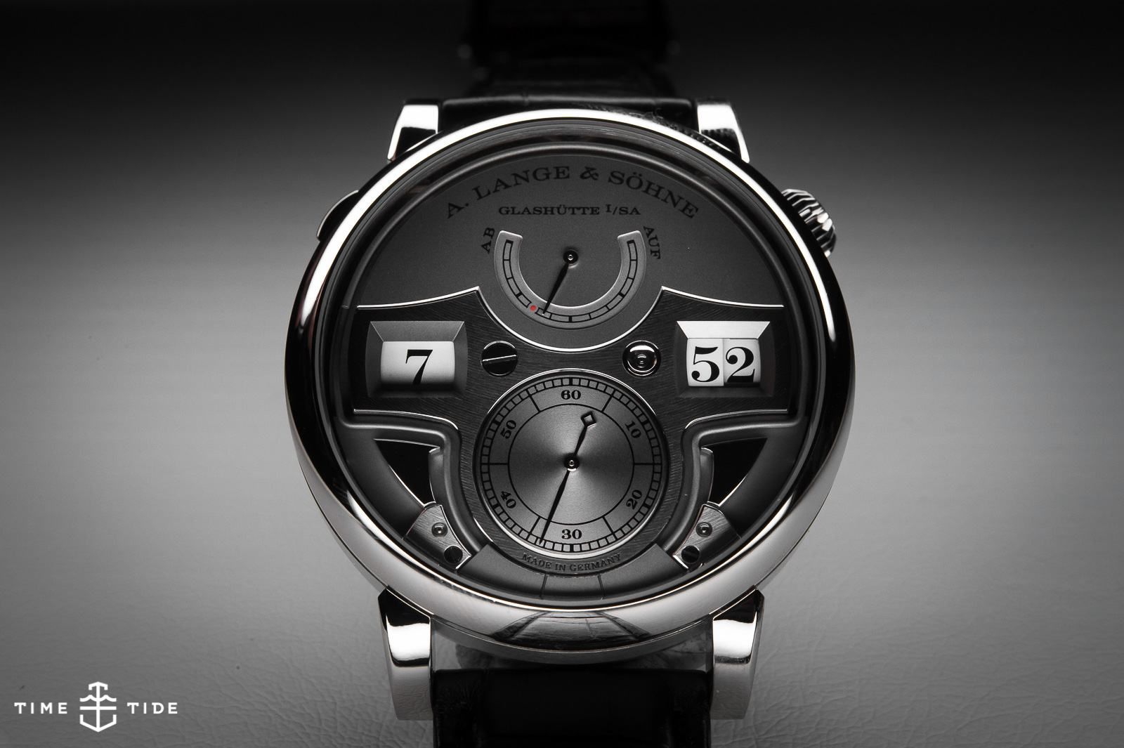
When considering Lange’s dial design, there’s one – perhaps surprising – design consideration that trumps all others. The movement. But, on reflection, this makes perfect sense. In the early days of A. Lange & Söhne, the brand operated on a philosophy of one-watch, one-movement, meaning the design of a dial was intrinsically linked to the architecture of the movement.

Bobe explains the challenges of this approach: “The development of every piece always involves ping-pong between the technical design of the movement and the aesthetic design of the outside. We need to have both of these competencies in-house, working side-by-side. Often the two sides are fighting to reach the best solution.” And if the technical considerations are part of the seemingly surface-level dial design, of course the counter is true:
“Our movement designers already think about aesthetics, there must be beauty in the movement as well as on the dial. Every watch has a sapphire caseback, so the designers must think about how beautiful the movement can be – the architecture, not just the surface treatments.”
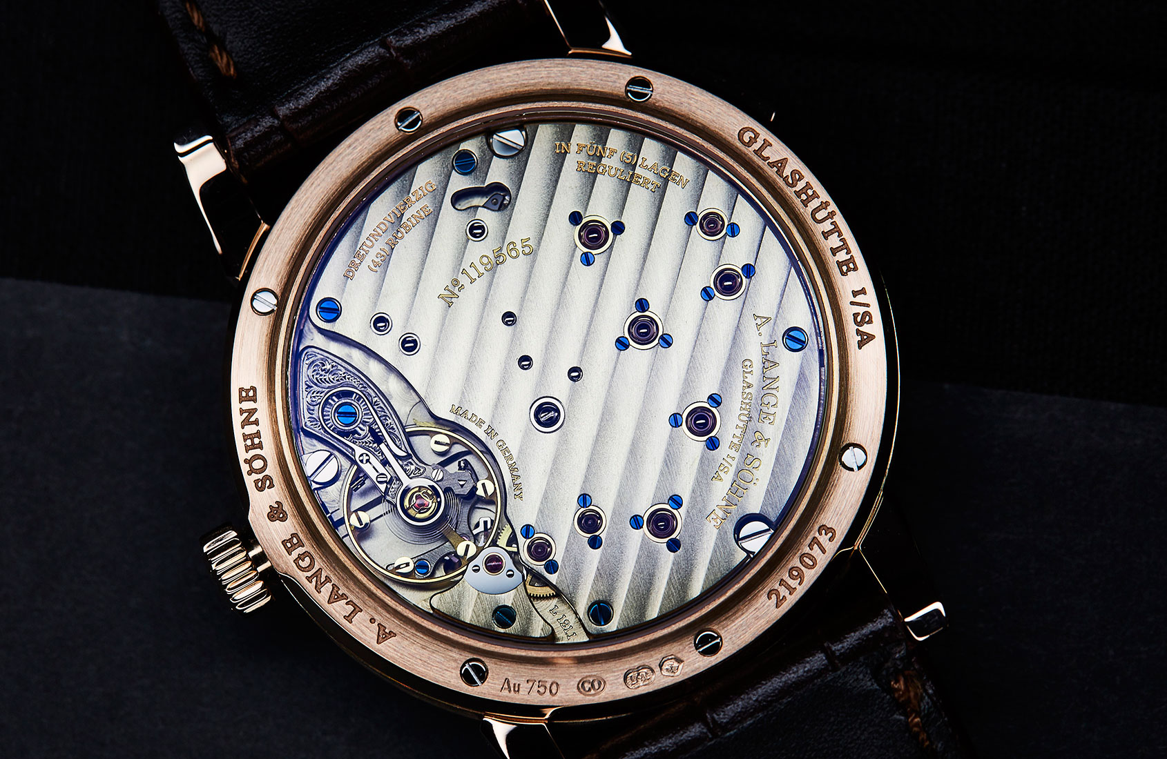
Clearly, given the near-rapturous praise heaped upon the almost sculptural calibres of Lange, the movement designers are very much doing their job, Andy Zhang, Australian-based collector and co-founder of Lange Nation, explains the appeal: “The appeal is the finishing, they’re big movements in thick cases, so the effect is very three-dimensional. The decoration is better than Patek, especially for the chronographs.” But Zhang’s love extends beyond the mechanics; he highlights two models as being particularly special: the enamel-dial of the Richard Lange “Pour le Mérite” and the Zeitwerk. On the latter: “Lange do elegance in a very harmonic way. The Zeitwerk is just a jump hour with a power reserve and small seconds, but when you look at the proportions, you know you won’t get bored of that dial.” Anthony de Haas gives a glimpse of the work that goes into achieving this sort of perpetual appeal: “The t-shirt shaped bridge (as we call it in-house) with two time windows is a functional movement part … that’s why one side has a fixing screw and the other has a jewel hole. It’s functional, but this detail also adds some visual ‘fire’ to the design. We tried about 500 bridge shapes before we got it.”
The pursuit of the perfectly balanced dial comes at many costs, be they the restraint placed upon the dial design by the movement architecture, or the adherence to a strong visual language, full of seemingly tiny details, but integral to Lange’s identity. And then there are the costs involved in developing custom parts. Take, for example, the Saxonia Thin in 37 and 40mm variants. Seemingly identical watches, except for the slight size change, but that change meant that the hour markers and hands are unique to each model, differences of a tenth of a millimetre, but still differences that require new tooling. And then there are the moon phases. The moon phase disc on the recently released black-dialled Saxonia Moon Phase is completely different to the previous model: darker, more midnight, in keeping with the new colour scheme. It turns out (again) that the seemingly simple is incredibly complex.
This incredibly intensive, detailed approach lies at the heart of the appeal of A. Lange & Söhne. Everyone I spoke to for this series of articles, from die-hard Lange lovers to seasoned journalists who have looked behind the curtain of many manufactures, and people who have had very little prior exposure to the brand, pinpointed the care and attention to detail as being at the heart of the German brand’s appeal. Eric van der Griend of Australian Lange distributor, Watches of Switzerland, sums it up: “They’re a very traditional brand, but one that’s innovative in a lot of ways. There’s young thinking at the business, which is very exciting. In some ways, having to kick-start in 1994 had a lot of benefits, compared to being in the same factory since the 1900s. They’re progressive, but steeped in tradition, but they’re always looking to improve. They won’t do something unless they can do it exceptionally well. There’s no compromise.”