INSIGHT: Designing A. Lange & Söhne – part 1, design approach & method
Sandra Lane“Money likes silence.” Several years ago, a Russian collector by the name of Nikolai (he prefers not to publish his surname) was telling me why he’s so keen on A. Lange & Söhne, and I was struck by that part of his reply. While he meant it to sum up the ‘stealth’ appeal of Lange’s designs (discreet elegance; the antithesis of vulgarity), it also begged the question: what does make Lange so distinctive?
A. Lange & Söhne is not what we think of as a “design brand” (the term suggests something altogether more conspicuous or self-consciously groovy) and yet its design language is not only unmistakable but also an intrinsic part of its being.
We live in the Age of Noise: advertising noise, entertainment noise, social media noise – all adding to the general cacophony of daily living. So, given that a Lange watch announces its specialness with a whisper, not a shout, how does it make itself heard?
The very quietness of Lange’s design is the answer, I think. A couple of years ago, Paul Tange, a prominent Tokyo-based architect and keen Lange collector, summed up the beauty of Lange’s design to me in the simplest terms: “Aesthetically, the watches are so pleasing – like a building that will wear well over time.” Yes, those designs seem to evince an inner strength – an assurance that all will be well with the world.
Today, it’s worth remembering that “design” plays a way more important role than in the past. It’s part of branding, which, itself, is a 20th-century construct. Even several decades into last century, watches were primarily about timekeeping – with beautiful cases and dials being a bonus (and, in the case of wealthy collectors, commissioned individually). In that ‘timekeeping first’ sense, as we will see, Lange’s approach to design could almost be regarded as anachronistic. If it were not so modern, that is.
The design philosophy of A. Lange & Söhne today was established in 1990 when A. Lange & Söhne was re-born, and it’s a direct expression of Günter Blümlein and Walter Lange’s lofty ambition. Beyond simply making the world’s finest watches, they set themselves a mission to restore the prestige of German (and specifically, Saxon) watchmaking to equality with its Swiss counterpart – a status it had once enjoyed. Therefore, a Lange watch would not – could not – be “Swiss-like”. In every respect it must be Teutonic: straightforward, a little bold, confident, solid and comforting – “like the sound of a Mercedes door closing”, it’s been said.
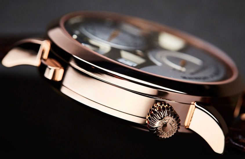
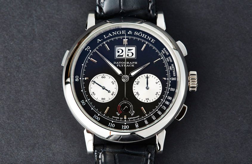
Shut your eyes and hold a Lange watch. Any Lange watch. It’s just a little heavier than others – that heft coming from the case material and thickness (a Datograph Auf/Ab, for instance, weighs 150 grams). Eyes still closed, turn it over in your palm: feel the straight case-sides, the sturdy lugs with their confident curve, the smoothly polished dial-side bezel and the deeply engraved case-back bezel. But it’s not just a case of heavy metal: even a Saxonia, despite its thinness, still feels just a little different from its Swiss dress-watch counterparts. Equally refined, just different.
Open your eyes and, of course, there’s a whole world of iconography and detail that makes Lange uniquely Lange. Much of that comes from the 170-odd years of heritage that the company could draw on – an important part of establishing legitimacy for the fledgling business in the early 1990s.
The value of this is apparent even to those encountering A. Lange & Söhne for the first time. “Drawing on heritage is very important as it expresses the brand’s deeply held values – and, as well, such a history provides a lot of detail and richness for its designers to work with,” says Amsterdam-based designer Karin Krautgartner, the Creative Director of Marcel Wanders Studio. However, she cautions, this must not mean just copying the past.
“Lange seems to have identified crafts, finishes, patterns and shapes that are intrinsic to its heritage. Then it has done something absolutely necessary: it has adapted them through the use of new materials and techniques.”
A case in point: the famous clock created by the company’s founder, Ferdinand Adolph Lange, together with Johann Christian Friedrich Gutkaes for the Semper Opera House in Dresden in 1841. Modern Lange adopted the idea and adapted it to create the outsize date display – a breakthrough in fine watchmaking when introduced in 1994 and one of the brand’s strongest signatures to this day.
While many legacy watch companies emphasise the value of their unbroken history, Eric van der Griend (Chairman of Lange’s distributor in Australia, Watches of Switzerland) suggests that Lange’s four-decade hiatus was a benefit: “Because they had to re-establish themselves, it means they established a new way of thinking. They were able to bring a whole new view to things that [they may not have] if they’d been in the same factory since the 1880s.”
Certain decorative elements aside, though, Lange design doesn’t start with making nice shapes or drawing distinctive lines. It springs from engineering. “We go very deep,” says Anthony de Haas, Director of Product Development. “Lange IS the movement. The habillage – the nice looking design you see on the outside – comes second.” (Just as in the “pre-brand” days of watchmaking, then.)
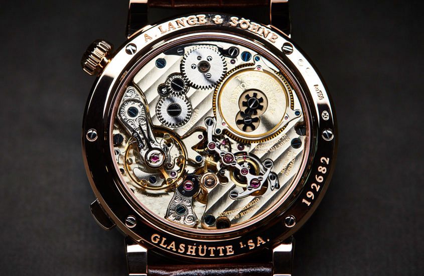
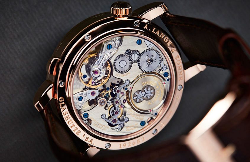
That movement-first approach explains another highly distinctive element of modern Lange design: the three-quarter plate. Ferdinand Adolph Lange developed it in 1864 to enhance the stability and robustness of the movement, and Lange today continue to use it for the same reason. (As a pioneer of German watchmaking, Ferdinand Adolph Lange encouraged other makers to use the three-quarter plate, among other ideas, which today have become part of the collective Saxon watchmaking identity.)
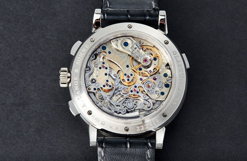
Nevertheless, A. Lange & Söhne have their own way of approaching the movement aesthetic. The three-quarter plate has curves and cut-outs that are not strictly necessary (unless you count offering a clear view of the escapement including the hand-engraved balance cock – and the opportunity to do microscopically perfect anglage a necessity). The design-architecture of Lange chronograph movements is also distinctive – an ensemble of strong curves that we could identify as Germanic, compared to the more French style of, say, Lemania. Even the chronograph clutch lever has a ‘Lange’ look that’s not quite the usual shape.
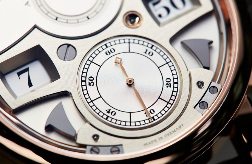
“These are not functional requirements; we do them purely for aesthetic effect,” says Robert Hoffmann, Head of the Zeitwerk team. “To us, it’s important that even the very technical heart of the watch is pretty – this is what A. Lange & Söhne stands for.” He lists several more aesthetic effects in the Zeitwerk’s movement that began as answers to technical problems: “The jumping discs need massive surges of energy, which meant that we needed a constant-force escapement – a remontoir-type mechanism that uniformly delivers energy to the escapement. The bridge holding the pivots for the remontoir could have been T-shaped but we decided to give it an anchor shape with many curves. It just looks nicer. And, as well, we decided to blue the constant-force spring – it adds visual depth and colour contrast.”
While design starts from the inside, it’s not a matter of just plunking the indications on the outside in places that correspond to the movement, points out Tino Bobe, Head of Manufacture. “The development of every piece involves a lot of ping-pong between the technical architecture of the calibre and the aesthetic of the outside. We have both of these competencies working side-by-side and often there are fights to reach the best solution.”
As Paul Tange observed, “An architect and a watchmaker have a similar approach to precision, in terms of both function and form – albeit on a totally different scale. What’s so remarkable about Lange is that it plays the aesthetic and mechanical sides together in such a fine way.”
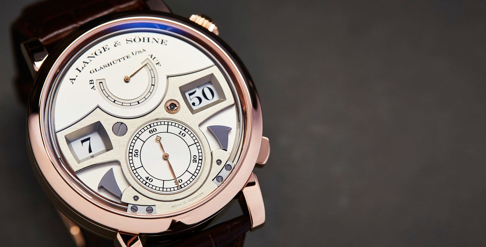
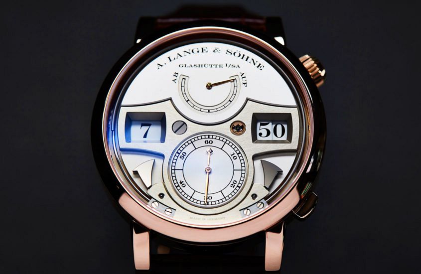
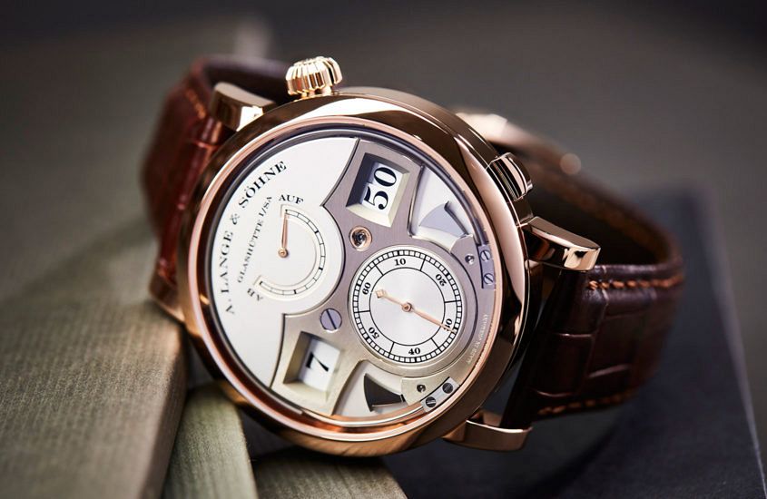
Perhaps the most extreme example of playing the two sides together (and “fighting to the best solution”) was the development of the Zeitwerk. It was Lange’s first attempt to show a major technical innovation on the dial side. Digital displays had appeared in historic pocket watches (as vertically stacked windows), and the outsize date was digital. The difference was the sheer scale of the thing (the numbers had to be easily read without glasses) and the fact that Lange wanted the time to read from left to right, as people had become used to doing with electronic digital displays.
“That idea [reading left to right] changed everything,” says de Haas. “There was no way we could follow or even adapt conventional thinking on the movement design. It was a very bumpy road. We had to create a completely different watch. For the bridge alone we tried about 500 different shapes before we arrived at something that was well proportioned, not dull, didn’t make the watch thicker …
“The lateral readout also determined the crown position at 2. We didn’t try to hide the fact that we couldn’t keep it in the normal 3 position but chose to make a feature of it at 2.”
Collector and watch historian Peter Chong, who founded the Lange Owners Group in the 1990s and is today editorial director of Deployant, recalls: “It was bold and looked avant-garde – by the standards of a lot of watch designs at the time (2009), not only by Lange standards. But to me it is simply a different dialect – made so by the absence of hands. It’s like a cousin to the other lines, rather than a brother.”
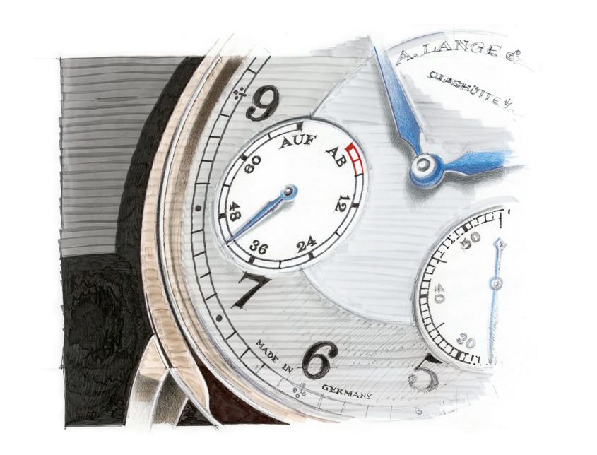
What the Zeitwerk shares with all Lange designs is a fascinating tension between simplicity and complexity, balance and asymmetry. It’s there on almost every watch, if you pause to notice – from the deliberately off-centred Lange 1 and Richard Lange Jumping Seconds to the at-first-sight symmetrical Datograph Auf/Ab (go on, see if you can spot it). And, as every designer and architect will tell you, it’s a very hard trick to pull off.
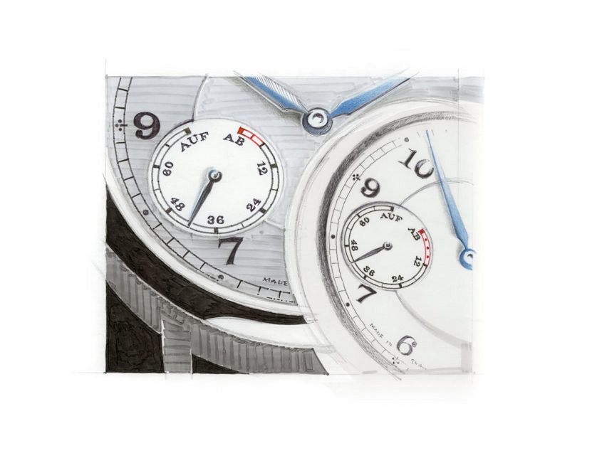
“It can take endless trials and drawings and prototypes,” says Karin Krautgartner. “Scale is so important, so is the distance from which the object will normally be viewed. And visual balance is not necessarily the same as real balance. Sometimes it’s produced by an optical illusion – and that’s when you just ‘know’ it’s right.”
What everyone in Lange’s design and product team knows is that, for all of the technical rigour demanded by their work, that ‘perfect imperfection’ cannot be achieved by mathematical calculation. As Krautgartner points out, “Too often, in modern design people only draw, they don’t also execute; there’s no handwork involved in the process – and that shows as a kind of lack in the final product. It seems clear to me from Lange’s designs that they do both. The products show a love of detail, of beautiful surface treatments, of real care. I feel a clear sense of what’s behind the product.”
Or, as the Russian collector Nikolai says: “You feel life inside these watches. There is something very human in them.”


