


HANDS-ON: A tale of two Seiko Shippo Enamel watches
Time+TideFor today’s review of Seiko’s Shippo Enamel watches (SPB073 and SPB075 to be precise), we’re doing something a little different, because, as it happens, two of the T+T team, Sandra and Justin, happen to own one of each. So, over to them on the how, the why and what they’re like on the wrist …
First encounters
Sandra: It started with Cocktail Time – no, not the Happy Hour when you sit around enjoying fancy drinks, but Seiko’s watch collection of that name. They had me at the dials – the beautiful texture, the gorgeous colours. Not to mention Seiko’s fantastic value-for-money proposition. But. Big but – the watch is large, my wrist is tiny. End of story. But this year, the 33mm version arrived. Perfect fit but none of ‘my’ colours. It had to be blue or green.
Meanwhile, here at Time+Tide, my colleague Cameron had written about a limited-edition Presage with a blue Shippo enamel dial. It looked nice – really nice. But no, I was fixated on the non-existent blue-dial 33mm Cocktail Time. Surely Seiko would do it eventually? I would wait.
Justin: My fascination with Seiko’s enamel Presage pieces goes back a few years to 2016. If I’m not mistaken, my first Baselworld appointment that year was with Seiko, and the year also marked the beginning of my working with the T+T squad. When I saw the 60th anniversary enamel dial Presage chronographs, I fell in love. It was the first year Seiko was going to sell the collection internationally, with only 1000 pieces scattered around the globe.
The fact that I could get into a column-wheel chronograph with an enamel dial at a stupidly low price (compared to the Swiss) at $3900 … I wanted to say, “Shut up and take my money!”, but at the same time I had just completed a transplant from Vancouver to New York, and there were other budgetary priorities that sadly needed to take precedence. Each year as I watched the collection expand, the desire grew stronger. Beyond the specs they fit me like a glove, whether the 42mm chrono or the smaller variants thereof, and I knew I one day needed to get my hands on one.
Sealing the deal
Sandra: One evening, preparing for an early flight the following morning, a message popped up in one of my WhatsApp groups: “Guys, I just did this.” Wrist shot of the Presage Shippo Enamel. “Dubai Duty Free. With an extra discount on top. They still have one more.”
Too bad that I was flying from a different terminal. But I found myself leaving home half an hour earlier. I was only going to look, OK? Not buy anything. (Anyway, I never shop in airports. Supposedly.) Got the watch onto my wrist. It actually fitted me with the standard-issue strap on its last hole – you have no idea how rare that is. That blue enamel looked gorgeous. And you know what happened next. (Maybe that’s the trick: have to run for the plane, no time to hang about rationalising.)
Justin: Between 2016 and 2017 there were at least a few moments where I nearly talked myself into a piece from this series. By the time I was rethinking my decision in 2016 it was miles too late. Only a few of the 1000-piece series were heading stateside, and by the time they were destined to land, the waitlist was already three times longer than the allotment. Come 2017, the updated series was no longer limited, but the move to Roman numerals on a white dial didn’t sing to me the same way the originals did.
Come 2018, these new Shippo enamel dials — much akin to the translucent blue enamel over guillochage dials that are regularly in Ulysse Nardin’s repertoire — completely blew me away at Baselworld. So vibrant, so eye-catching, I knew I needed to get my hands on one somehow. While I didn’t mind the darker blue enamel “moonlit night” variants from mid-2017, these pieces were that much more complex to produce yet still offered significant value. Much like Sandra, once I had it on my wrist, the power reserve date variant (the SPB073) had to be the one for me.
Getting to know them better
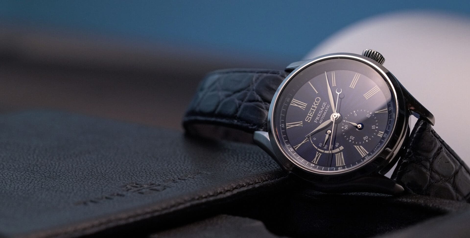
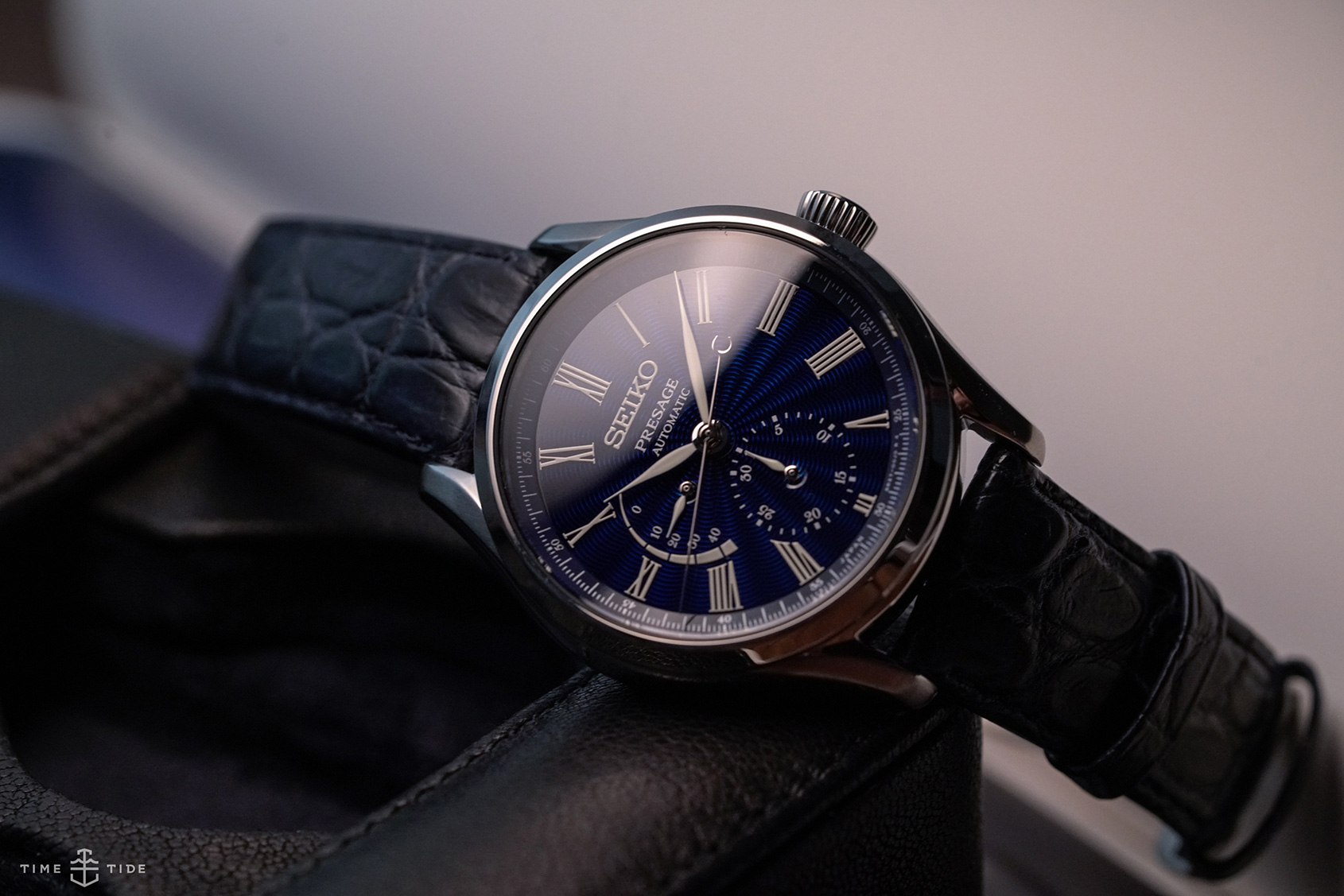
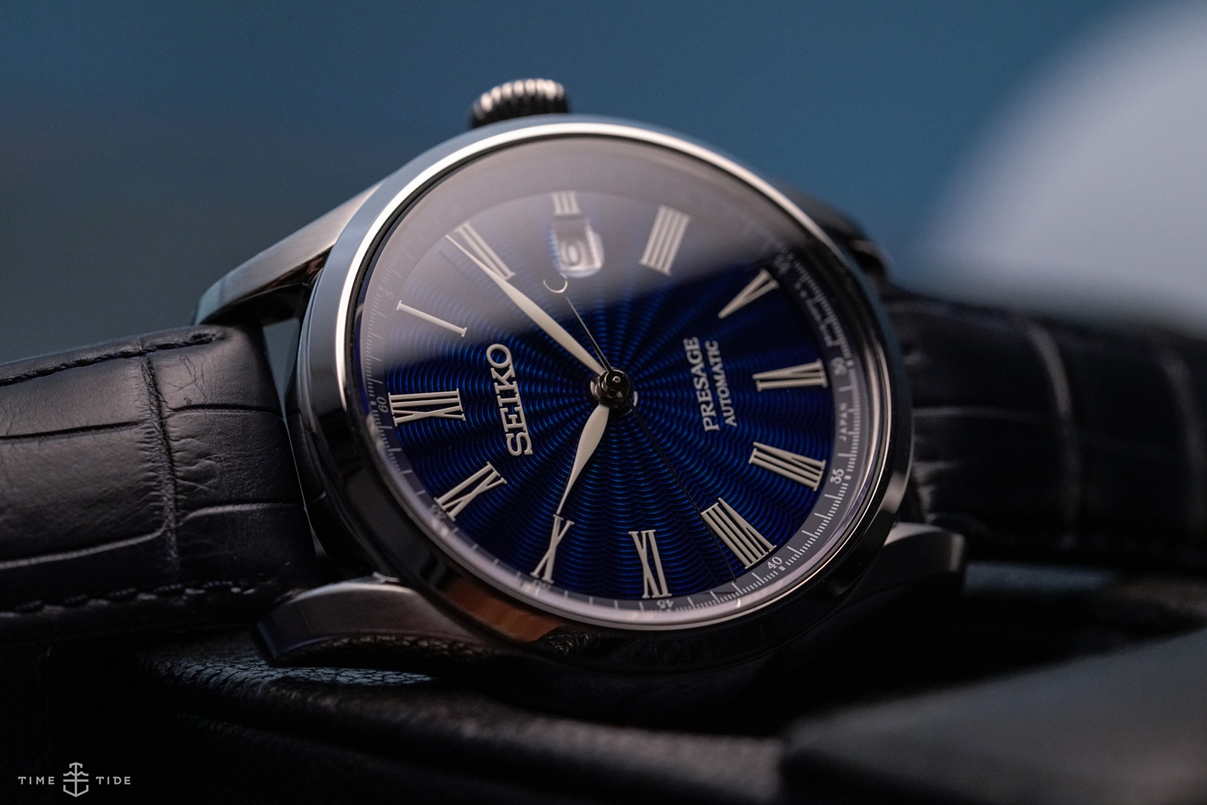
Sandra: Mid-flight, I just had to unbox the watch and get it onto my wrist. Getting off the plane, bright morning sunshine caught the dial. Just wow. It’s the bluest of blues – a deep dive-into-the-ocean blue, the blue of a Kashmiri sapphire. That is due to the Japanese Shippo enamel technique. Very similar in appearance to the European flinqué enamel, it’s a specialty of Ando Cloisonné, an enamel workshop that was founded in the late 19th century and still supplies the Japanese Imperial Court. Each dial is made from start to finish by a single craftsman and I know that mine was made by Mr Wataru Totani, thanks to a swing tag that bears his name – a lovely gesture of respect by Seiko for the artisan’s skills.
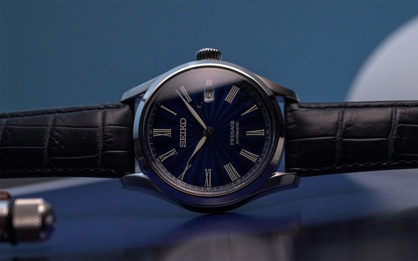
Then there are the slim Roman numerals, which sit perfectly in the ‘rays’ at the edge of the sunray engraving, and a wonderful crisp contrast between the intense blue and the chalky white of the numerals, hands and logo. Everything else about the watch is simple and discreet – the polished steel case, the navy-blue alligator strap. There’s nothing to distract from the main feature – and funnily enough, even the date window at 3 o’clock doesn’t impose on it visually.
When I look at the version with the Power Reserve display and Date on a sub-dial – the one that Justin has – it just doesn’t have the same impact. I love a nice complication but here, I think, the displays overload a dial that deserves to be seen in its pure, uncluttered glory.
Justin: My decision between the two models was effectively the complete opposite of Sandra’s. Neither of us is right or wrong, but we came at the decision from two different angles. I do agree that the base dial is so fantastic that it deserves to be admired, however I’m a fan of complications in general (especially when combined in less common ways) and the pairing of size and positions of its power reserve and date just works for me. It also allowed Seiko’s detail-obsessed designers to include a couple of details that just make me grin every time I notice them.
The half-moon shape of its seconds hand counterbalance isn’t designed the way it is for no reason. As you watch it track its way around the dial it has three little points of interaction. First, it mirrors the size and shape of the “O” in Seiko perfectly. On the opposite end of the dial, it surrounds the pinion for the date sub-dial hand. Not long thereafter, it also surrounds the “40” of its power reserve. None of these details is the least bit functional, of course, but have a look at the vast majority of other watches out there in this price bracket, or even $5-$10k higher, and you’ll see that incredibly few are equally clever or thoughtful with details like this.
The other thing that nudged me towards this variant instinctively was its case proportions. Generally speaking, a thinner watch will be more appealing than a thicker one, but not here (at least for me). The difference in diameter is nominal (mine is 0.6mm larger at 40.6mm), but the jump in case thickness is justifiably more significant, measuring 14.1mm thick vs. 12.4. I’ve always been one to wear watches more casually even when their inherent design speaks a different lingo, and there’s something about the slightly pudgy case that helps this model cross those boundaries with ease.
Two months later
Sandra: This is the first modern watch I have ever bought myself, and while it doesn’t have the emotional resonance of my vintage pieces – the soul, the history – I’m getting massive enjoyment from it. Partly it’s the strap-it-on-and-don’t-think-about-it ease of daily wear (even without the lovely ritual of hand-winding my watch each morning), but mostly it’s the way it looks.
Just as the dial changes from bright azure to almost-midnight blue, the white details pop more in different lights, becoming almost luminous in near-darkness (not actual lume; much more subtle than that). That’s never going to get old or boring – and in that respect it’s similar to my beloved 1972 Piaget (albeit totally different from the latter’s sun-brushed galvanic blue dial with applied gold indexes).
Speaking of the eternal pleasure of details, there’s one that I didn’t properly register until a week after I got the watch – and now I can’t un-see it. Whereas many dial designers remove a numeral to make space for a date window, Seiko shrunk the ‘III’ rather than eliminating it altogether – so the whole numeral + date ensemble remains in better proportion to the rest of the dial. Oh yeah – and that half-moon counterbalance on the seconds hand that Justin is so enamoured with. It is ridiculously cool.
There’s also the pleasure of knowing that I got great value for money – really great value: enamel dials of any kind, let alone this quality, are extremely rare at such a price. And that’s why I have no issue with the basic finishing on the movement (Seiko’s ever-trusty 6R15). It’s not as nice as you might expect to see with such a special dial, but it’s nice enough – and the lack of refinement clearly helped to keep the price down.
Finally, there’s the reaction of others (call me shallow … but, come on, don’t we all love a bit of recognition from other watch-people?). Not once has anyone looked and just shrugged – and that includes some pretty serious collectors. Nobody, it seems, is immune to this blue beauty.
Justin: In regards to my compulsion to wear this dressy gem more casually, I’d say mission accomplished. Since it landed in my hands in October I’ve thrown it on a variety of rubber and NATO straps and been thrilled with the result. Much like Sandra, I’ve become even more enamoured with its dial over time. Generally speaking, a high-polished case like this is a deterrent for me, as I tend to wear my watches when doing just about everything, but so far the new beauty has survived (relatively) unscathed. The brushing of the top of its lugs tones things down just enough, as there’s ample shine and reflection coming off its dial and a 100 per cent polished case would be overkill.
I’ve also experienced the same glowing response from fellow collectors, enthusiasts, as well as from friends and acquaintances that aren’t necessarily into watches at all. This is fairly understandable considering it ticks a ton of boxes that align with mass appeal. It’s not too big or too small, too bold or too boring, too dressy or too casual, too formulated or too outlandish, too cheap or too exorbitant. Could this be the Goldilocks of watches? Maybe not for all, as an unfortunate few will still throw down the “but it’s not Swiss” card and, as Sandra noted, its movement finishing isn’t anything to write home about. But strapped on the wrist and ticking away as accurately as anything else in my regular rotation (not to mention considering its bargain pricing), I really can’t bring myself to be bothered by that fact in the least. Fact of the matter is it has bumped quite a few other things out of regular rotation these days, and I’m not complaining in the least.