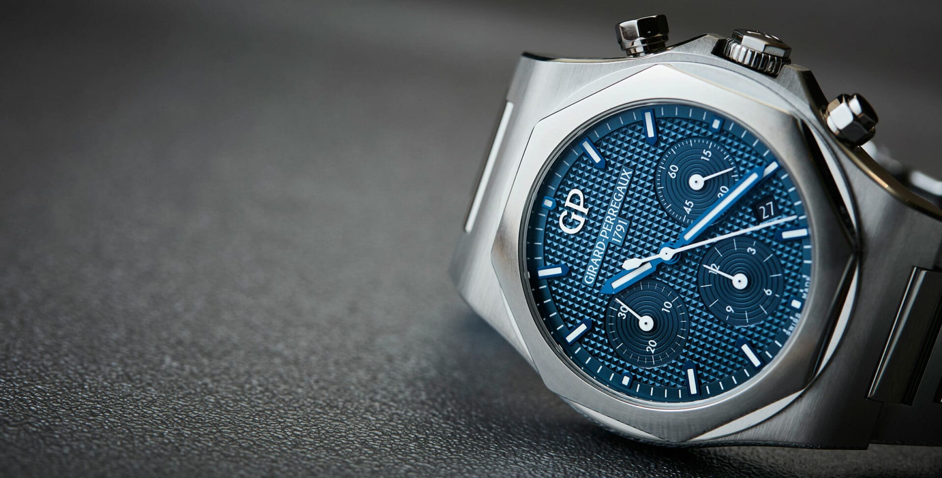
MY WEEK WITH: The Girard-Perregaux Laureato Chronograph, and how I got completely turned around to loving it
Andrew McUtchenWhen it came up that a review of the Girard-Perregaux Laureato was on the editorial agenda, Felix cocked an eyebrow and said, “Are you going to write about your reaction when you first saw it?” Yes, I thought, when the time comes, I will. So here we are.
The day that I first laid eyes on the relaunched Laureato, it is fair to say that I was a long way from a potential buyer. Firstly, it was an Instagram picture, so it was pretty grainy. To my jetlagged eyes – it was day one of SIHH 2017 – it was a blurry octagonal sports watch quite like many others.
To confirm Girard-Perregaux’s focus on the enthusiastically relaunched model, the wall of their booth was textured with the dial pattern at a ratio of at least 50:1. Huge pyramids, in other words. The rationale for this was lost on me. Why would GP draw attention to a design code that also – on first glance – evoked other brands? As a result, I pretty much ignored it that year. Not in my lists from the fair, or end-of-year bangers. I didn’t really give it a second thought.
It’s not an easy, or comfortable thing to admit (especially given where I’ve ended up, the clue is in the title), but my key reasons for dismissing the collection in the first instance were both based in ignorance. And as for that first impression, cast by the Insta pic? The saying goes that you don’t get a second chance at one. Untrue. I saw it again months later on an Instagram pic on the GP account. I was spellbound. There was a galvanic sheen to the finely textured dial that had me looking at it repeatedly. The case looked sculptural, layered and interesting, not derivative. How could this be the same watch?
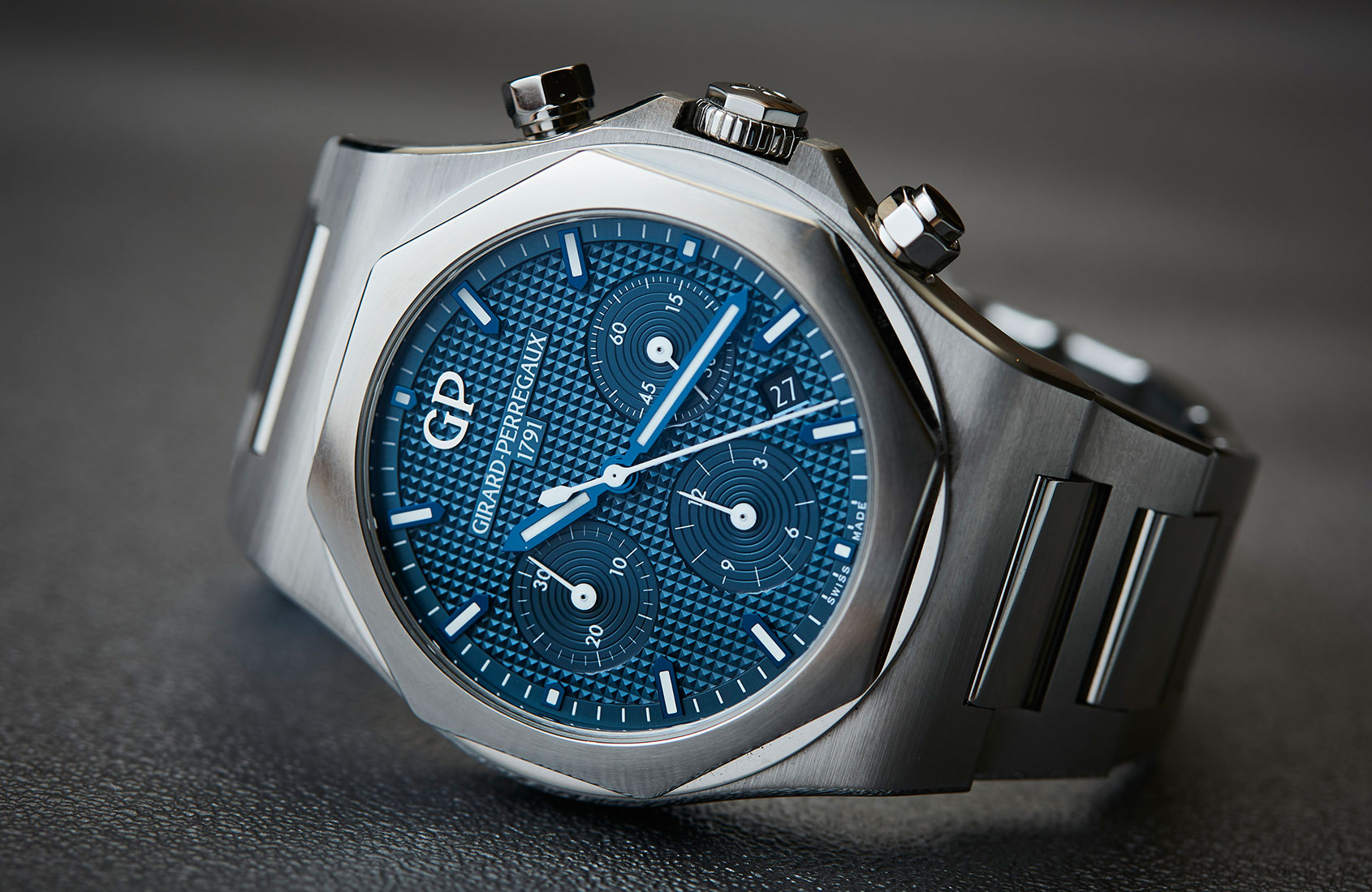
The game of shapes that the case and cut-out bezel play; it’s actually an octagon within a circle, framed by the smooth shoulders of the case. On closer inspection, it has none of the sharply angled cheekbones and bold case lines of an AP. While hailing from the same era, both watches clearly have different intentions from a design point of view – the RO aggressive, muscular and angular; the Laureato, slim, rounded, more conservative.
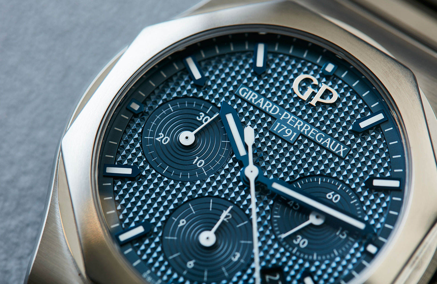
As for the dial, well, another thing that originally repelled me – from a distance you could mistake it for a waffle pattern dial – ultimately drew me right back in. GP were right to be proud of this dimensional design twist. You will read later why the dial is the best thing about this watch, easily. But I won’t steal my own thunder just yet.
And so, with a budding interest, down the rabbit hole I went. Learning that the first Laureato launched in 1975 was one of the first in-house Swiss quartz movements released, and it was very, very slim comparatively – an attempt, perhaps, to prove that in changing times, with changing tastes, the Swiss could keep up with the times.
Quartz was not a dirty word in 1975. It was cutting-edge tech. As such, ‘Quartz Chronometer’ (the chronometer certification was achieved with a quartz crystal that oscillated at 32,768Hz) was proudly inscribed on the dial. This was during the ‘Quartz crisis’, which necessitated the Swiss watchmaking industry to respond to Japanese quartz circuitry with a superior version. Those keeping score will note that, yes, it post-dated the Royal Oak by a couple of years and pre-dated the Nautilus by one. While sharing design codes (sometimes liberally, with the original Laureato bracelet clearly an inspiration for the Nautilus), I’ll talk later about the overall difference in the concepts – and design intentions of each.
Once I put it on I felt …
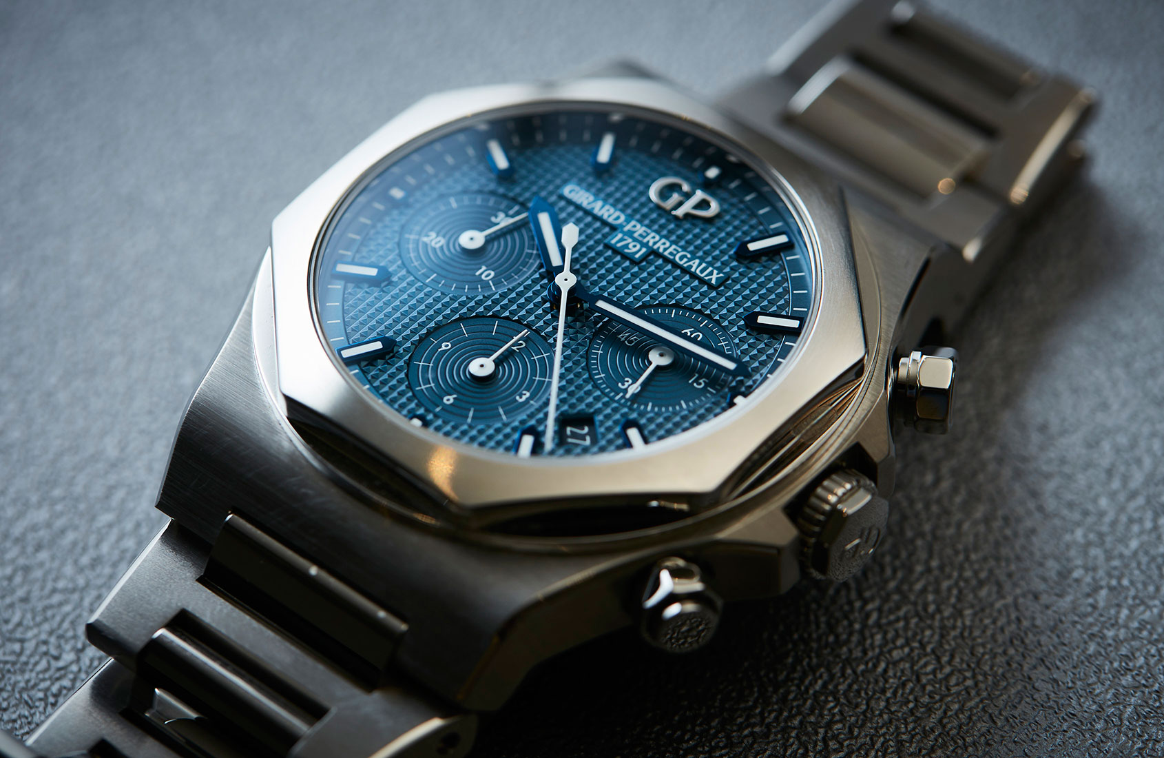
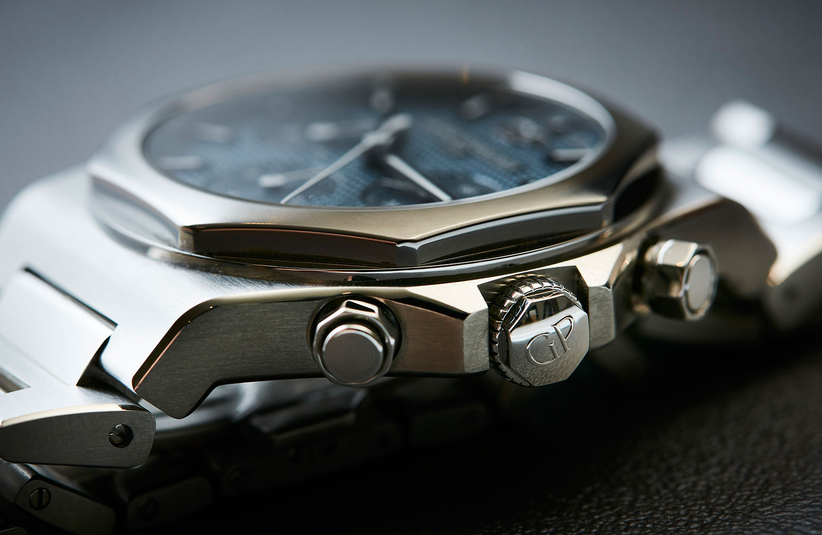
That it was familiar. This Laureato is made of 904L steel. Anyone with a modern Rolex knows what that means. 904L is warm liquid metal. The bracelet of my BLNR was the first steel bracelet I wanted to wear every day. It is the prince of steels in my opinion. The Laureato also feels comfortingly solid on the wrist, and overall burnished to the touch. Again, like a Rolex, it has no component, no link, case edge or clasp that does not feel well polished.
Before we go on, here is a brief, but passionate tribute to the most comfortable steel I’ve ever had on my wrist. I did a quick Wiki search so you won’t have to. Here’s a clip: “904L is an austenitic stainless steel. In comparison to 316L, its molybdenum addition gives it superior resistance to localised attack (pitting and crevice corrosion) by chlorides and greater resistance reducing acids and in particular its copper addition gives it useful corrosion resistance to all concentrations of sulphuric acid.”
As for the big crown … “In 1985 Rolex became the first wristwatch manufacturer to utilise 904L grade steel in its watches. Rolex chose to use this variety of steel because it takes a higher polish than other grades of steel and provides greater corrosion resistance, though it does not machine as well and requires specialised equipment to be properly modified into the required shapes.”
Looks-wise …
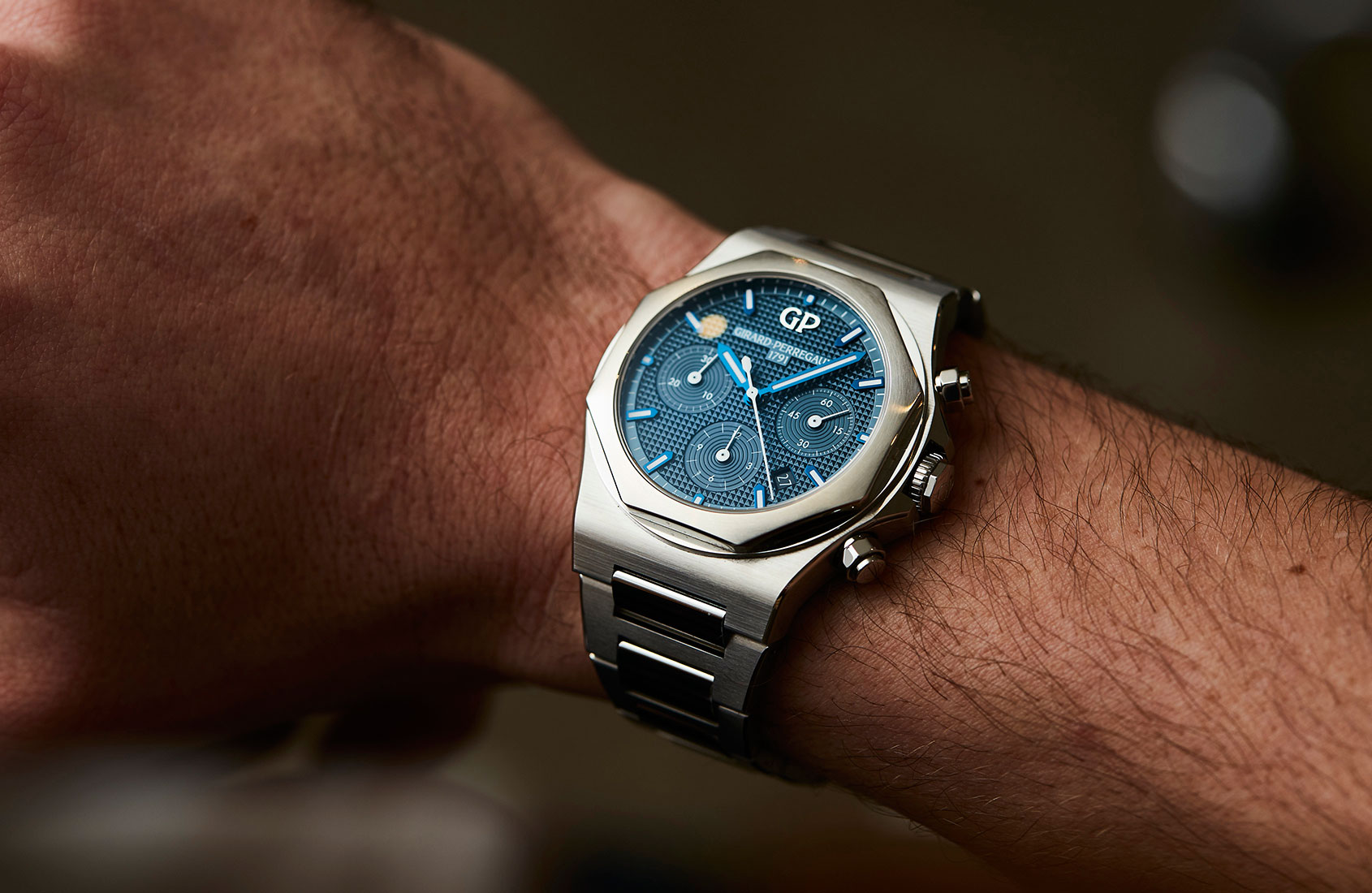
The Laureato may just be the watch that carries the dubious honour of being the most exponentially better-looking watch in the metal and on the wrist than in pictures (apart from the aforementioned one on the GP account).
@stummepeter just commented on Instagram: “I mean you can tell that print pics do not do this watch justice; however, this quick wrist roll demonstrates the strength and beauty of this wonderful GP watch.”
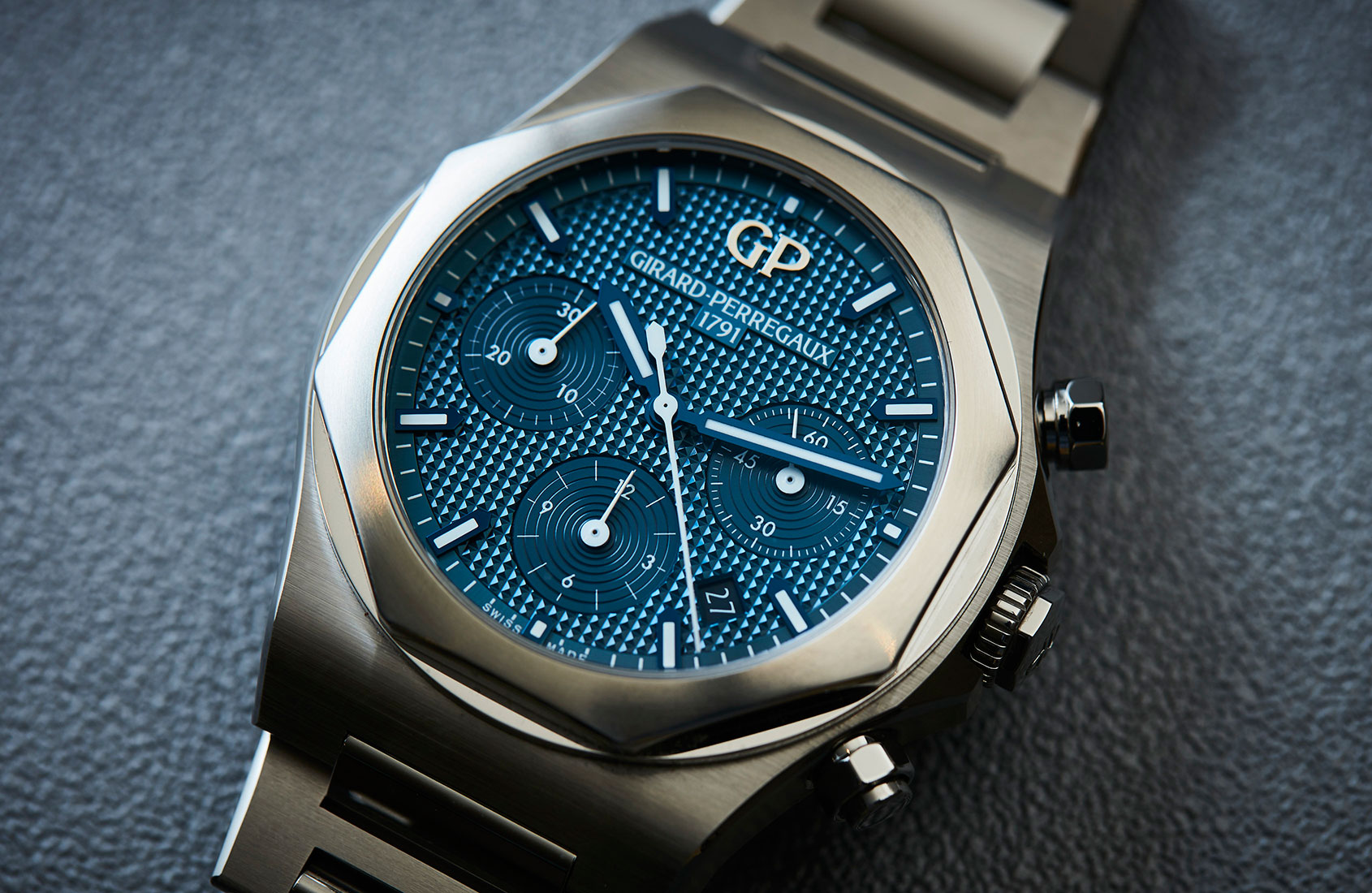
What makes it so? Almost certainly for me it’s the dynamic effect created by the four-sided pyramids on the dial. As you shift the angle of your wrist, the panels align and create a thrilling galvanic flash; in this case, of an electric blue. A futuristic blue. And then, if that wasn’t enough, the indices and hands are blued as well, which adds yet another visual jolt of blue over the flashing dial.
What stood out to me …
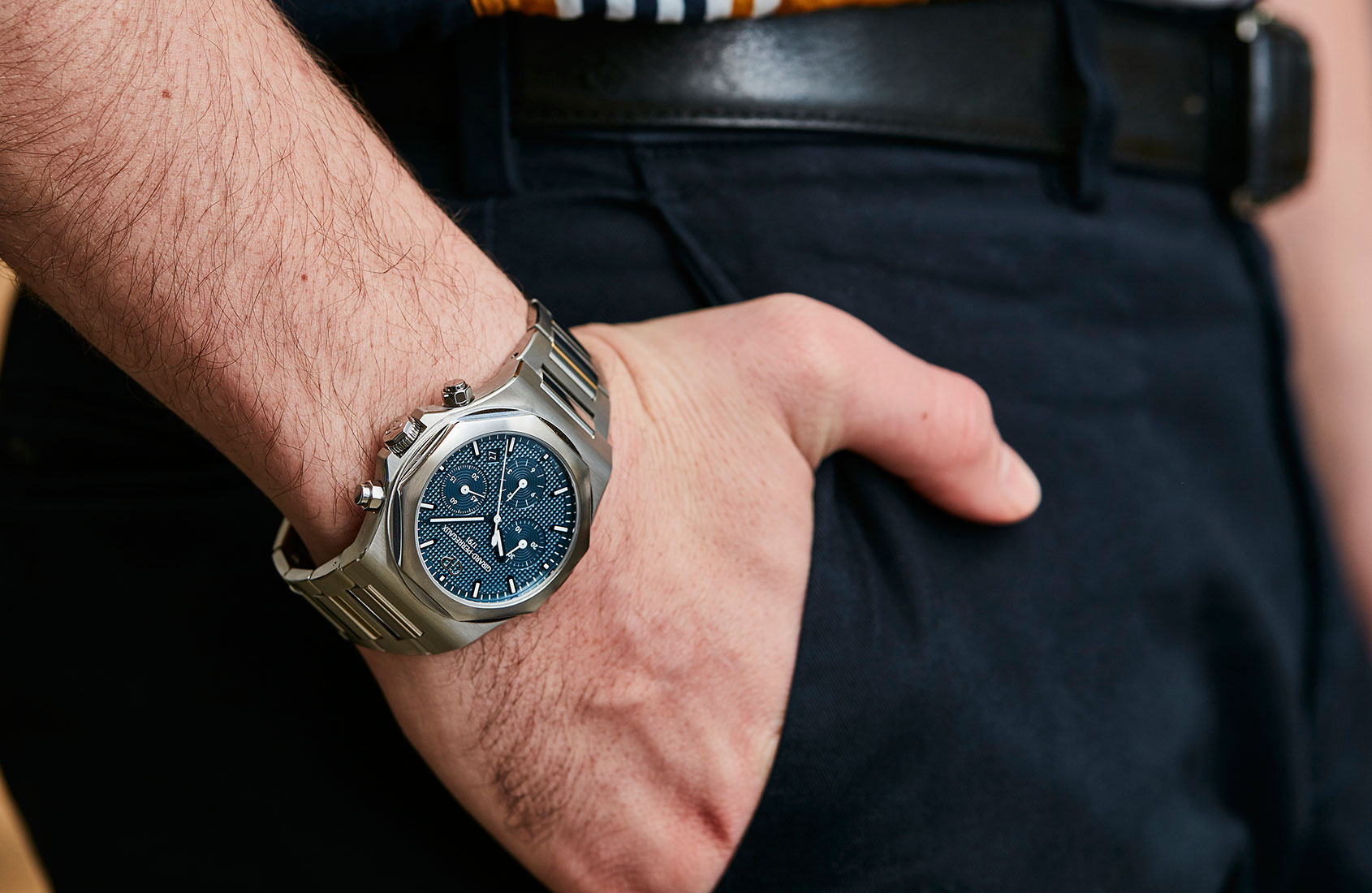
I can be brief here, because aside from the dial and the immediately evident nuances (blued hands etc) what stood out to me is the way this watch hangs together as a design statement. It clearly hails from that halcyon era of luxury steels sports watch. No prizes for noting that. However, because its origins are in a slimline watch, and when combined with the more reasonable and conservative orchestration of rounded case, and the softening of the bezel by the round under-layer, it makes a strong case as a daily wearer. Like most of you, I have lusted after a Royal Oak since I started getting into watches. What holds me back is the brutality on the wrist. The Laureato is a little more flexible and adaptable, because it’s reasonable.
I’d wear this with …
Ok, I’ve tried the lot. The best results were with a white T-shirt and jeans. You immediately shift from casual to sports luxe. Boom. And with a suit: any suit, any colour, any shirt. Blue is chameleonic in its ability to fit in. And the case is so lovely and rounded that it slips neatly where it needs to be.
Look, I could go on here. I think it’s best that you check out the on-the-wrist roll on our Insta right now. It tells it better than I can, clearly. One last Easter egg to change up the flashing tones is the applied GP logo, in highly polished stainless steel. On the second day of owning this watch, I was walking in the subway with the lights above me – I swear I could hear lightsabre noises going ‘pew pew pew’ as the white neon tubes above me made my watch glow blue and silver with each liquid pass. The contrast of finishings is also pretty cool – straight grain satin brushing on the H links and polished centre links, as well as a circular grain satin-brushed bezel and vertical grain satin-brushed case, both with polished and rounded edges.
If I could change anything …
Some would have liked a clear caseback, though I can live without. The adjustments made to the 2017 model in terms of the bracelet not being supple enough, and the clasp being uncomfortable to the skin, have resulted in dramatic improvements if I remember correctly. The original relaunched model had quite stiff links and the clasp caught slightly – these have both now been fixed, and the bracelet/clasp are as high-quality as the rest of the watch. Elsewhere, I’d just say a blued steel frame for the date window (which has sympathetic wheel background colour to the dial, making it disappear rather than contrast, which some may have an issue with, though I prefer) would have taken things one per cent higher. It’s a pretty high bar though. And I bid you, see it in the metal. There is a lot to see here.
Girard-Perregaux Laureato Chronograph Price
Girard-Perregaux Laureato Chronograph, $21,700 AUD


