HANDS-ON: The Rado HyperChrome Captain Cook, a cheeky ’60s reissue that swings both ways
Andrew McUtchenCaptain James Cook was a British explorer, navigator, cartographer, and captain in the Royal Navy and he is credited as being the first European to make contact with the eastern coastline of Australia. Considering the number of Europeans that make contact with the east coast these days – especially the bit between Sydney and Cairns – he definitely started a route that started the whole of Europe tanning.

In more interesting news, to have a ‘Captain Cook’ in Australian (possibly Cockney) rhyming slang is to have a look at something. Yes, really. With those local references, how could we not be drawn to this reissue of a watch first released by Rado in 1962 of the same name (minus the HyperChrome) that swings both ways with contemporary/commercial and vintage designs?
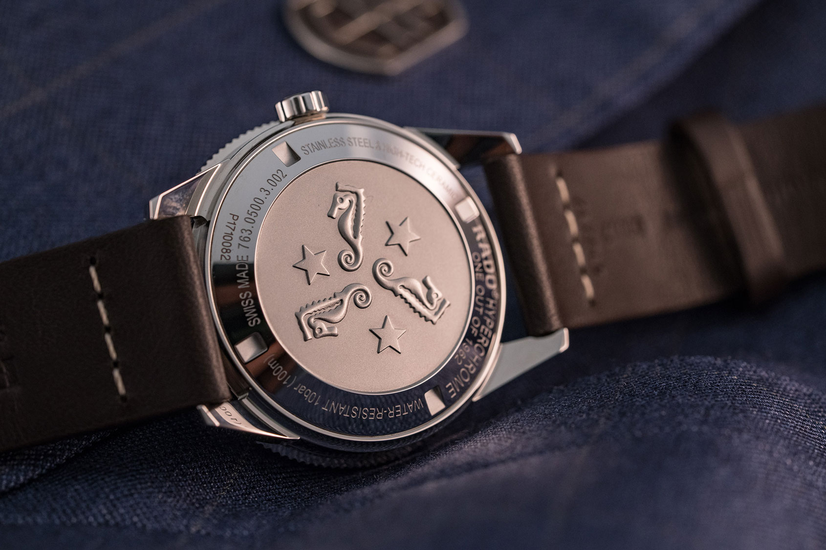
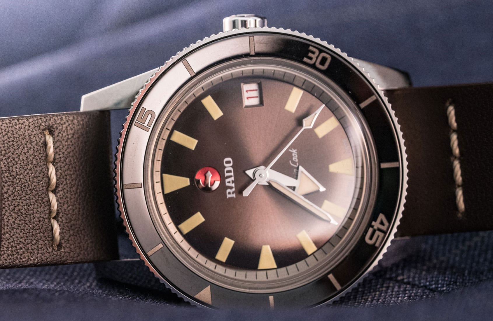
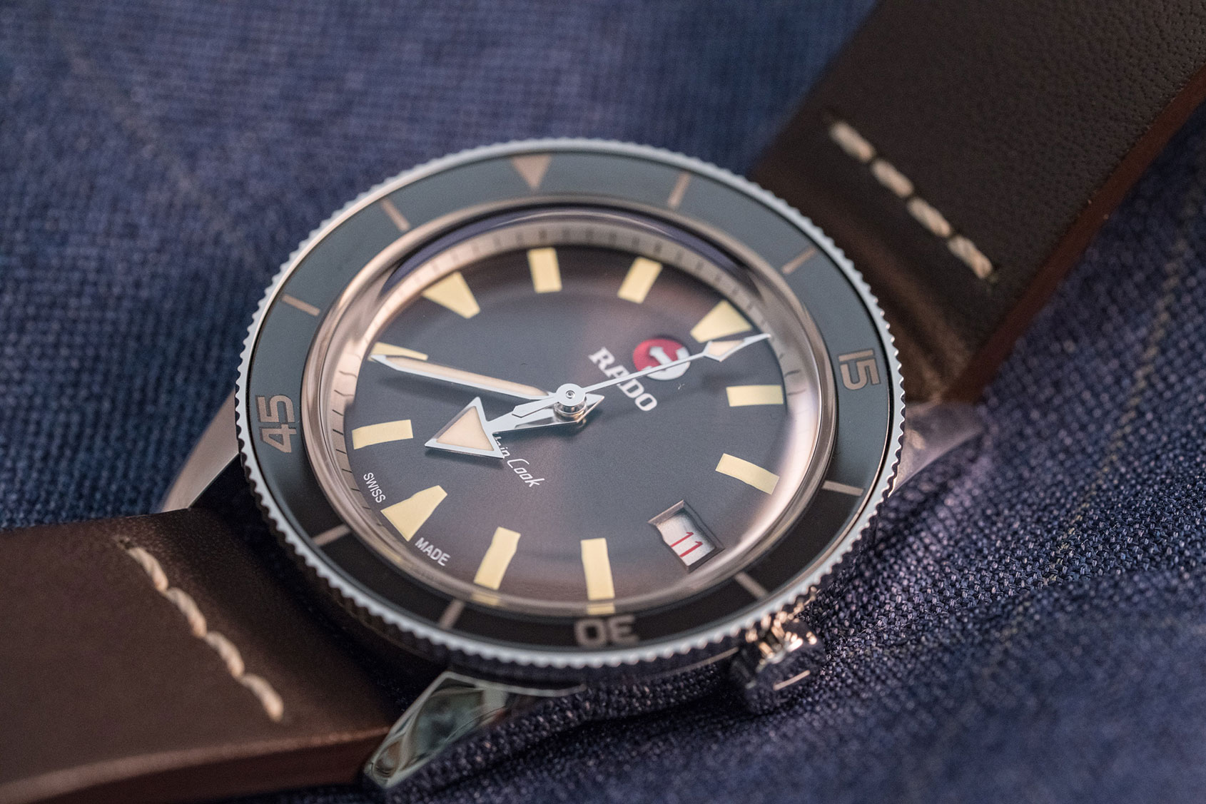
There are three new references, including a white women’s version with diamonds, a limited edition (of 1962) 37mm dark grey sunburst dial version (pictured here) on vintage leather strap and a larger 45mm titanium model. Despite water resistance of 100m in the first two versions and 200m for the titanium one, In our meeting Rado’s staff were quick to point out that it’s “not a dive watch”, functionally speaking.
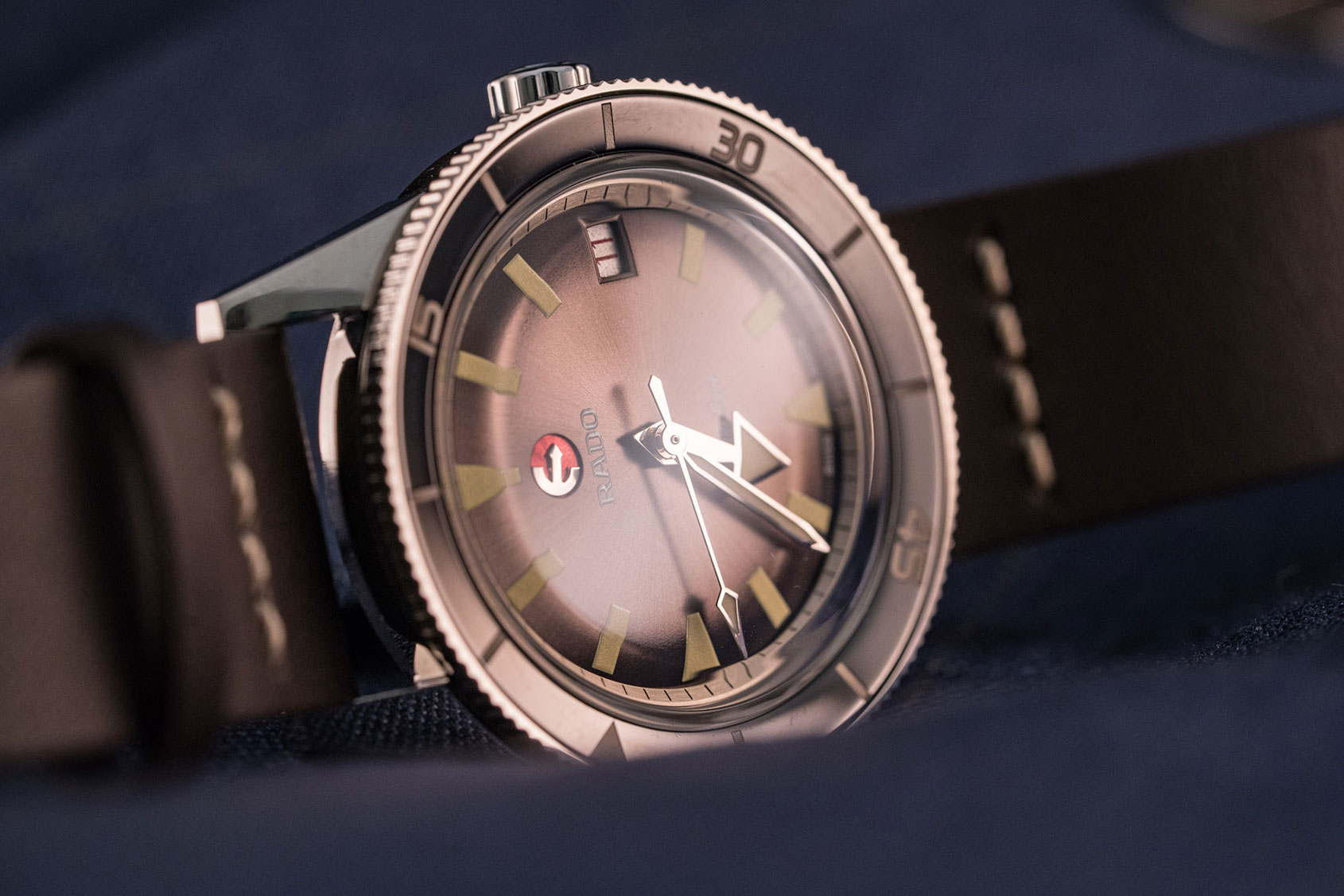
The Hyperchrome Captain Cook is quite petite by modern standards, a perception further enhanced by the thick, dark bezel in high-tech ceramic and stainless steel. I had to do a double take when I was first handed this watch. It is surprisingly faithful as an homage to the original. There’s also a glass box sapphire crystal which heightens the vintage mood.
The smaller size is an unusual choice because it cuts out the segment of the market that wants a reissue piece at a more contemporary size. But on the other hand, it has definitely caught the attention of purists, who pay attention to honesty in homages to classic older models and tropes. Hats off to Rado for following the vintage story through from the style.
The chunky broad arrow hands and italicised font of Captain Cook on the dial combine to give the model yet more of a cheeky ’60s personality that is not quite Austin Powers, baby, but certainly a little funky. No matter where you stand on the overall assembly of elements, it’s a fresh, fun and completely unexpected piece from the usually forward-focused Rado.