


HANDS ON: The IWC Portugieser Annual Calendar
Felix Scholz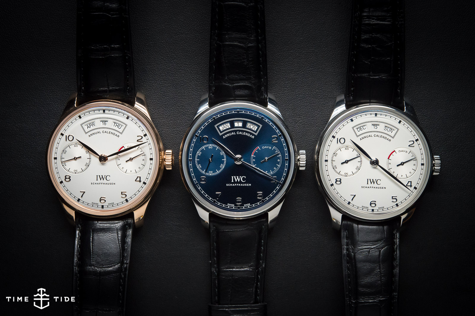
There must have been nerves. There must have been second thoughts. Because you only tend to fix things when they’re broken. And the Portugese, which is without question the most popular/profitable and most iconic of the entire IWC range, is a long way from looking any kind of broke at all. But it’s the IWC way to move from collection to collection each year, making improvements – large and small – to the watches both outside and in. Last year was the inflated, bronzed Aquatimer and now it’s time for the new Portugese to stand up. And the first thing we have to adjust to about the Portugese circa 2015, is that it’s not called a Portugese at all. It’s The Portugieser. Which is ‘Portugese’ in German. This first teutonic twist to the watch is the most minor, even though it’s caused major consternation in this team every time we’ve posted about it. Portu-GIESER. Portu-GIESER.
That said, the overwhelming feedback from SIHH was that Christian Knoop, Creative Director, has got it right. Different enough to offer a genuine alternative, with meaningful new complications and design changes but similar enough to still look like a Portugese. The strength of the new range was largely derived from its singular focus – IWC did not distract from this new range by updating others. It was all about this family, and we were all ears.
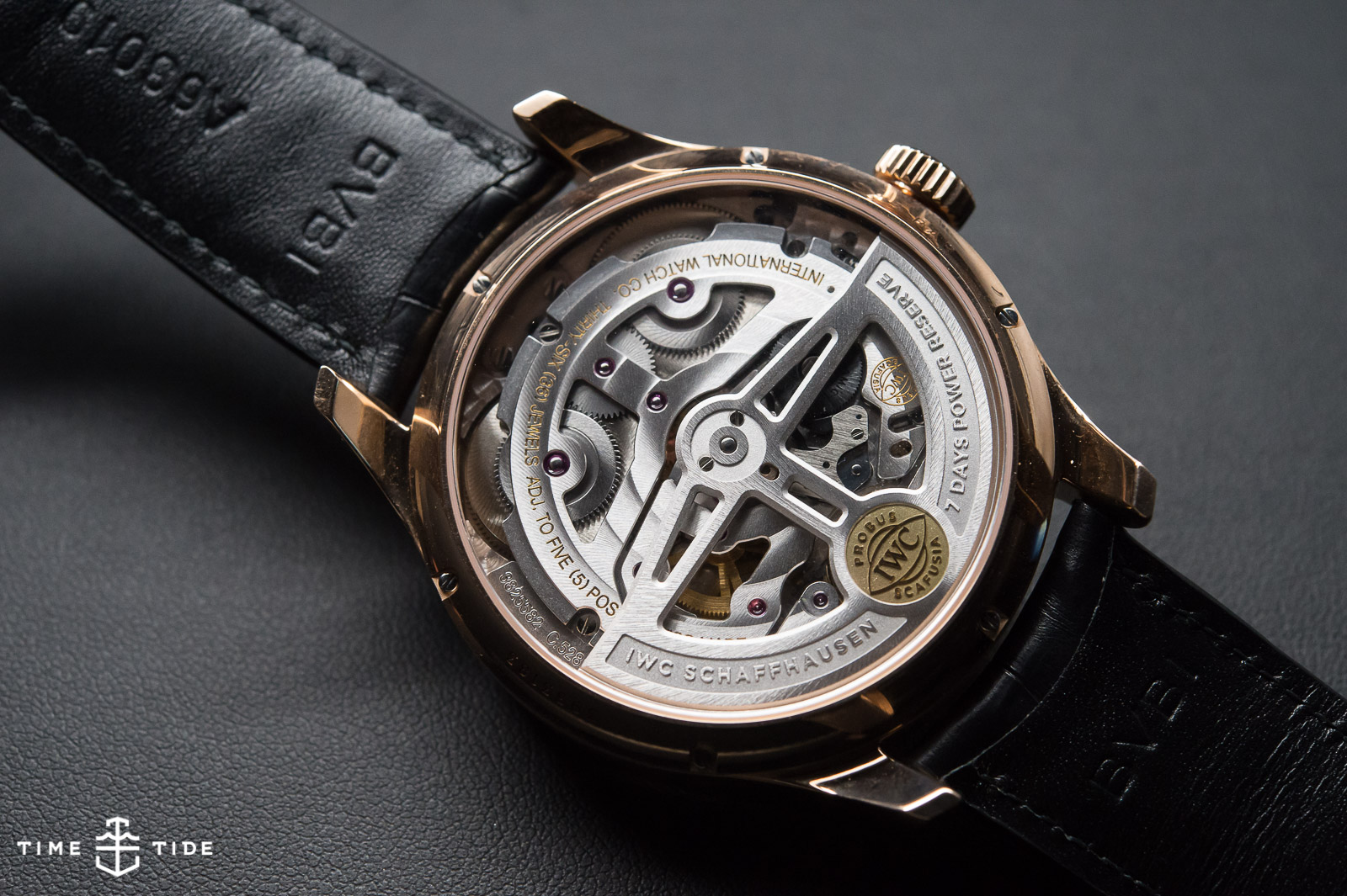
There are 3 completely new models, and all other models are getting some cosmetic changes and the odd adjustment in size. But the changes are more than surface deep – with IWC ramping up their in-house capacity, launching the newly designed 52000 calibre family this year (replacing the calibre 5000), with two other calibres to follow in the coming years. IWC have made quite a few improvements that put them in a strong position for the next few years. They’ve added an extra barrel to provide power for whatever complications they integrate, they’re using ceramic for crucial parts, and increasing the frequency to 4 hertz (as well as maintaining 7 days power reserve). The movement in itself is big news, but that’s not what got people talking.
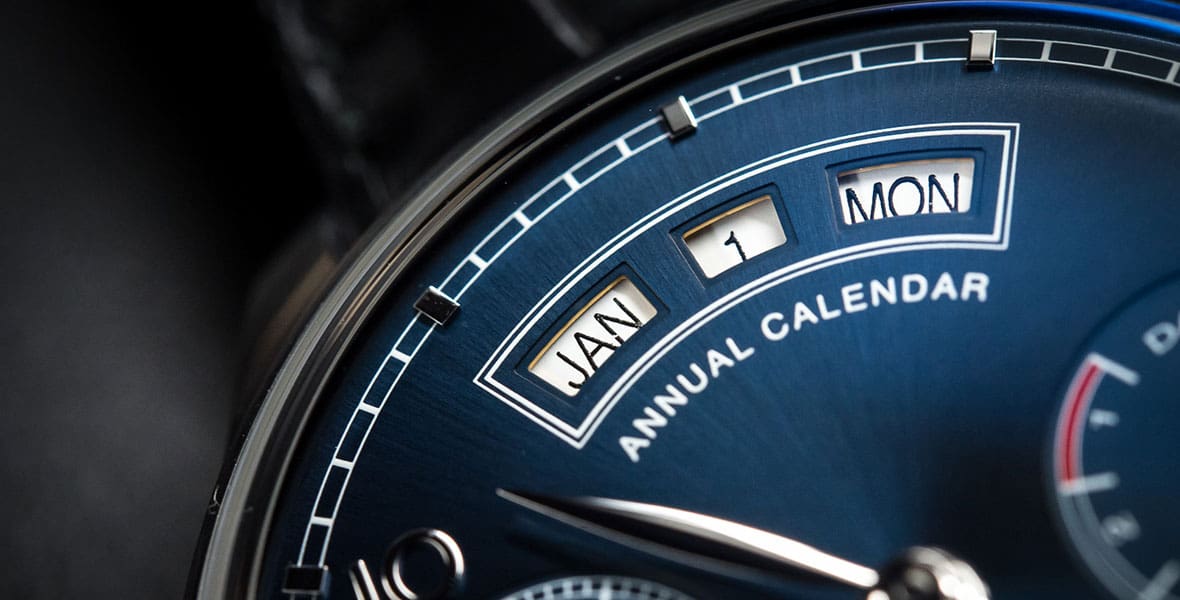
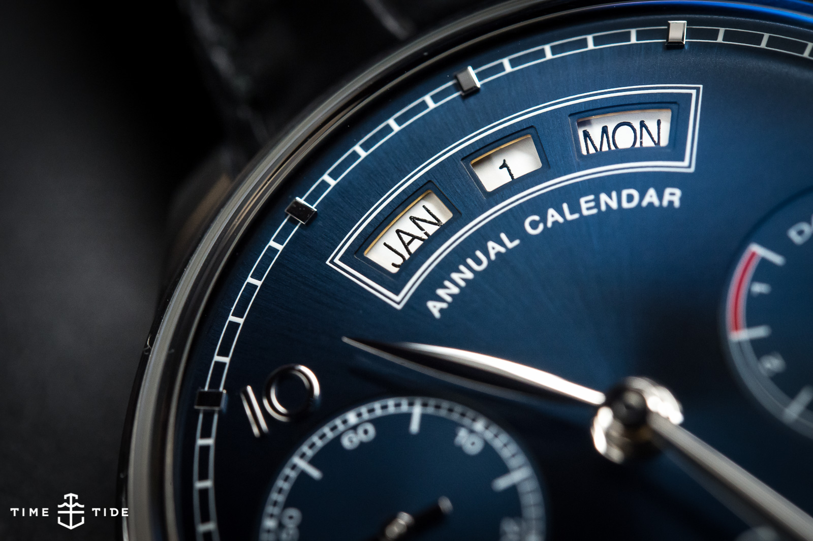
The watch that had most tongues wagging (thanks to it’s early pre-SIHH announcement), and generated more than a little controversy was the brand new Annual Calendar. It generated buzz because it’s a brand new complication for IWC, and a watch that sits neatly between the simpler, entry-level Portugieser models and the more complex and pricey perpetual calendars. The Annual Calendar has generated controversy for two main reasons, the layout of the date (month/date/day) and the fact that the watch spells out ‘Annual Calendar’ front and centre on the dial. We’ll get to those points in a little bit, but lets first talk about the watch as a whole.
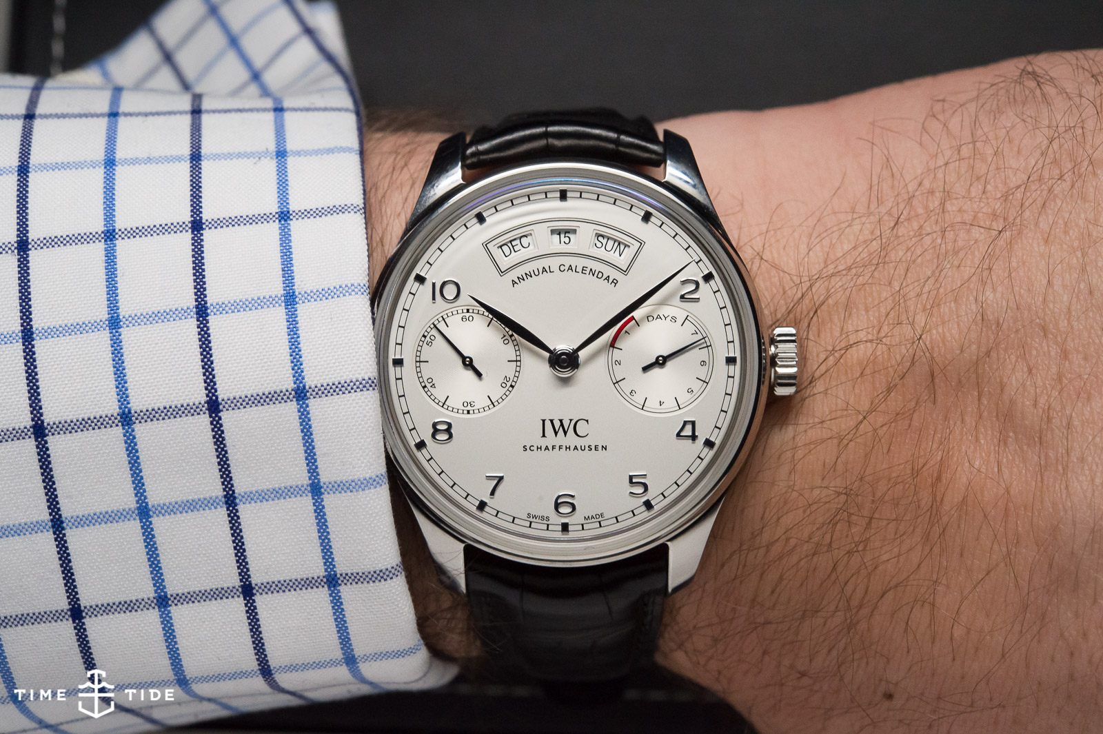
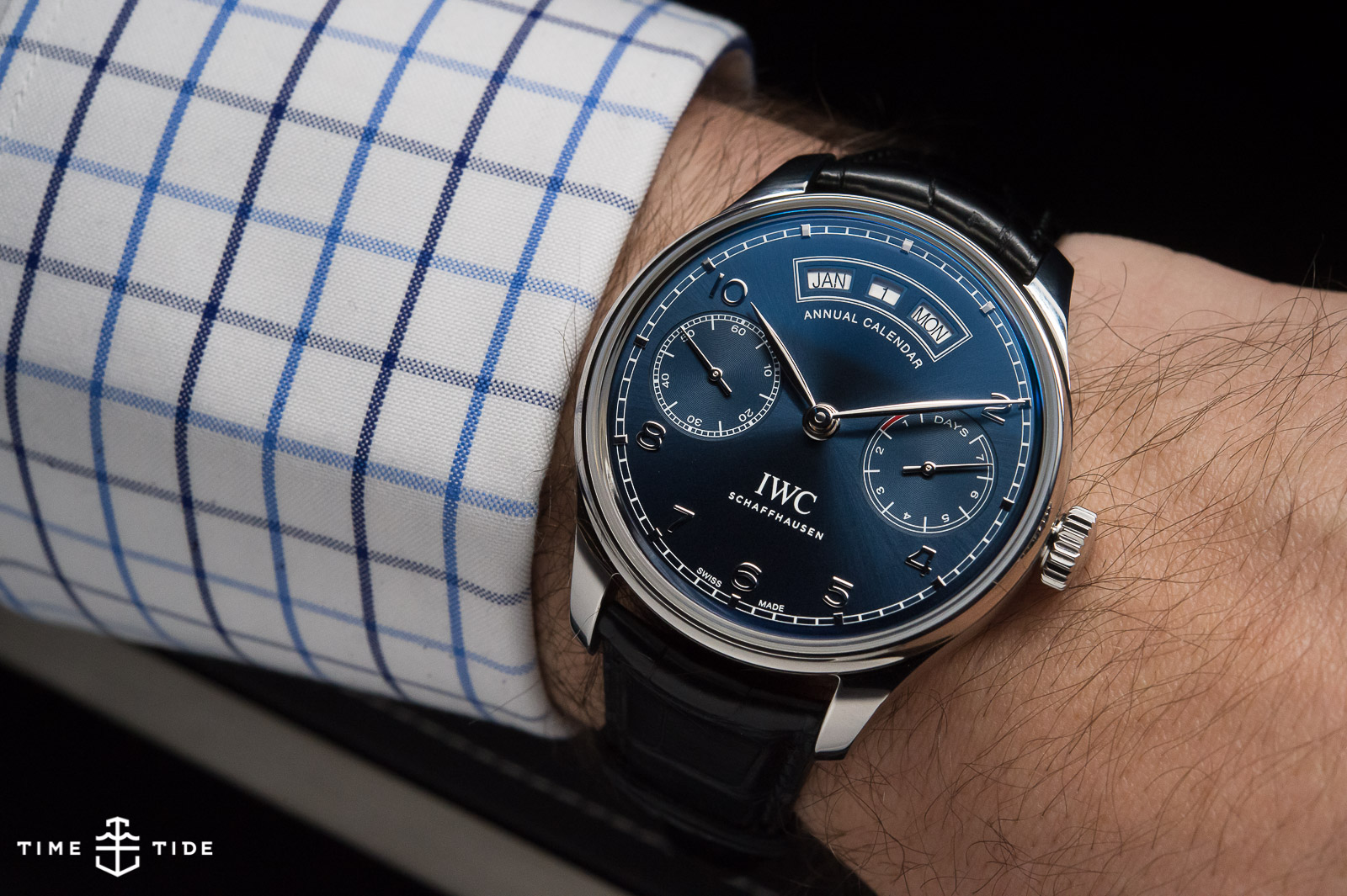
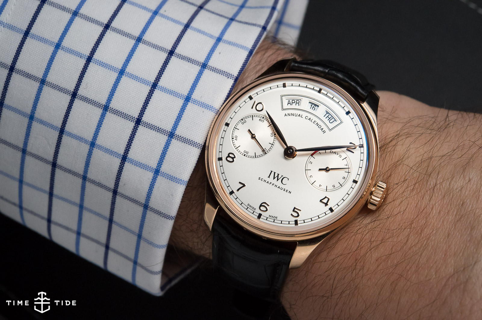
As with all watches in the Portugieser family (in fact pretty much all IWC watches) the Annual Calendar is a big chunk of metal. Some will find the 44.2mm case width off-putting, especially on a watch that could hardly be called slim, but to be fair it’s a size in line with the 1939 original. IWC have gone to some effort to ensure this is a watch wearable by all, using a new sapphire crystal with a curved edge, as well as new straps with curved ends which combine to make the watch a little more svelte. It certainly wears very comfortably on the wrist, with the heft and presence that you associate with the Portuguese (or rather Portugieser).
Having only seen the press shots of this watch I wasn’t sure if I’d like it in the metal, the traditional two-register layout of the watch risked being outbalanced by the date windows at the top of the dial. IWC were clearly concerned with this as well, as they showed us countless renderings of the dial design through its development. I’m quite comfortable stating, after having worn the watch and seen the designs that were left on the cutting room floor, IWC have gone with the best dial design possible. Now, about that problematic Month/Date/Day layout – IWC’s line on this is that this is an “American” date layout, in honour of F.A. Jones, the American founder of IWC. I understand that in a mass-produced model like this you need to pick a single date style and work with it, but as an Australian it goes against the grain and I’m not sure I’d get used to it.
This seems like a good point to talk about that ‘Annual Calendar’ text. According to IWC this was a late edition to the design, and while at first it might seem like unnecessary verbiage (and they wouldn’t be the worst offenders in the world of horology) it does serve an important purpose. The dial text tells you that this watch is an annual calendar complication. Seems obvious, but it does need to be said. This watch isn’t a perpetual calendar, that a; costs a whole lot more and b; only needs adjusting once in a blue moon. But it isn’t a (much simpler to achieve) complete calendar only, which displays day/date/month, but needs manual adjustment when the month doesn’t have the full complement of 31 days. So while it might at first glance seem superfluous the dial text does fulfill an important role in differentiating this particular complication from its other calendar cousins. Knoop was also eager to point out that the text “visually balances the dial”. Make your own mind up by checking out the scrapped variations (most, interestingly, without the text) on our Instagram post here.
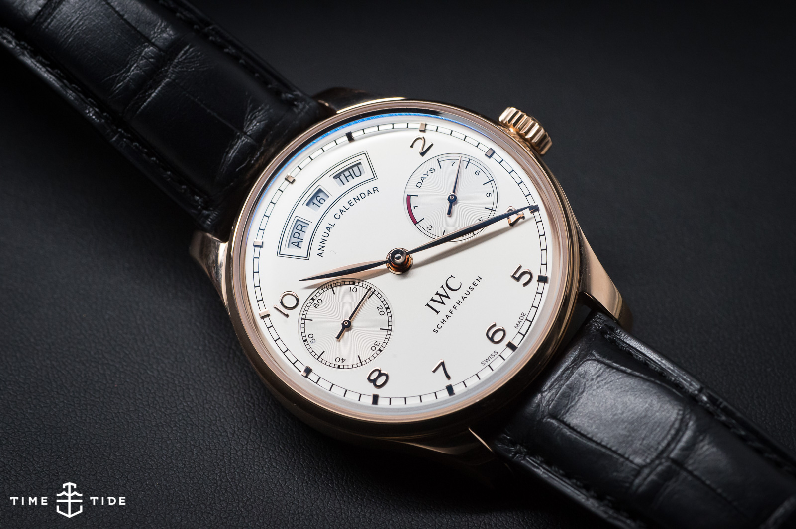
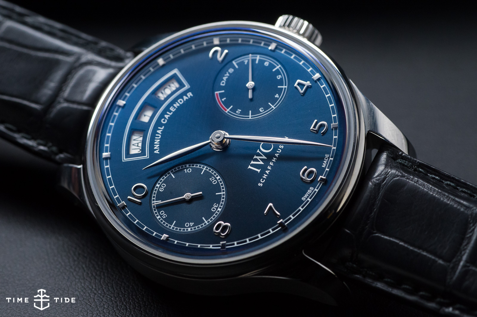
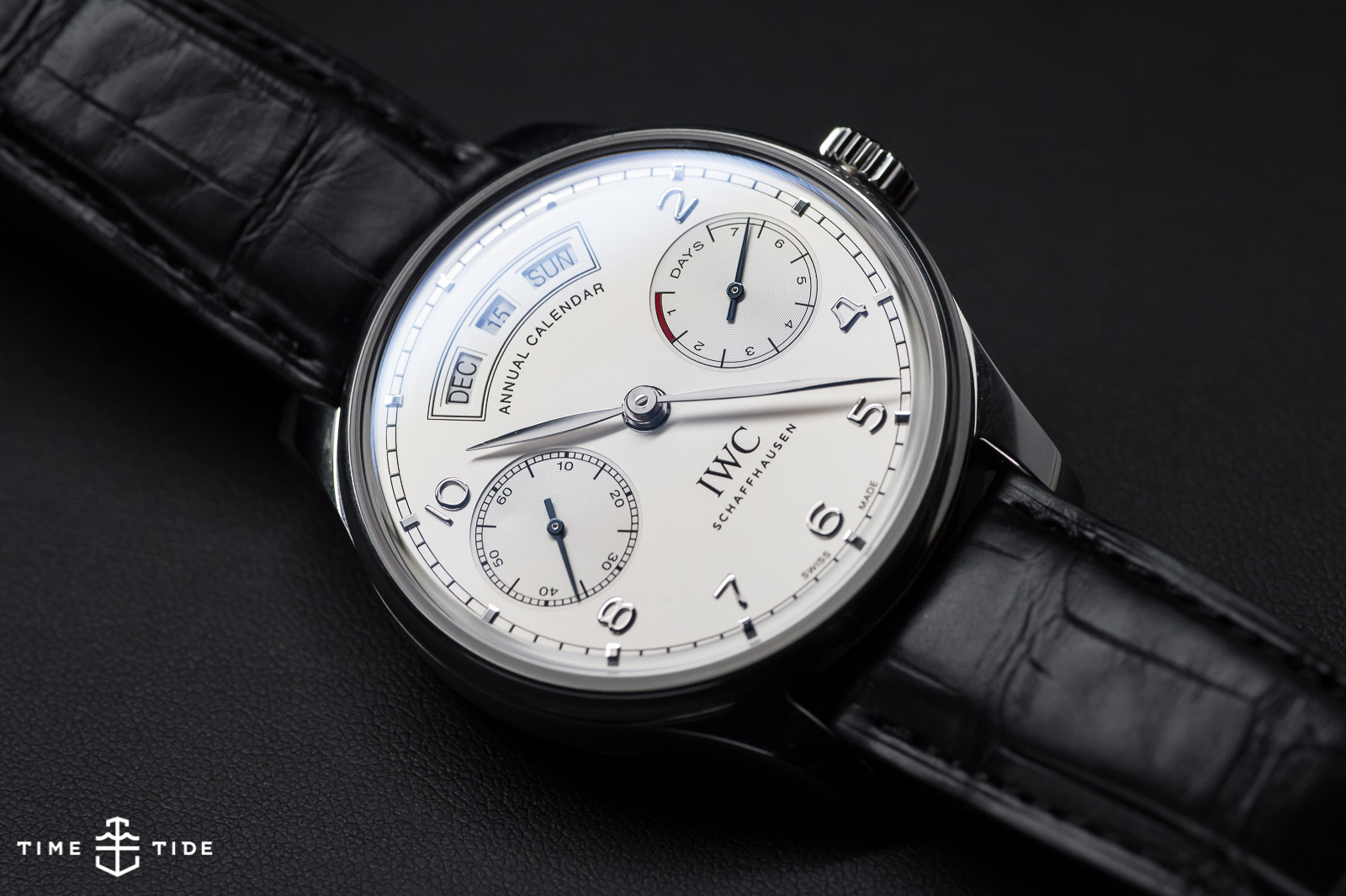
The Annual Calendar comes in three variants; steel with a silver dial, steel with a blue dial and red gold with a silver dial. They’re all pretty, but the star of the show is the steel/blue combo – the sunburst blue dial has that mirror-like quality that can make it look like midnight or a summer sea, depending on the light. It’s a dial I would look at a lot. Lovingly. And I’m already looking forward to the inevitable gold/blue or platinum/blue combos we’ll see in the future.
IWC Portugieser Annual Calendar Australian pricing:
- Ref: IW503501 (Stainless case/silver plated dial) – $29,200 AUD
- Ref: IW503502 (Stainless case/midnight blue dial) – $29,200 AUD
- Ref: IW503504 (Red gold case/silver plated dial) – $43,200 AUD
Please note that these prices are indicative, and may change when the watch reaches the retail market.